Skip to content
Red's Kingdom
Home
philgomm.com
Behance
Chimera Trilogy
Chimera Book 1 / The Audiobook
Even The Most Shunned Of Things
Patience Kite
Search
Art
July 1, 2026
The Bontecou Pavilion (2026)
philgomm
June 30, 2026
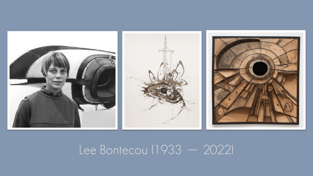
The Kick-About #161 | Lee Bontecou
philgomm
June 19, 2026
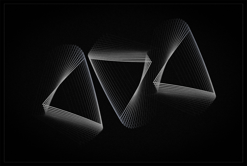
Jazzy Triangle (2026)
philgomm
June 16, 2026
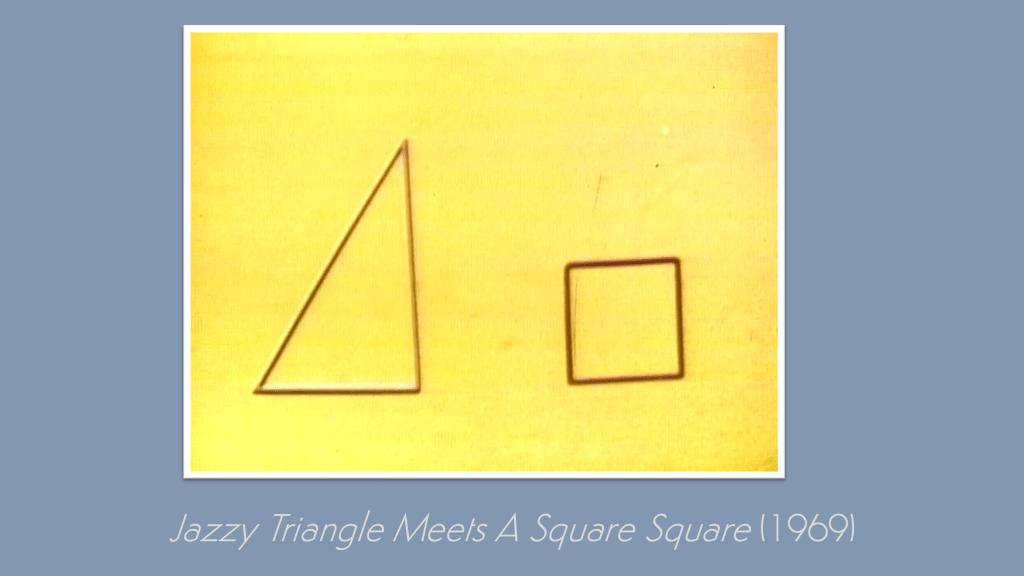
The Kick-About #160 | Jazzy Triangle Meets A Square Square
philgomm
June 2, 2026
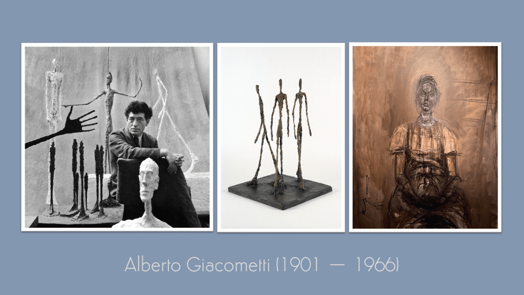
The Kick-About #159 | Alberto Giacometti
philgomm
May 19, 2026
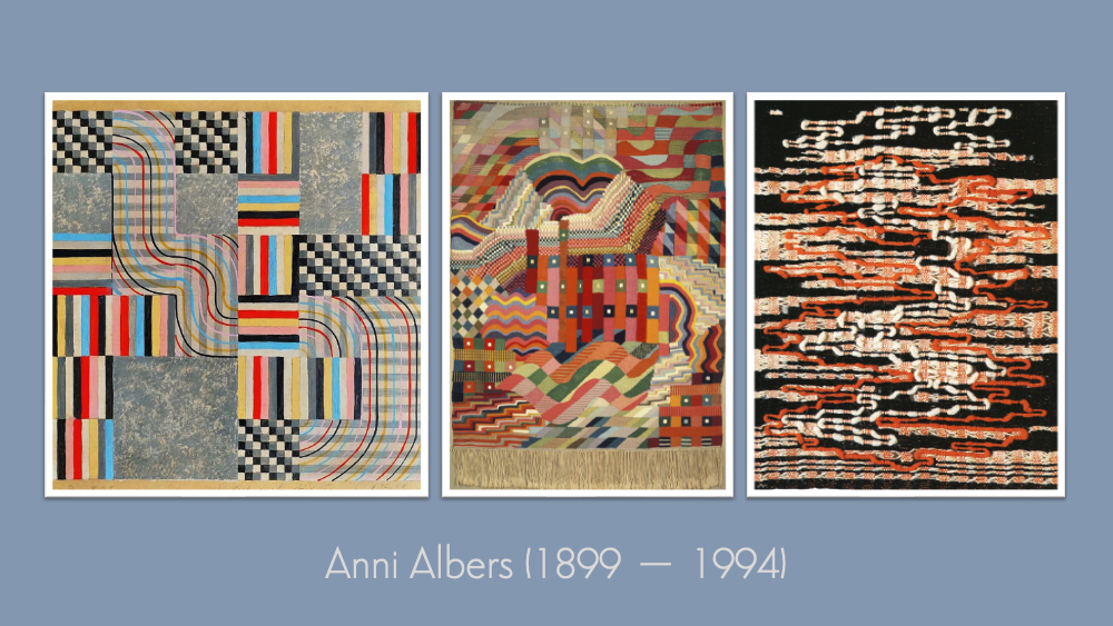
The Kick-About #158 ‘Anni Albers’
philgomm
May 6, 2026
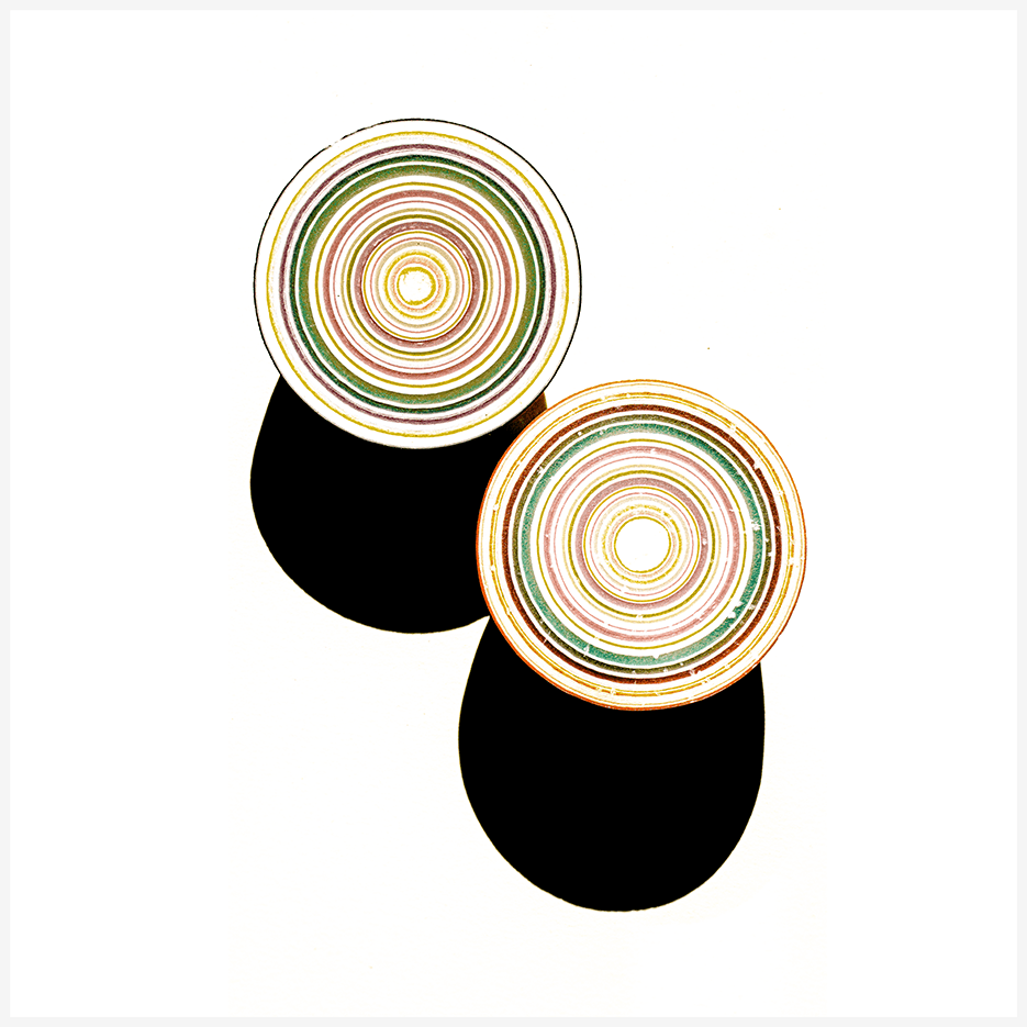
Gobstopper (2026)
philgomm
May 5, 2026
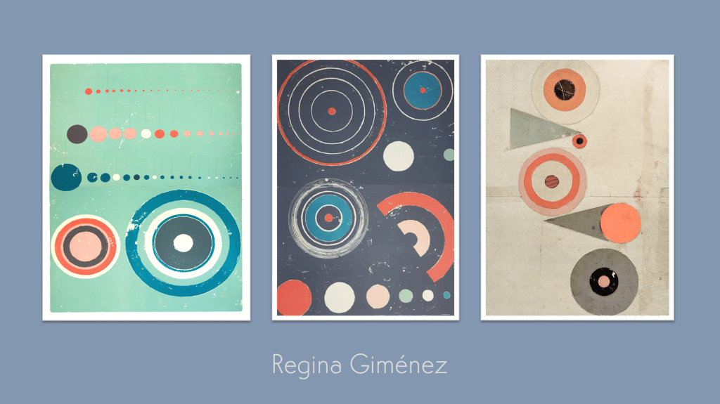
The Kick-About #157 ‘Regina Giménez’
philgomm
April 21, 2026
The Kick-About #156 | 313.071
philgomm
April 8, 2026
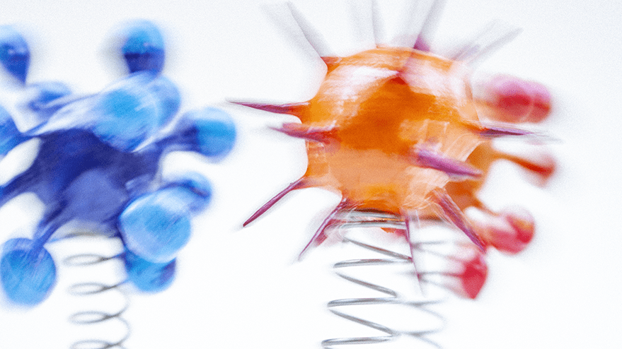
Vis Viva (2026)
philgomm
1
2
3
…
44
Next Page
Subscribe
Subscribed
Red's Kingdom
Join 286 other subscribers
Sign me up
Already have a WordPress.com account?
Log in now.
Red's Kingdom
Subscribe
Subscribed
Sign up
Log in
Report this content
View site in Reader
Manage subscriptions
Collapse this bar