Skip to content
Red's Kingdom
Home
philgomm.com
Behance
Chimera Trilogy
Chimera Book 1 / The Audiobook
Even The Most Shunned Of Things
Patience Kite
Search
landscape photography
July 14, 2026
The Kick-About #162 | Donati’s Comet
philgomm
September 23, 2025
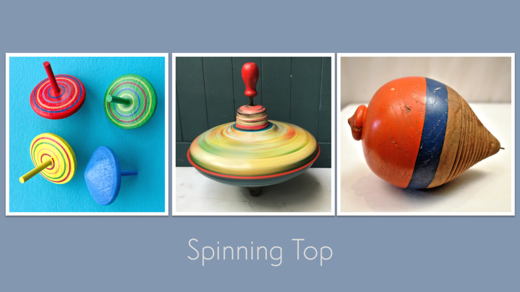
The Kick-About #141 ‘Spinning Top’
philgomm
January 15, 2025
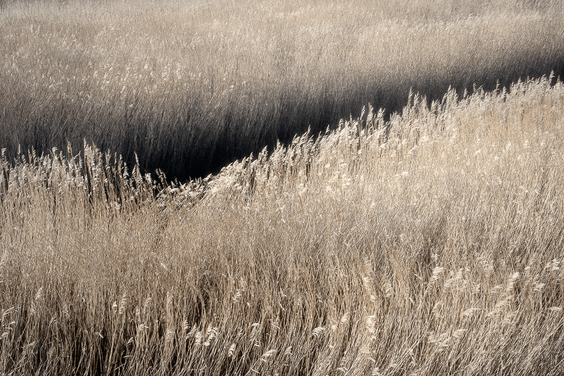
Thornham Reeds, December (2024)
philgomm
January 14, 2025
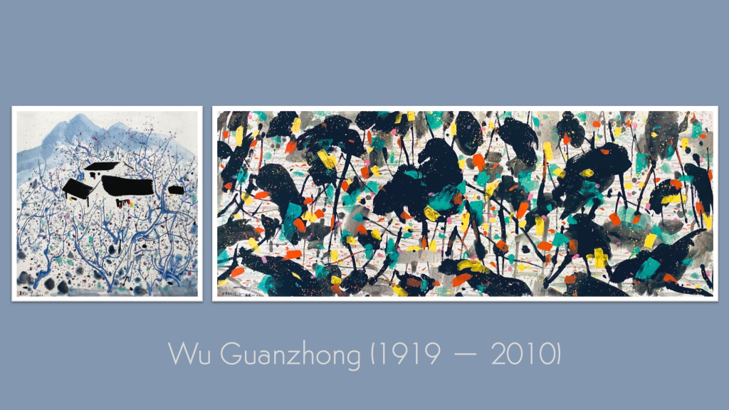
The Kick-About #123 ‘Wu Guanzhong’
philgomm
December 18, 2024
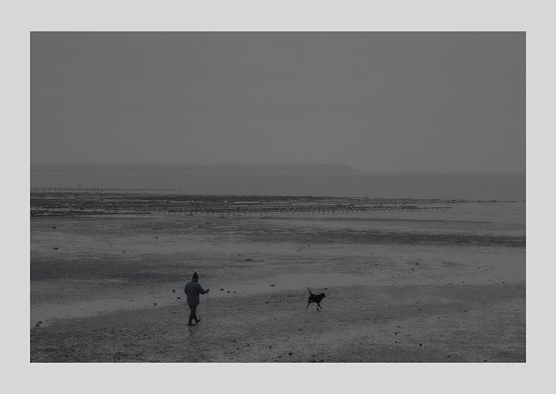
December Dog (2024)
philgomm
December 17, 2024
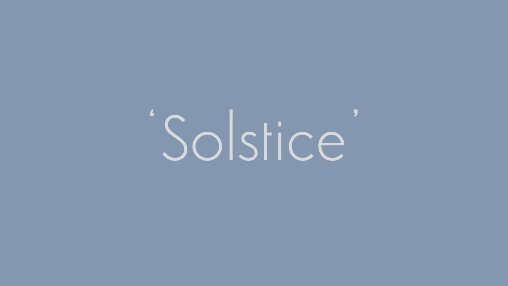
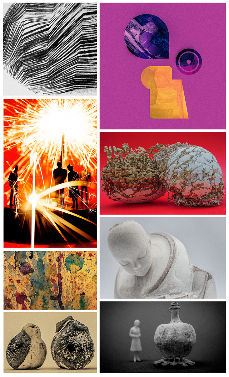
The Kick-About #121 ‘Solstice’
philgomm
September 24, 2024
The Kick-About #115 ‘Negative Space’
philgomm
May 10, 2024
Short Film: Pool Side (2024)
philgomm
May 8, 2024
Pool Side #1 (2024)
philgomm
April 24, 2024
The Kick-About / A Fourth Year Later
philgomm
1
2
3
…
14
Next Page
Subscribe
Subscribed
Red's Kingdom
Join 286 other subscribers
Sign me up
Already have a WordPress.com account?
Log in now.
Red's Kingdom
Subscribe
Subscribed
Sign up
Log in
Report this content
View site in Reader
Manage subscriptions
Collapse this bar