Skip to content
Red's Kingdom
Home
philgomm.com
Behance
Chimera Trilogy
Chimera Book 1 / The Audiobook
Even The Most Shunned Of Things
Patience Kite
Search
July 2021
July 30, 2021
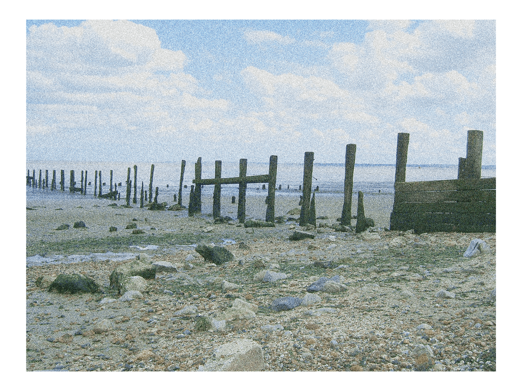
Throwback Friday #66 Shellness #1 (2009)
philgomm
July 29, 2021
Church Plantation #1 (2021)
philgomm
July 28, 2021
After Rutenberg #4 (2021)
philgomm
July 26, 2021
After Rutenberg #3 (2021)
philgomm
July 24, 2021
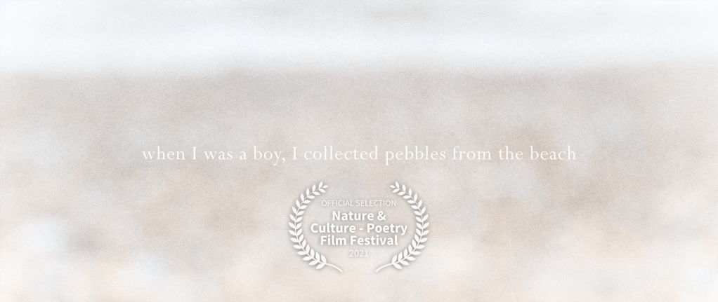
When I Was A Boy, I Collected Pebbles From The Beach @ Nature & Culture – Poetry Film Festival 2021
philgomm
July 23, 2021
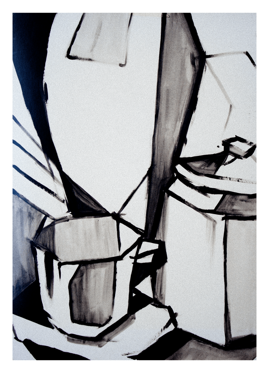
Throwback Friday #65 Still Life (1993)
philgomm
July 22, 2021
After Rutenberg #2 (2021)
philgomm
July 21, 2021
After Rutenberg #1 (2021)
philgomm
July 20, 2021
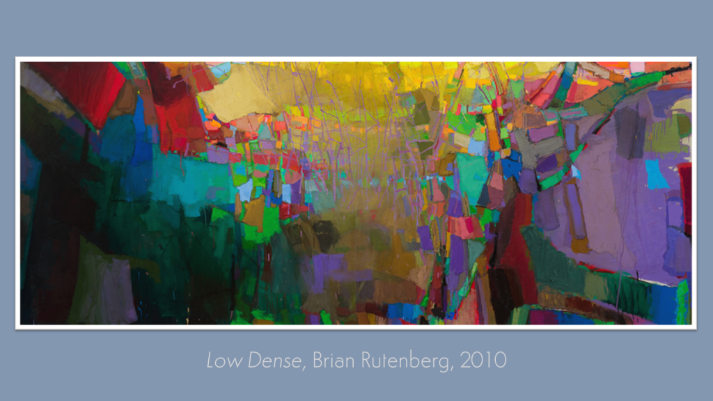
The Kick-About #32 ‘Low Dense’
philgomm
July 16, 2021
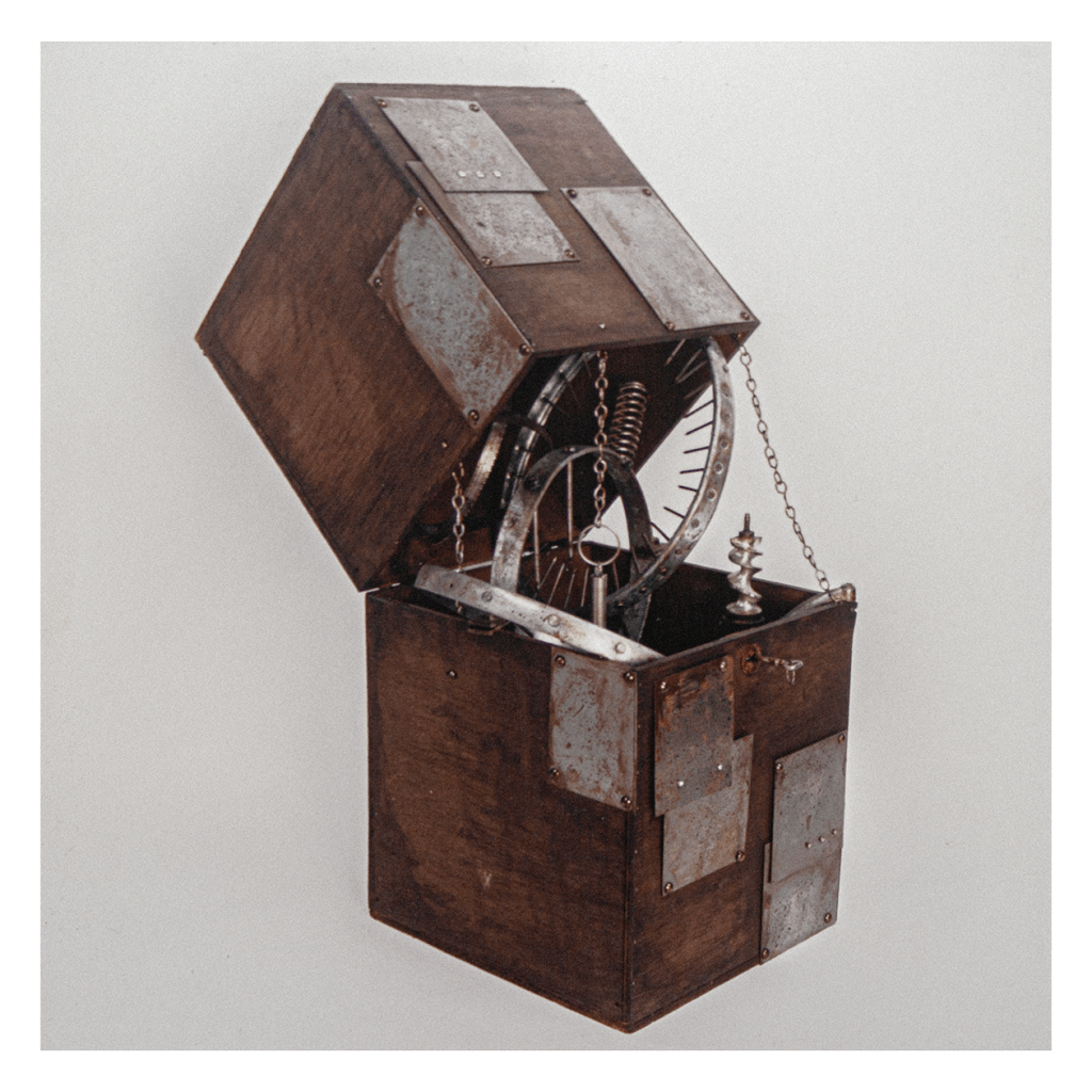
Throwback Friday #64 Inquisition Box (1993)
philgomm
1
2
Next Page
Subscribe
Subscribed
Red's Kingdom
Join 287 other subscribers
Sign me up
Already have a WordPress.com account?
Log in now.
Red's Kingdom
Subscribe
Subscribed
Sign up
Log in
Report this content
View site in Reader
Manage subscriptions
Collapse this bar