
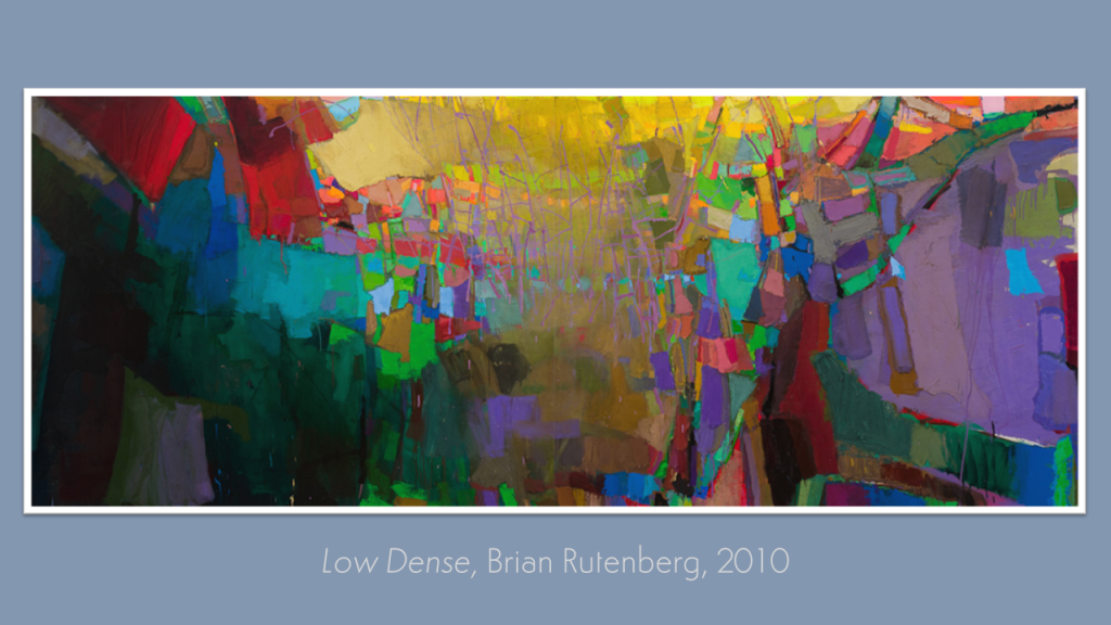
From the previous Kick-About’s deep and velvety shadows, courtesy of animator of silhouettes, Lotte Reiniger, to this Cinemascopic vista of glowing, saturated colours by the painter, Brian Rutenberg, and all the new work Low Dense has inspired in the same short space of fourteen days. Enjoy the view.
Graeme Daly
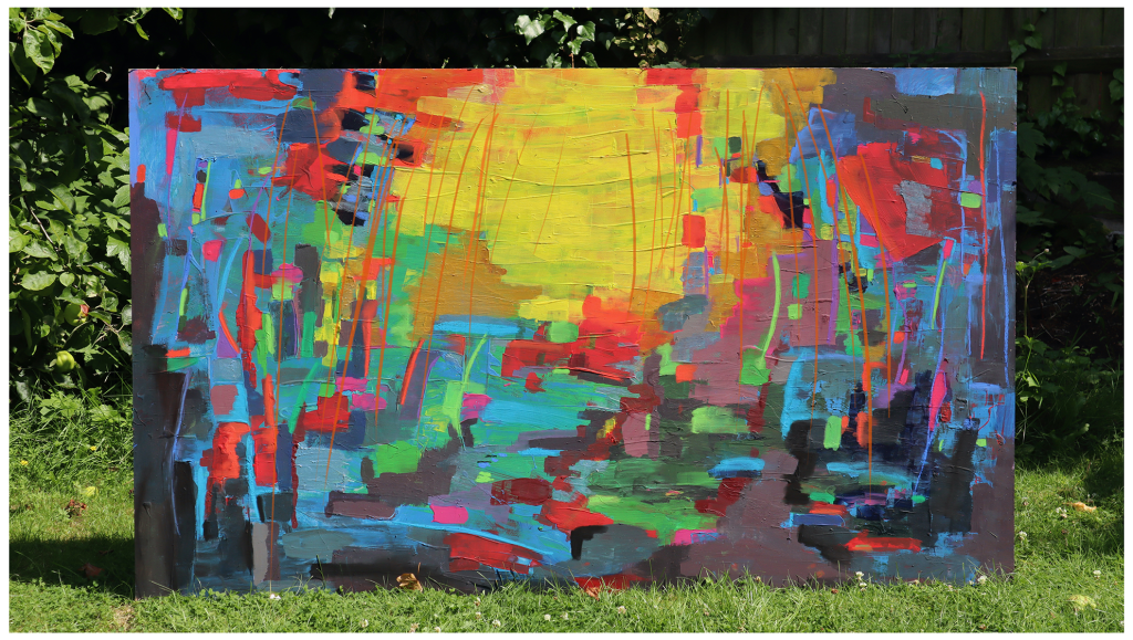
“When I was an ambassador for University one hot summer, similar to the melting heat in the UK at the moment, I was tasked with taking down the graduate shows of the students that proudly presented their creative work to their family, friends and fellow students. I spent a few weeks dismantling the makeshift wooden stages, pulling out nails and painting over the brightly coloured stripes and symbols that students designed to present their work in theme with their creations.
One task I had to do was take large canvases students had painted on, and throw them into the skip near the smokers’ shed (where I spent many lunch breaks laughing and smoking my lungs out with my friends and classmates). It always saddened me to know some students would rather dump their work, no matter how large the canvas, so instead of giving them the heave-ho into the trash, I told my thrifty friends about the canvases, who happily decided to take them back to their uni homes and upcycle them to their hearts’ content, painting and drawing on them however they pleased.
I kept the largest canvas for myself. Dripping in sweat, carrying this beast down the iconic Rochester hill, I ended up sandwiching it into my tiny uni bedroom, but I never did anything with the canvas for years, which has since followed me along with two house moves. I have had ideas; I cut out all the silhouettes I kept from life drawing classes, and thought about doing a collage of all of them together on the large canvas, but never did, but I always knew I would do something with it when the time was right.
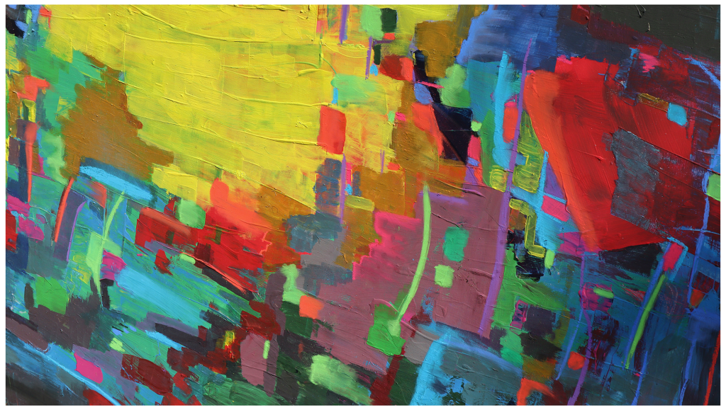
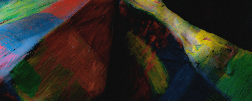
I have always loved Rutenberg’s kaleidoscope of colours, with the blocks of different variants of hues having such an immense power of depth to them. I thought it would be the perfect chance to finally let loose upon this canvas, and use the many tubes of paint I have stashed from many Christmas gifts that otherwise have been left to gather dust. I couldn’t think of any better way to spend a hot day – sitting outside in the heat with a cold beer or two, and painting away in the garden. It was a therapeutic experience to say the least. I think I may have to figure out how to make my own canvases”.
@graemedalyart / vimeo.com/graemedaly / linkedin.com/in/graeme-daly / twitter.com/Graeme_Daly / gentlegiant.blog
Vanessa Clegg
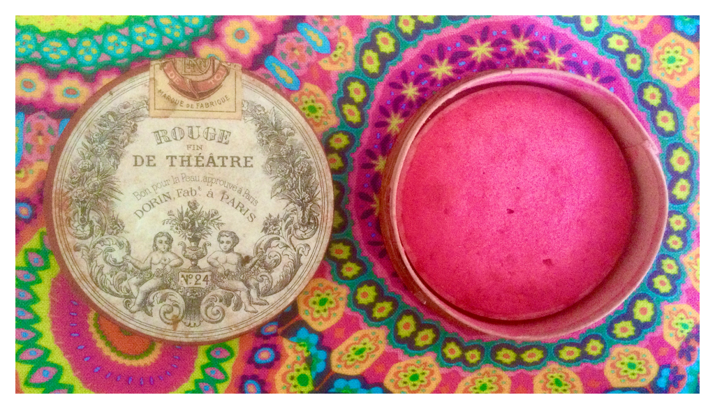
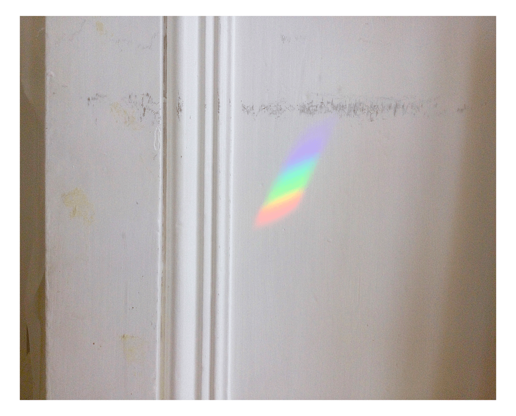
“Colour: I’ve had this beautiful little pot of rouge for years and would guess it dates back to the 1930s. It’s such a vivid pink and lifts my spirits in the same way the fabric (a recent buy, reminding me of the 70s) does… a perfect zingy combination! The “rainbow” appeared on the wall of my studio: a tiny oblong of jewelled colour in an otherwise white space.“
James Randall
“Kick-About colour: I have been toying with a method for applying colour to my electronic scribbles with mezzotint filters in Photoshop. I applied it to a section of a refrigerator totem image I am continuing to work on and it seems to have worked, but you have to zoom in to see the colour which works in a kind of pointillist way without the effort. In other news, I have been short-listed for the Kilgour prize at Newcastle (in New South Wales) Art Gallery with my Isadora Duncan Kick-About painting (red jumpsuit / yellow car). It is a competition that actual artists enter so I feel quite chuffed. It’s now framed and will be couriered down to New South Wales on Friday for judging and exhibiting with the other finalists.*“
*Congratulations, James!
Jan Blake
“Edible colours oooooooo! I was fascinated by Rutenberg’s YouTube videos. The joy he brings to the work. So visceral as well.
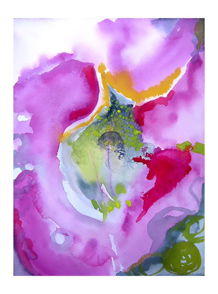
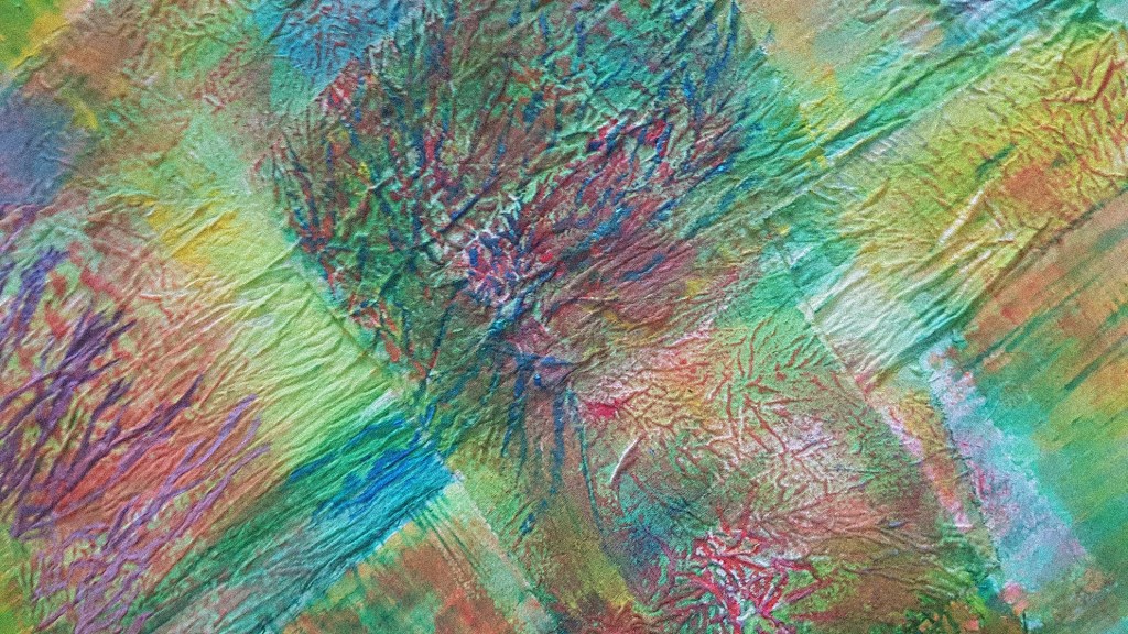
This weekend, I happened to go to an exhibition at Bristol’s Botanic garden. It was showing work from a residency by Artist in residence, Alex Hirtzel, in association with biologist, Dr. David Lawson. It was called Displays Decoded – The Multi-sensory language of flowers. In part of that exhibition, the artist had explored how, scientifically, the bee or other insects see colour. For us it appears that they see the ultra violet, and radiation of heat attracts them, as bees particularly cannot feast on the flower until it emits over 30 degrees. So there are lots of them around at the moment. Making hay while the sun shines! Thinking of Brian Rutenberg, I found myself watching a bee entering the Antirrhinums on my balcony and wondered what they would be seeing or feeling within that flower that they seemed to have to force their way in. I have tried to capture some of that possibility without UV! It looks a little Georgia O’Keefe to me now. Getting into sensations and how to describe them needs a lot more exploration.“
Charly Skilling
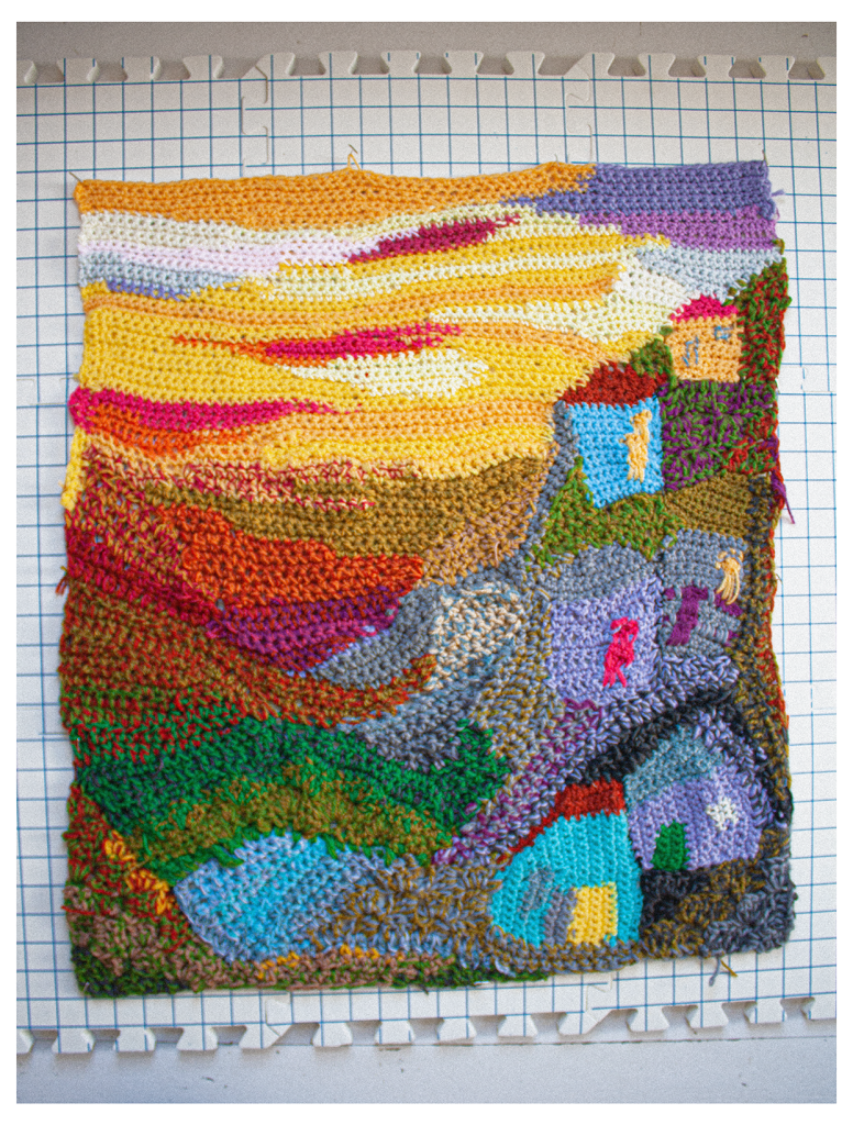
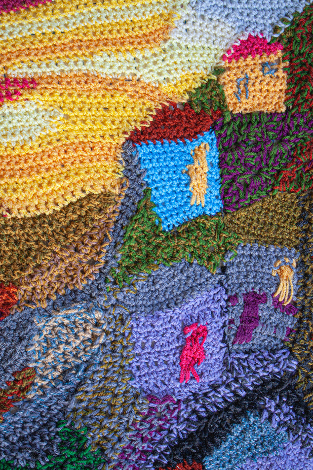
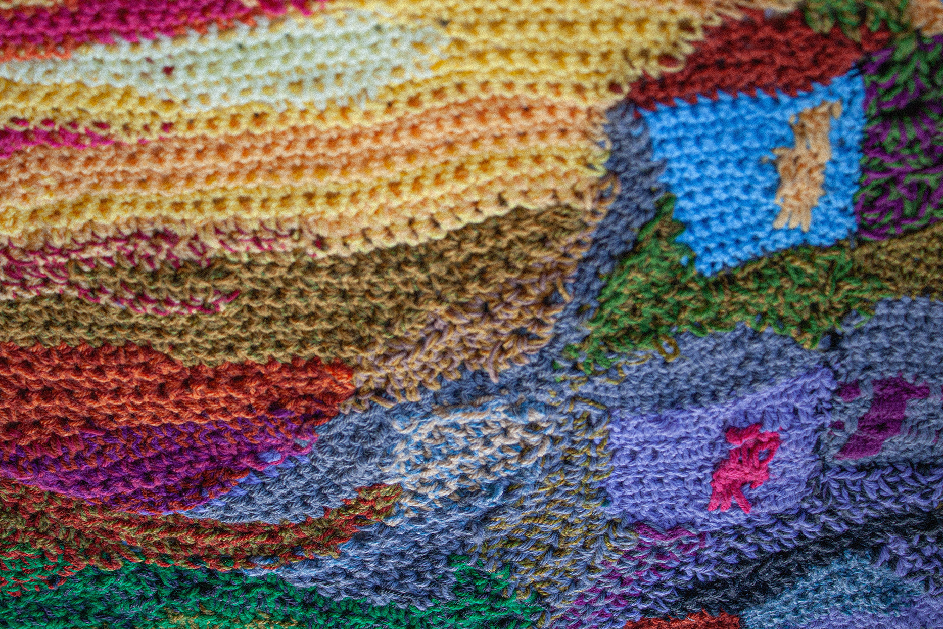
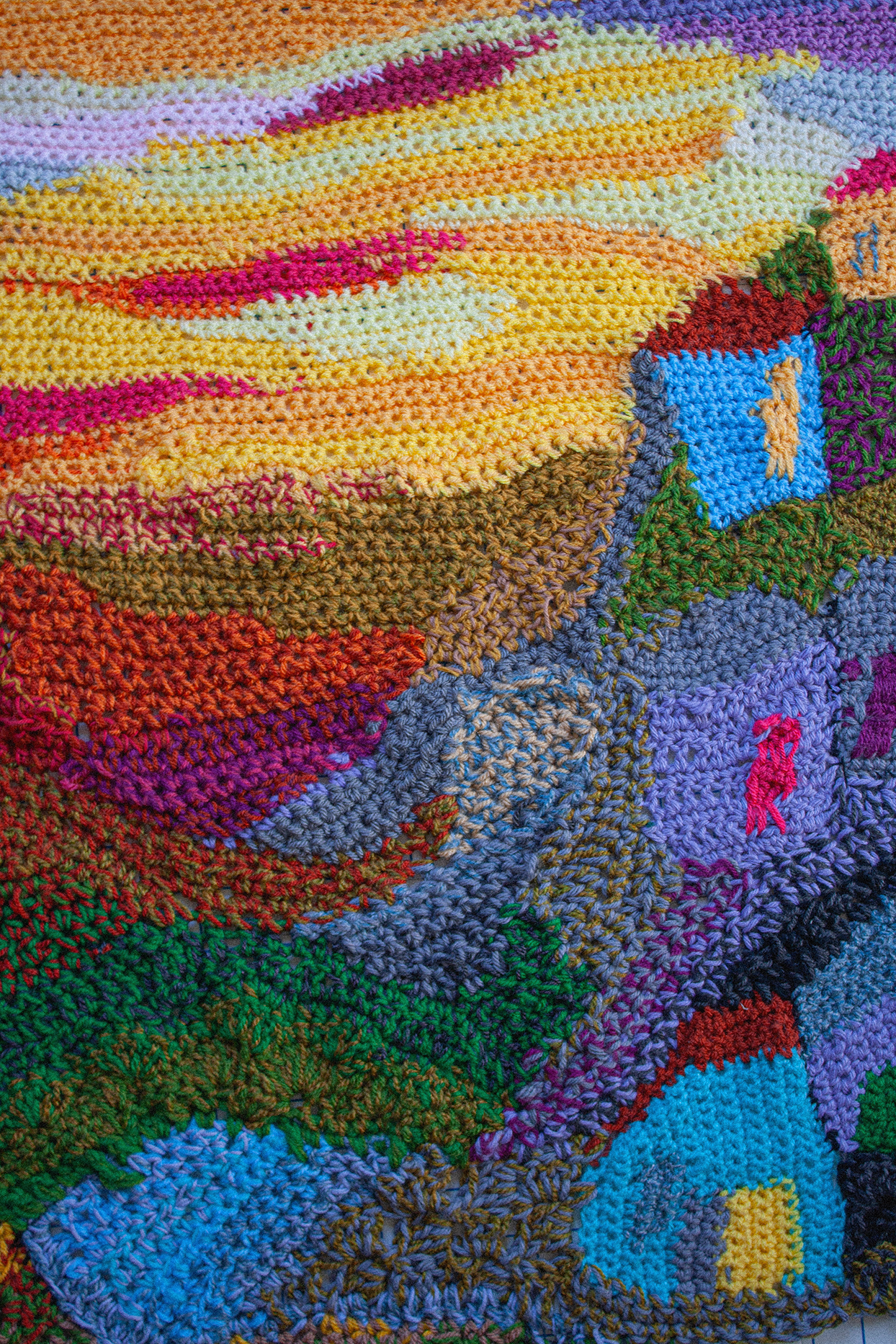
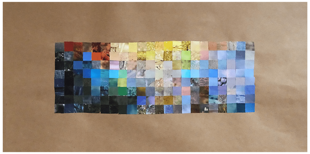
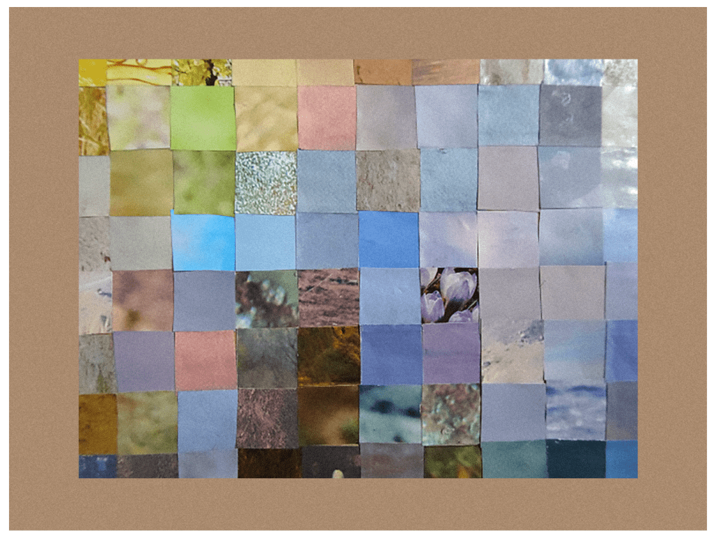
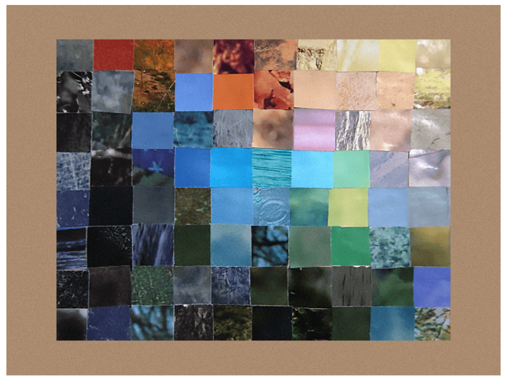
“This painting makes me think of shanty towns, rift valleys, and the coming of night. I was interested in the way Rutenberg combines angular blocks of colour with broad sweeps of undefined colours that merge and separate. I played about with some paints and pens, but my thoughts kept turning to how I might create a similar effect with yarn. I decided to have a go. It is still a work in progress, butt here is what I have done so far. In my head, it is called ‘The Last Ray’”.
Kevin Clarkson
“I had not heard of Brian Rutenberg and the first impression was ‘Wow! Very powerful!’ So I spent quite a bit of time ‘deconstructing’ his technique. The apparent abstract nature is, of course, in reality highly stylised landscapes. If you put aside the idiosyncratic drawing style they are quite simple compositions. The cleverness for me is the use of colour; he has substituted primary or secondary colours for tone on most of the pieces, enhancing the abstract qualities. The texture and randomness is the product of palette knife work – that said, given the size of the canvases, it was more likely a large trowel!
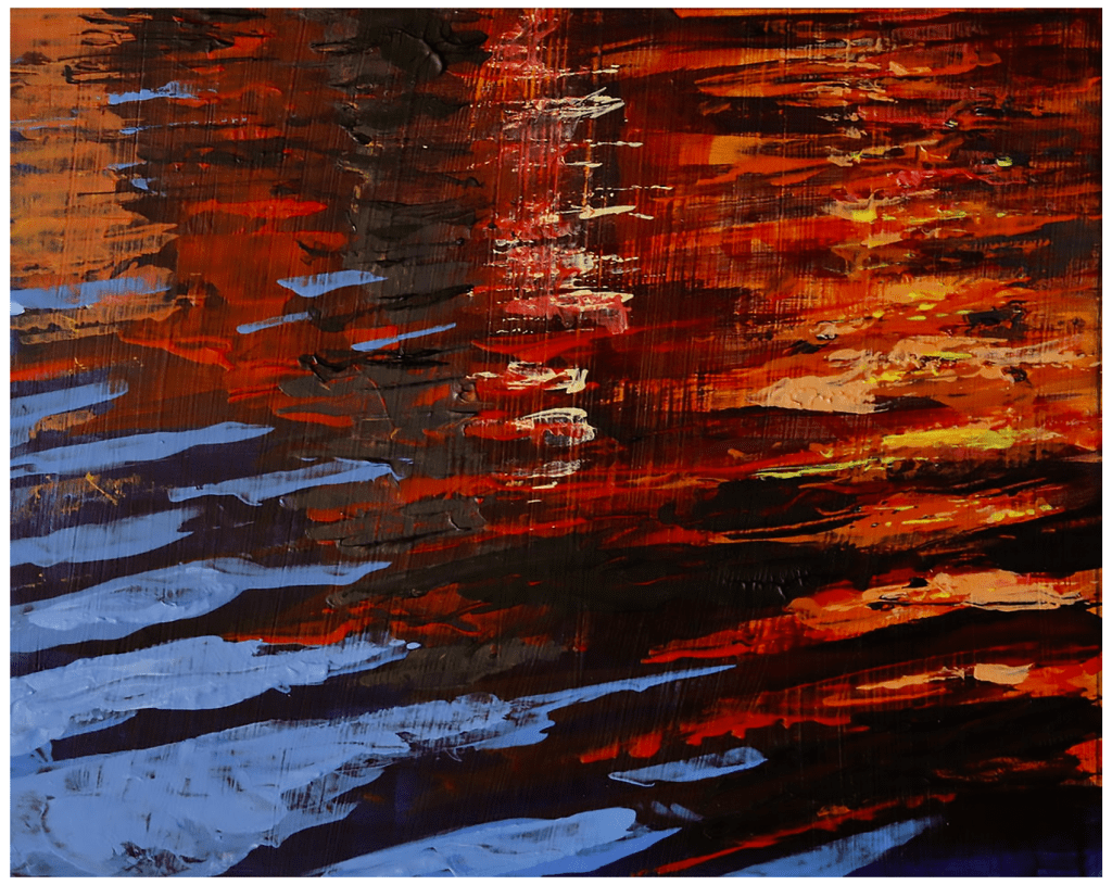
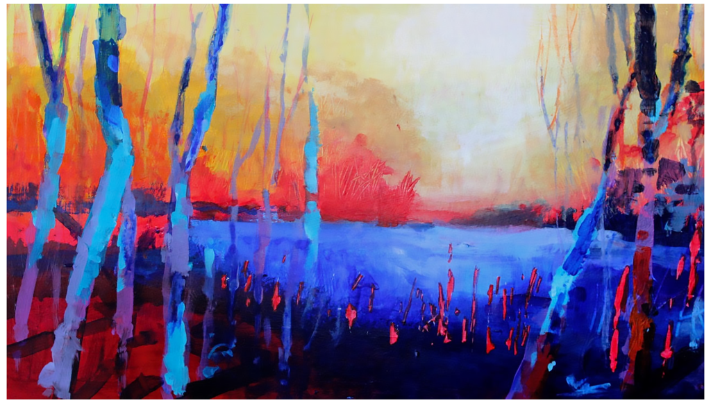
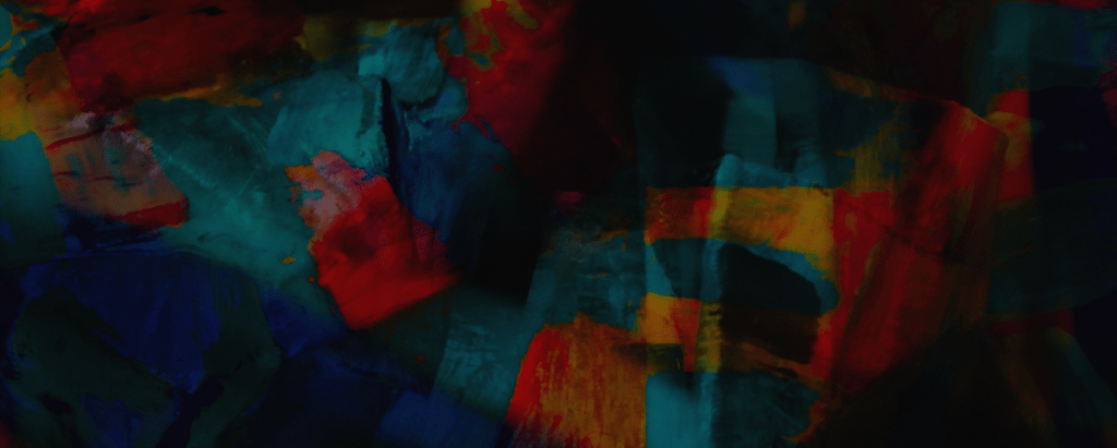
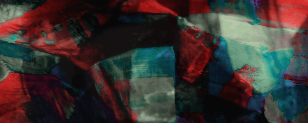
I must admit, as a figurative painter, once I’d analysed the HOW, for me, much of the work lost some of its WOW. It’s the kind of work I have come across in large corporate boardrooms (not that I have been in that many), designed to impress or intimidate. For my pieces I took the technique I had unpicked and tried a few landscapes of my own, with very mixed results. It is one thing to understand a process but quite another to create in that genre. A lot of my work is marine in subject, so for the first piece I took an image of reflections on water and upped the colour values and worked largely with a palette knife. I think you can still just about make out it is meant to be liquid. For the other piece, I chose a lake surrounded by trees and threw away the tonal values, replacing them with primary colour. I failed to match the stylisation of Rutenberg, but I think they are just about going in the right direction.”
kevinclarkson.co.uk / artfinder.com/kevin-clarkson / kevinclarksonart.blogspot.com
Kerfe Roig
“The colors immediately made me think of Monet, which made me think of the grids I did based on Monet’s work. This is a very intense way to look at art, and I learned a lot from it as I not only did some of Monet’s paintings, but an entire book of other artists for The Sketchbook Project. The subtleties of color are amazing when you look closely at them. Rutenberg clearly has an eye for color. You can see my work with Monet here and here, and my Sketchbook Project book, Art I Like, here.”
everywhere
falls apart
mind to eyes
expanding
falls apart
becomes its opposite
expanding
into stories
becomes its opposite
days into nights
into stories
the sun intersecting the moon
days into nights
future and past
the sun intersecting the moon
enlarging the horizon
future and past
the surprise of delight
enlarging the horizon
to leave is to arrive
the surprise of delight
mind to eyes
to leave is to arrive
everywhere
kblog.blog / methodtwomadness.wordpress.com
Marion Raper
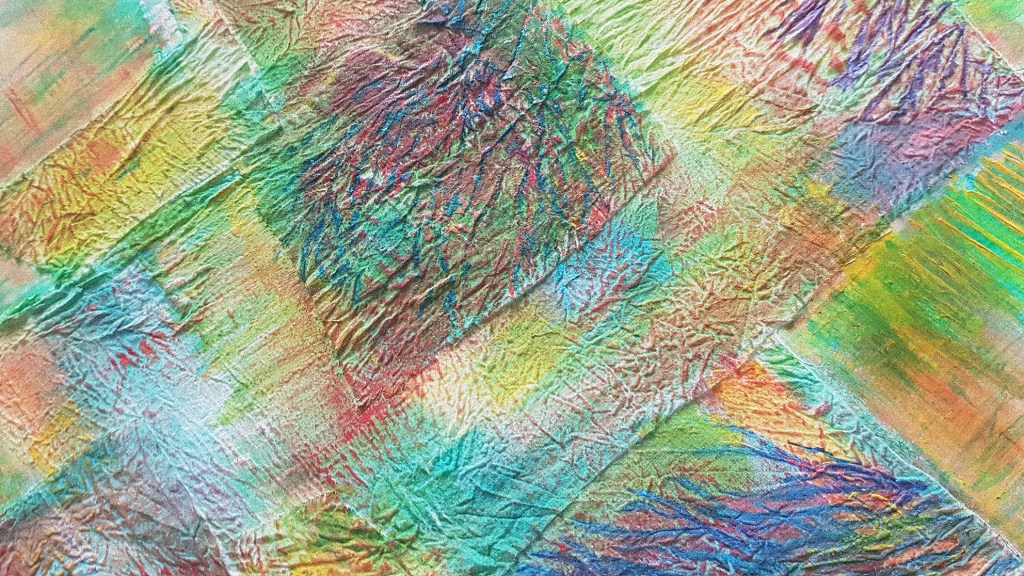
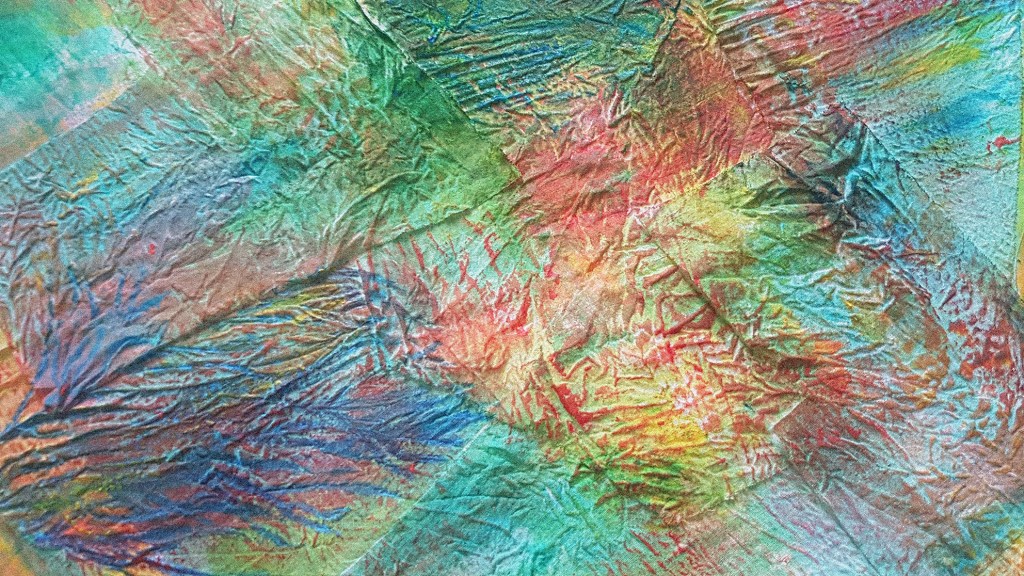
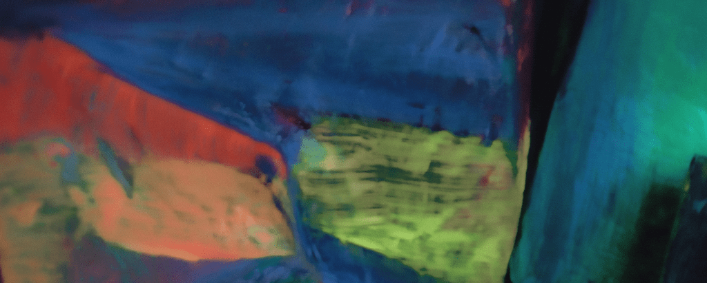
“I really love Brian Rutenberg’s painting, with its wonderful explosive colours. My own attempt at an abstract was inspired by my recent (surprise) gliding experience, and the view of the fabulous patchwork of fields below me. I firstly made a rough sketch of my ideas and then took some prewashed pieces of crinkled cotton and stuck them onto A2 paper. After this I proceeded to add acrylics with a very large brush and just primary colours. All the while I tried to remember how it felt to skim 2000 feet up over the air currents. I then used a fine brush to add details of contours and rivers in contrast colours. The thing that I found most difficult was knowing when to stop! I mean, it’s not that easy on an ordinary illustration, but an abstract seems to have its own momentum. Well, I finally came in to land – so to speak. However, the painting as a whole doesn’t seem quite right. My other half says it needs a focal point and I fear he’s right. Ah well, here are the best bits.”
Francesca Maxwell
“This is glorious, what a great painting and a new discovery for me, thank you, Phill Hosking, an inspiration, and also a new addition to my list of abstract artists I use for my painting classes – particularly the abstract and colour courses, but also brilliant as an example for composition and depth. So this is one of my abstract paintings that deals with space, macrocosm and microcosm, more than rooted in the landscape, as I feel Brian Rutenberg’s are.” Ink on watercolour paper, 76×56 cm.
Phil Cooper
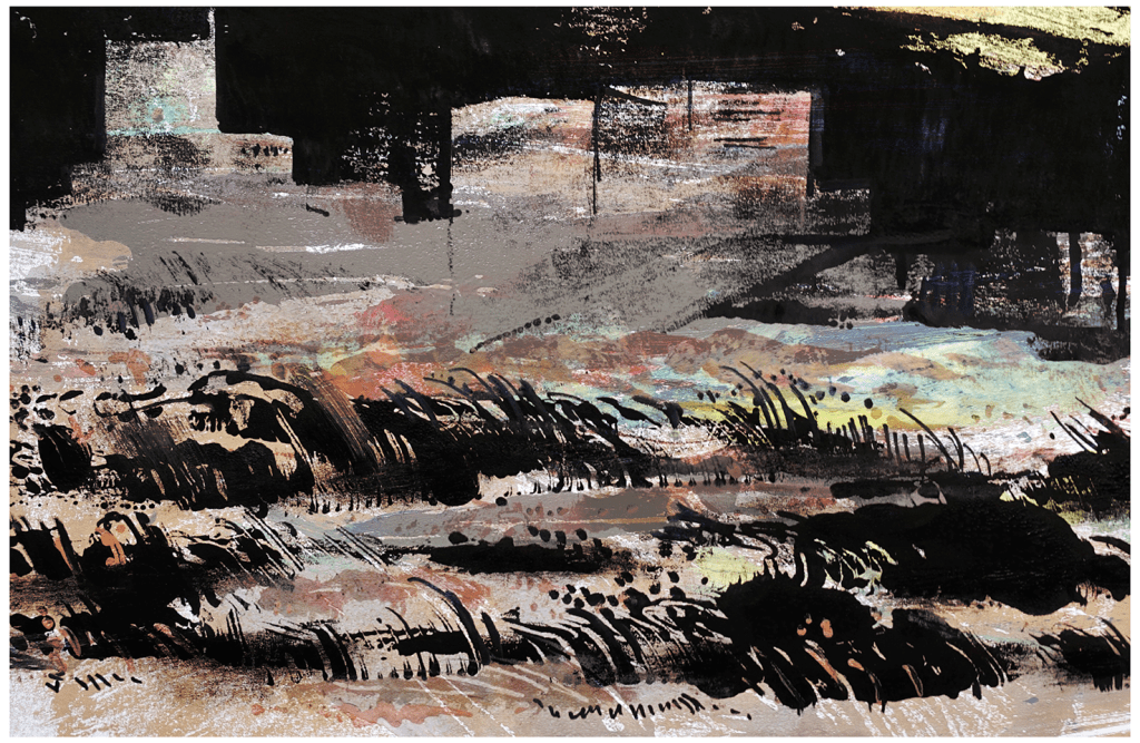
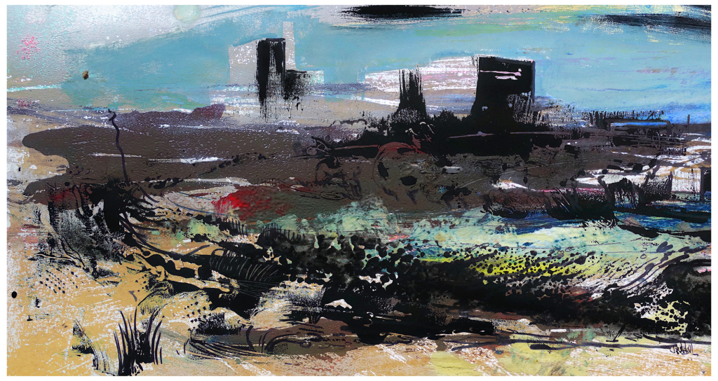
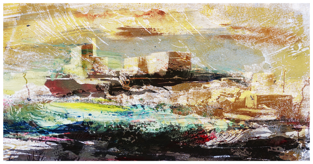
“When I looked into Brian Rutenberg’s work, I was struck by the lush sensual paintwork, the bold abstraction, and the immersive scale. I was also intrigued by his limited range of subject matter, and how he explored a few subjects repeatedly, always managing to find new emotional responses. I’ve honed in on a particular landscape that I’m fascinated by; the shingle spit of Dungeness. I’ve made a few semi-abstracted images of the scrubby vegetation that colonises the shingle with Dungeness B nuclear power station looming up behind. I never tire of this place and I could explore the strange, wild landscape over and over. These images are made using the monoprint technique, with two monoprints digitally overlaid and edited to make the final image.”
instagram.com/philcoops / hedgecrows.wordpress.com / phil-cooper.com
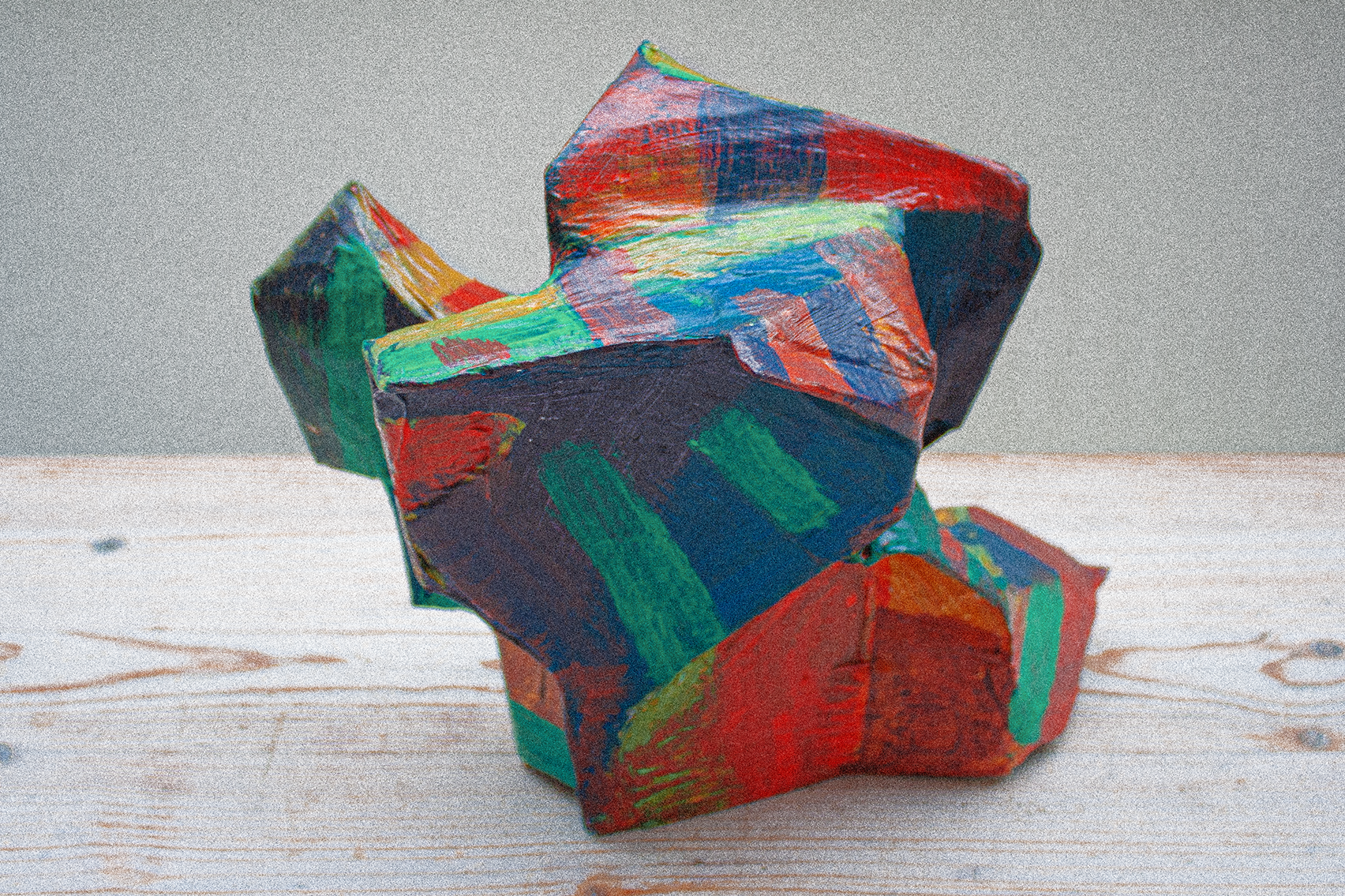
Phil Gomm
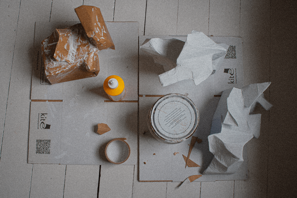
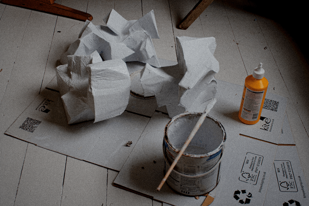
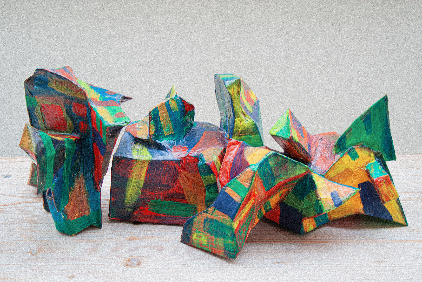
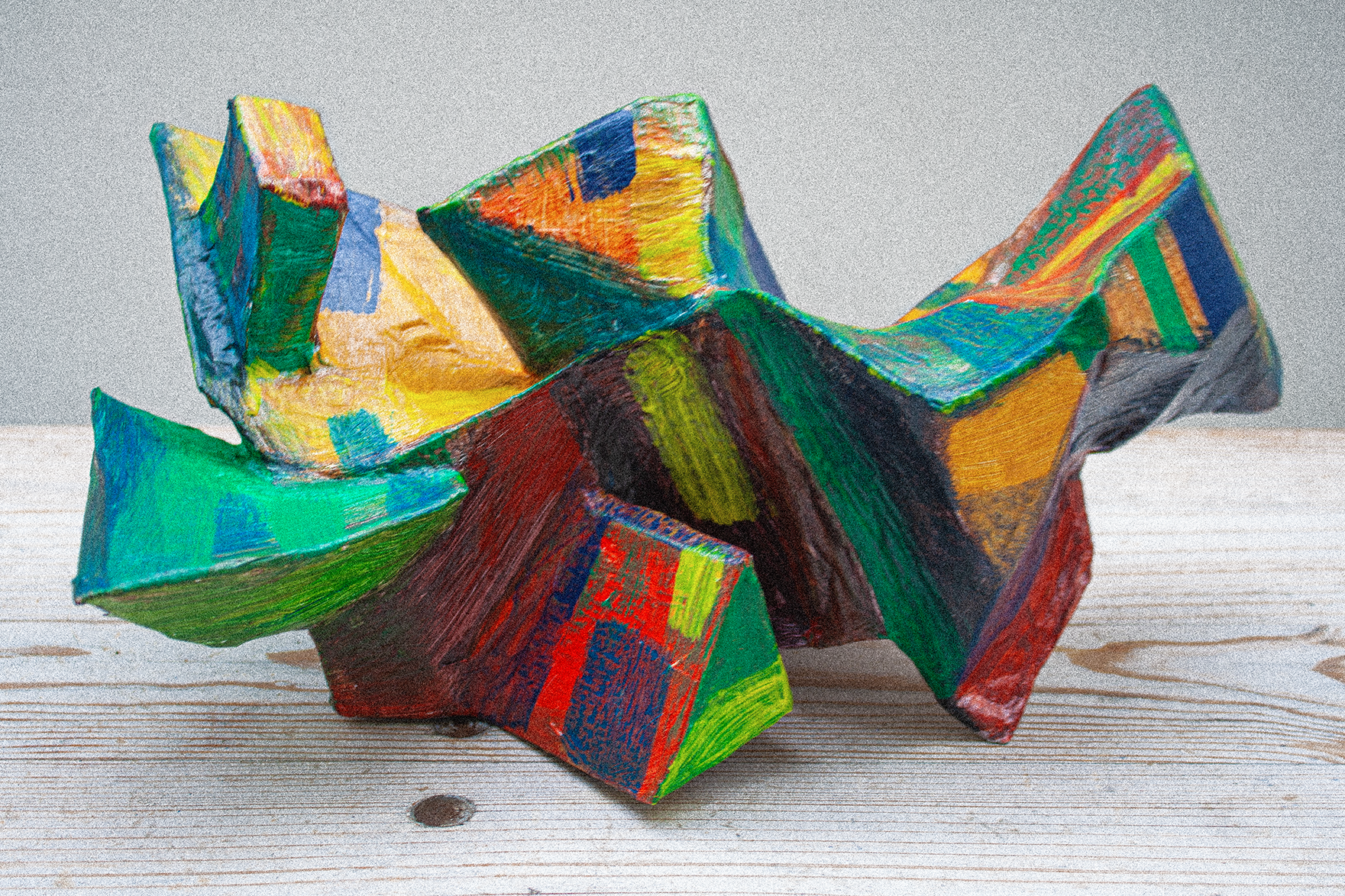
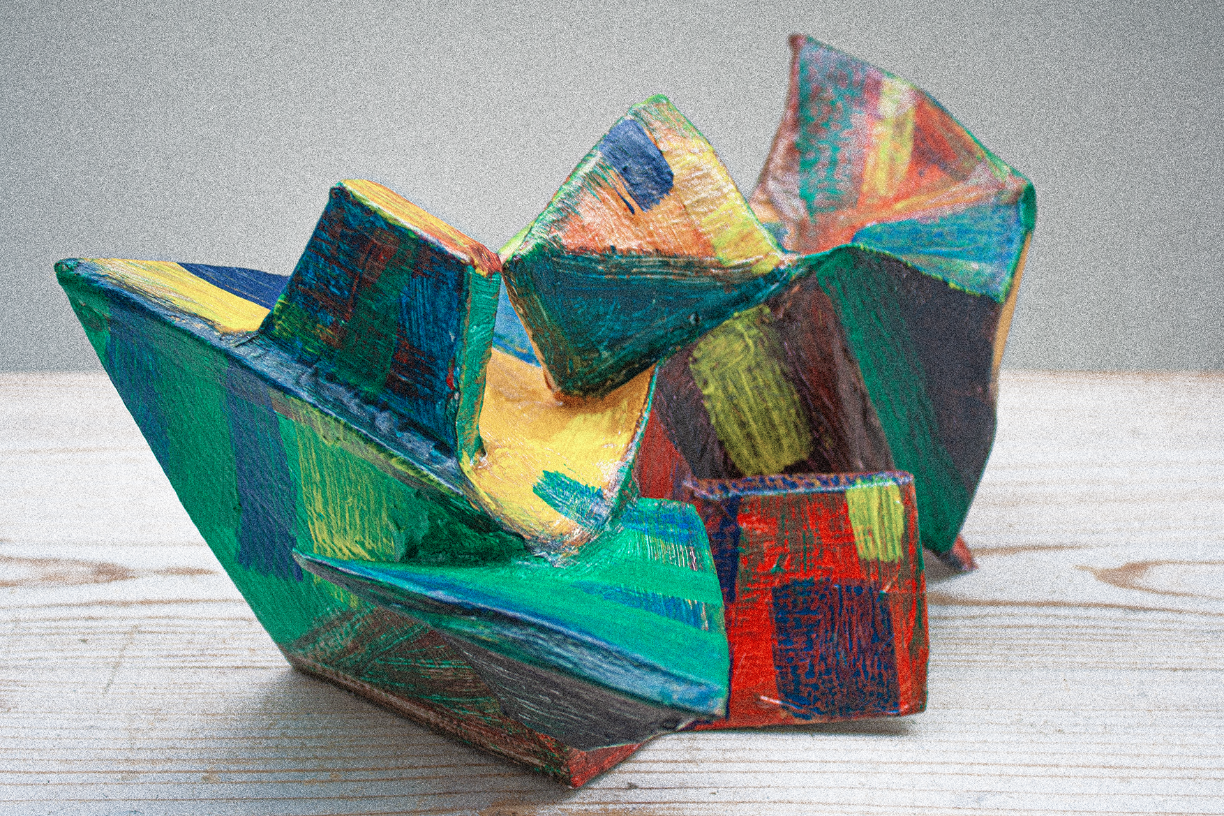
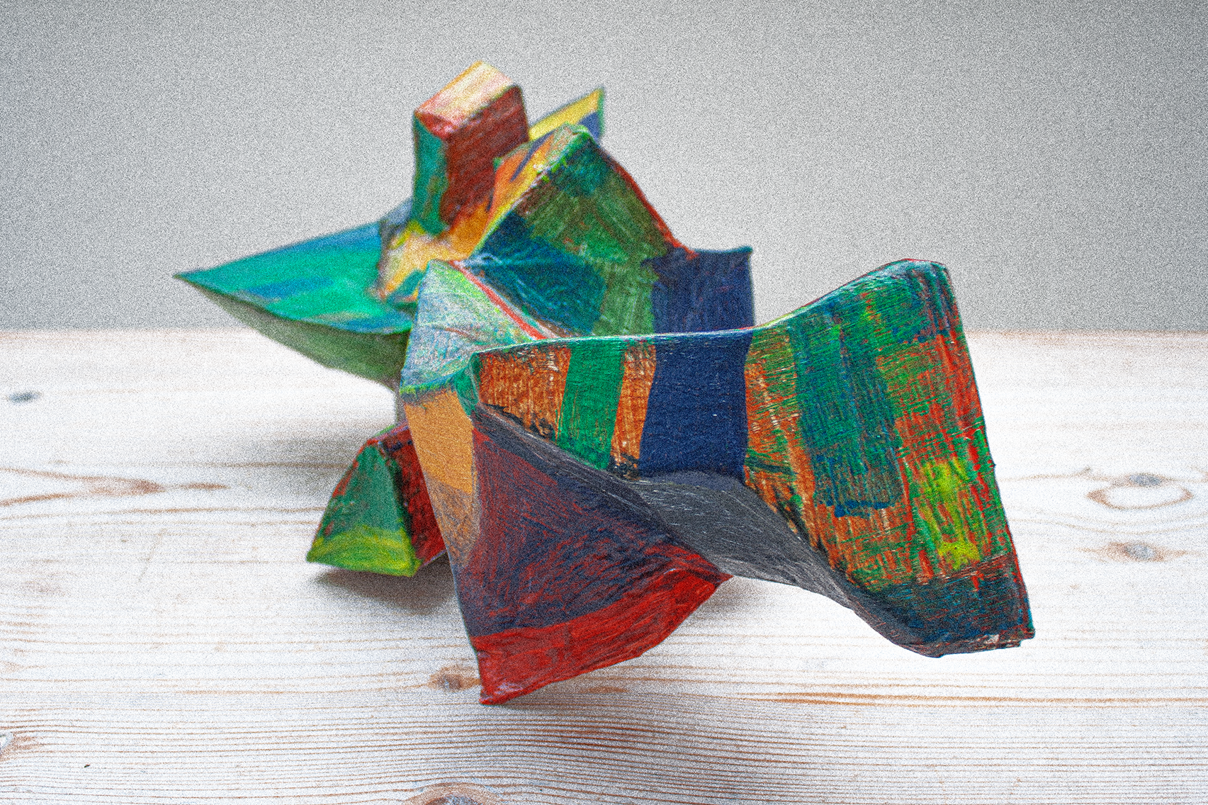
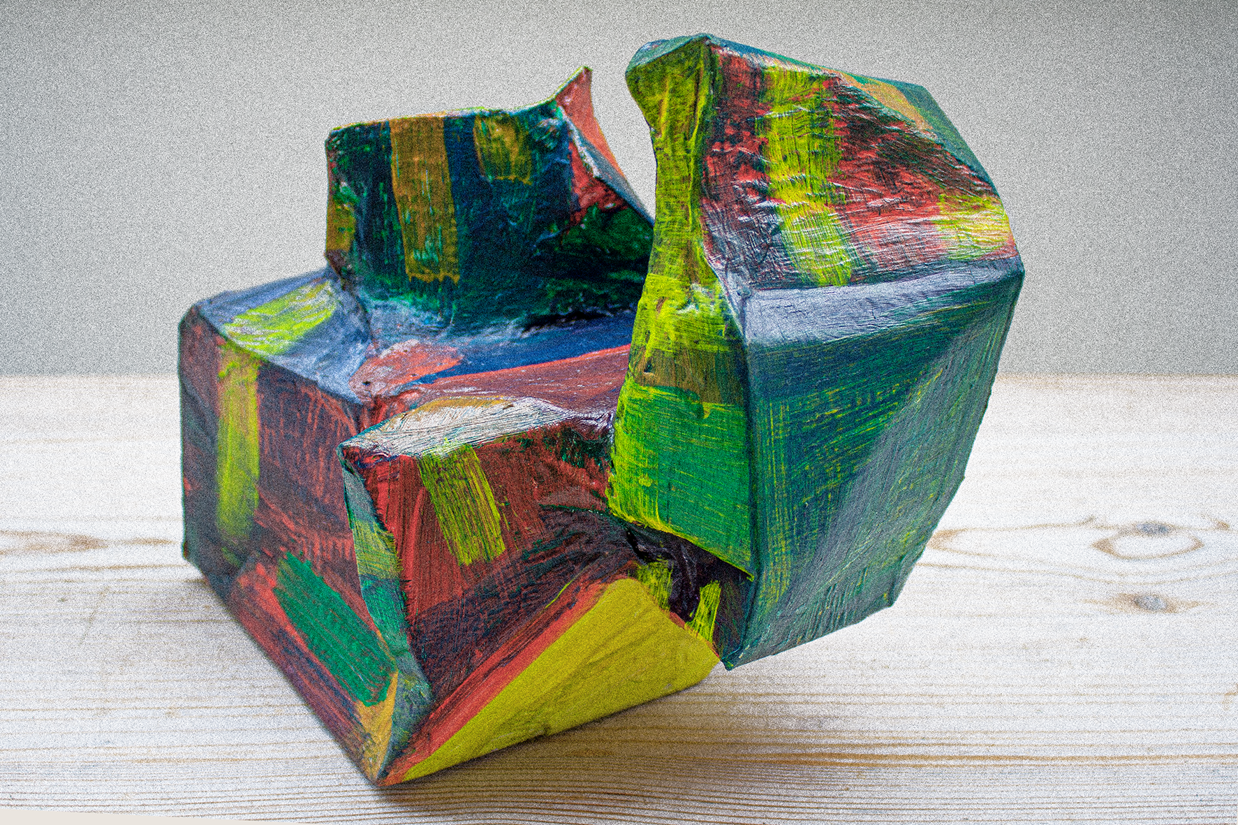
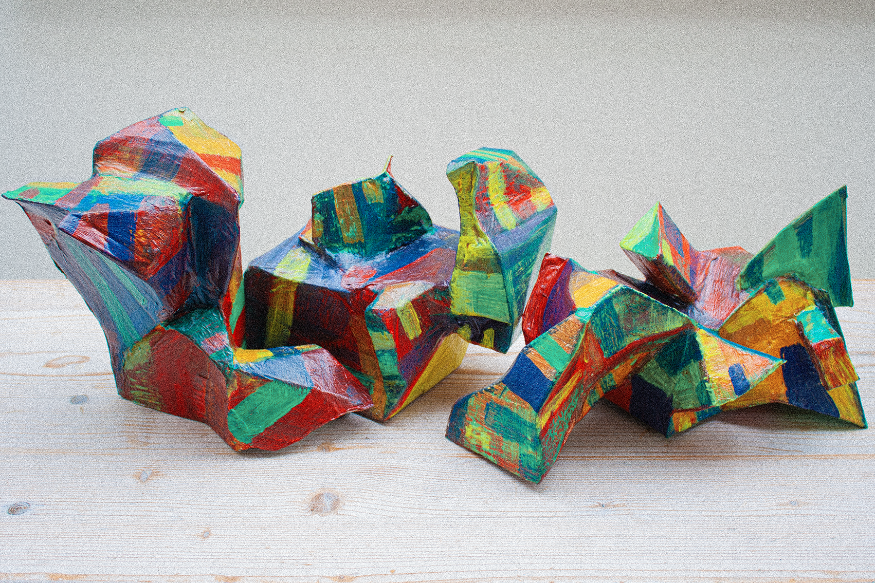
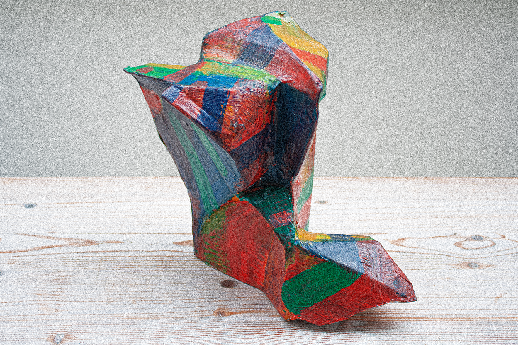
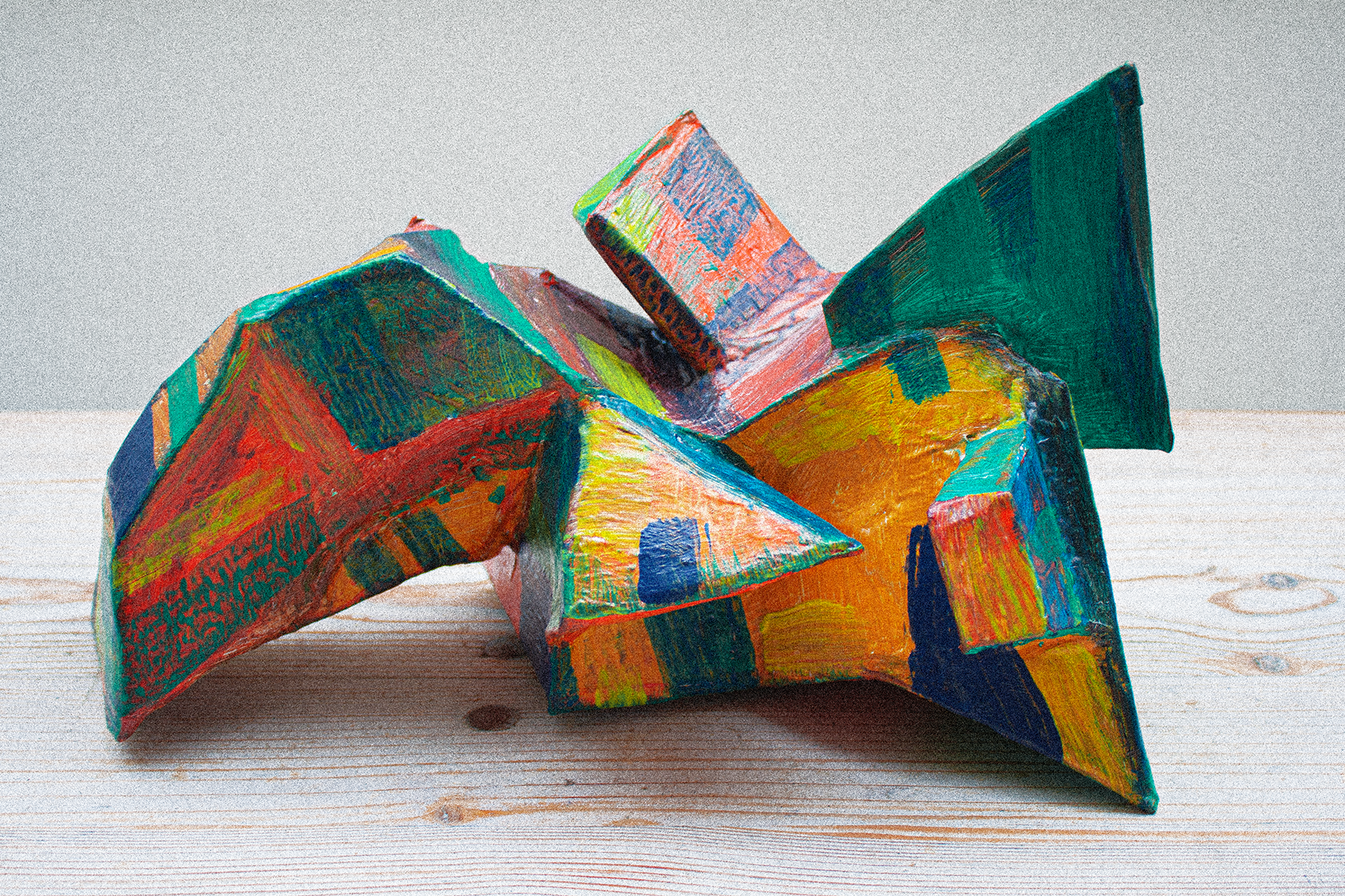
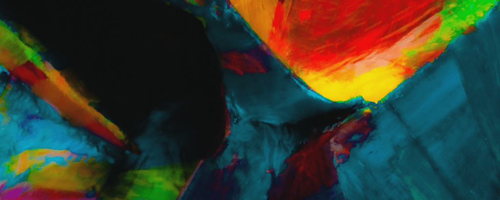
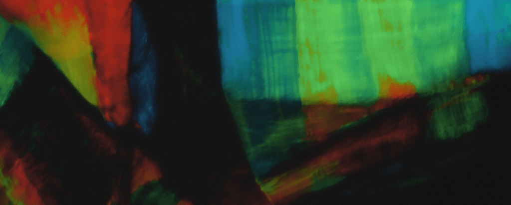
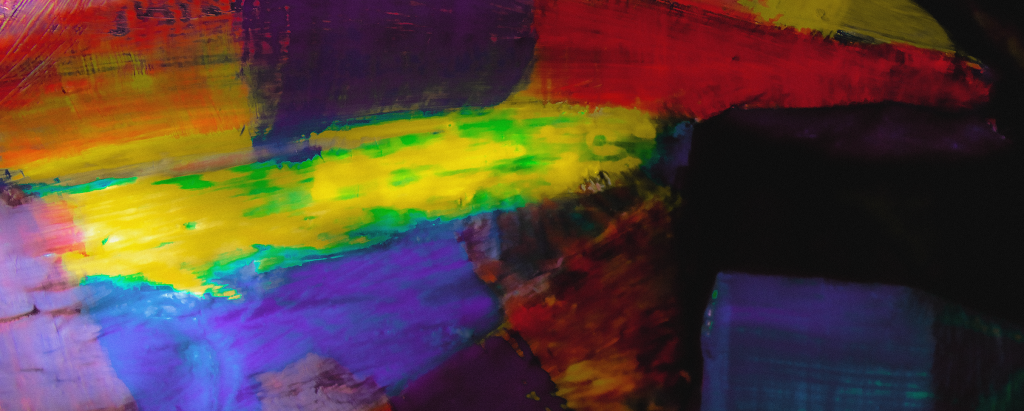
“After the first big hit of colour, the next most immediate thing I got from Rutenberg’s painting was its three-dimensionality, that strong sense of folded planes and faceting, as if we’re stood on the floor of some Technicoloured canyon, staring off into the distance, or more precariously, standing with one foot on either side of a rainbowed crevasse, and looking down between our feet at the prismatic chasm below. This was a vista I could feel with my fingers and I found the desire to build some Low Dense-inspired ‘chunks’ irresistible. Fabricated quickly by folding cardboard and taping it into shape, and reaching once again for some tried-and-tested PVA goop, I whipped up some ‘Ruten-Bergs’ and then painted them up in a manner meant to emulate some of the characteristics of the painting. That done, I then pushed my Ruten-Bergs together in different configurations and photographed them in various different ways, under various different lights, until I was achieving some suitably painterly effects.”

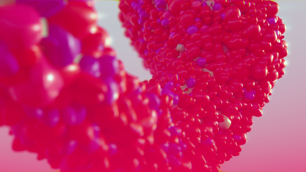
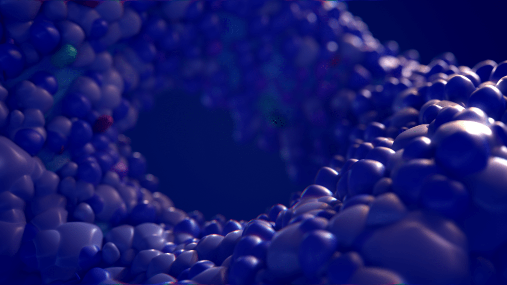
Tom Beg
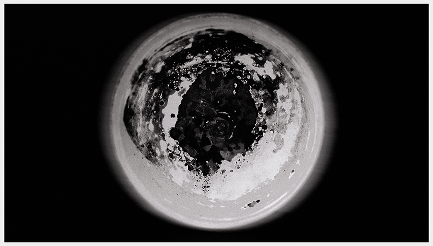
“Looking at the painting, I imagined that I was staring through the viewfinder of an inter-planetary rover on the surface of some dusty and rocky multi-coloured planet. With this planetary vision in mind, I explored the idea of creating computer generated ecosystems. Through multiple iterations and experimentation, it started to develop into models and images that seemed less about surface and into something more microscopic. Perhaps these could even be particles of paint magnified to impossible levels.”
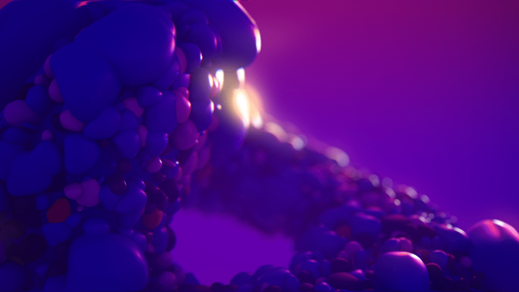
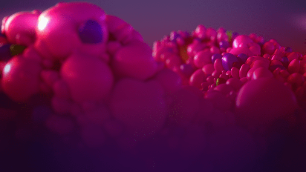
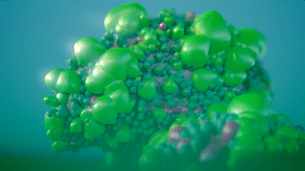
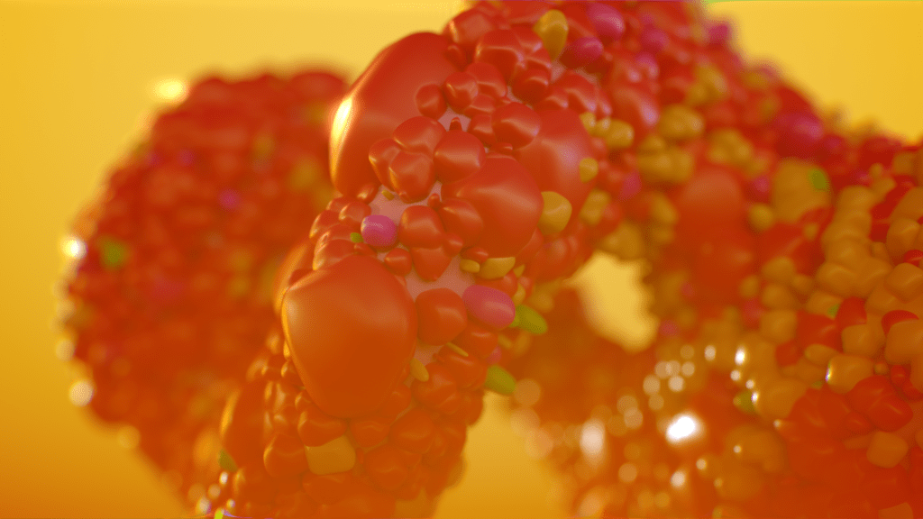
twitter.com/earthlystranger / vimeo.com/tombeg
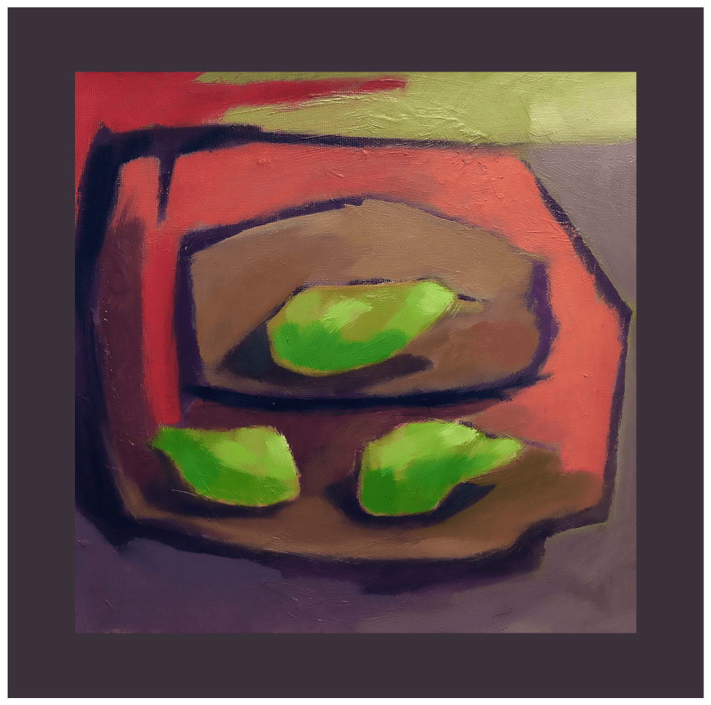
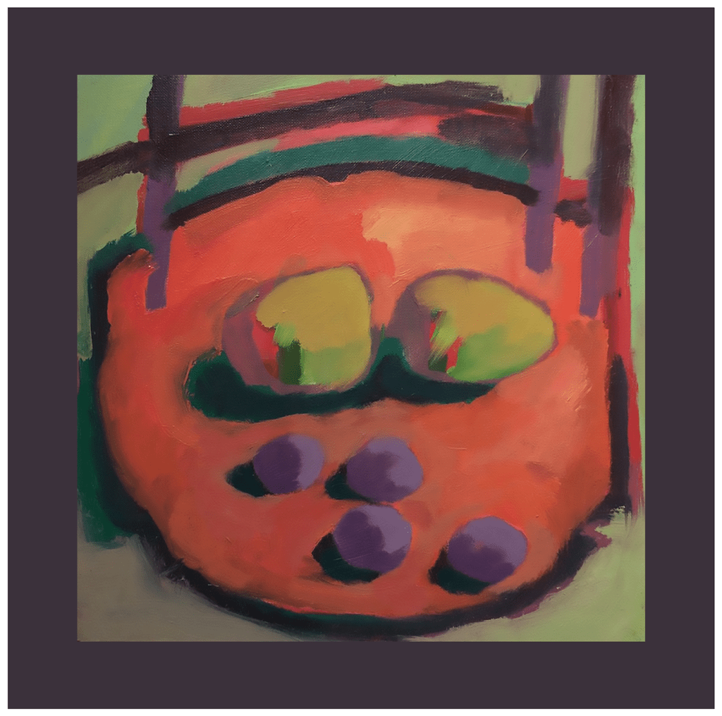
Gary Thorne
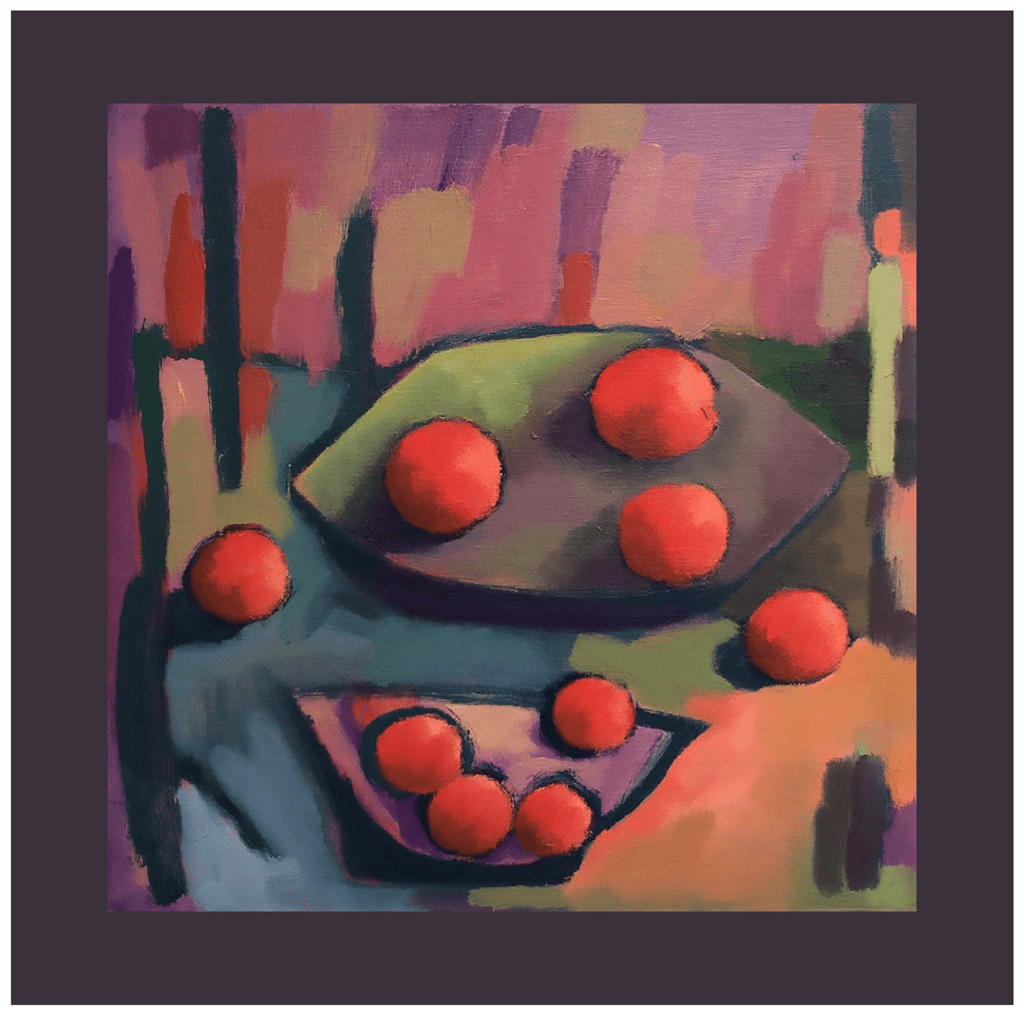
“Rutenberg has me questioning how abstraction evolves from the memory of landscape. So I set up the challenge of memory of still life inspired by his enjoyment and use of colour. Yet I could not break free from the fruit form so, more work ahead on that problem. How jealous I am of his mixing 500ml of richly colour-saturated oil to then apply it with his palm across the canvas!” 25x25cm oil on prepared paper.

Phill Hosking
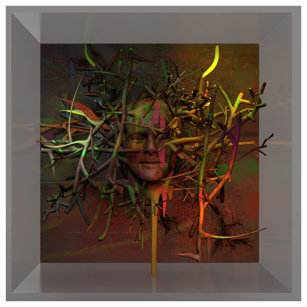
“This piece started life as a digital painting, in the style of Rutenberg’s paintings. The more I’ve gotten into his work over the last few years, and as I’ve listened to him speak about his work and process, I’ve absorbed a lot of his wisdom and theory. Painting in Photoshop, from some recent photos I took on holiday in Somerset, I realised that without all the elements of thick oil paint, walnut oil, textured canvas and the monumental scale, this just wasn’t going to cut it. The sense of depth and light depicted in Brian’s work always astounds me, so I took the idea of his interplay of horizontals and verticals into ZBrush. I used the original digital painting to create the colour on the 3D. I made a rough approximation of the artist himself, just as a homage to a bit of a hero of mine, then created a tangle of intersecting forms. I encased this in a glass box to contain this in a 3D space, something the artist conveys so well on his canvases. A departure from my comfort zone on this one, another lesson learned from Rutenberg himself.”
instagram.com/eclecto2d / linkedin.com/in/phill-hosking / phillhosking.wordpress.com
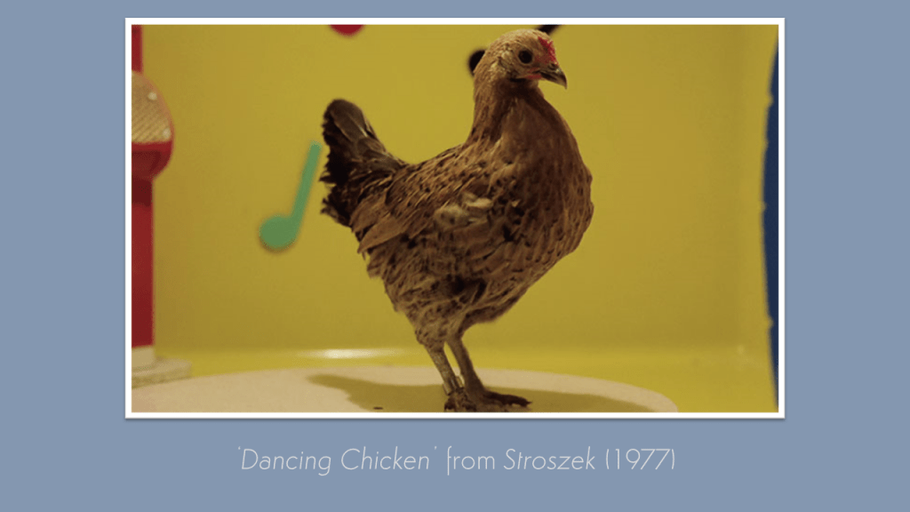
What I love about the Kick-About is the way in which the different prompts send us all haring off in such unexpected directions and producing work we can’t predict. I suspect our newest prompt, courtesy of Tom Beg, will prove no exception: behold Werner Herzog’s celebrated dancing chicken from his 1977 film, Stroszek…


Leave a comment