Skip to content
Red's Kingdom
Home
philgomm.com
Behance
Chimera Trilogy
Chimera Book 1 / The Audiobook
Even The Most Shunned Of Things
Patience Kite
Search
water colour
January 14, 2025
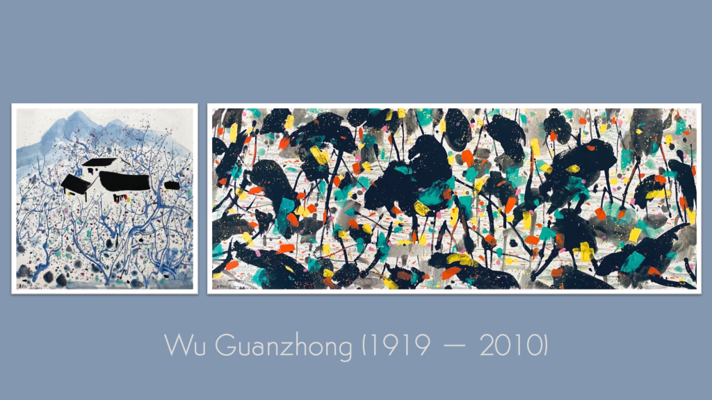
The Kick-About #123 ‘Wu Guanzhong’
philgomm
June 18, 2024
The Kick-About #108 ‘Atsuko Tanaka’
philgomm
November 7, 2023
The Kick-About #92 ‘Cai Guo-Qiang’
philgomm
July 18, 2023
The Kick-About #84 ‘Murano Glass’
philgomm
May 9, 2023
The Kick-About #79 ‘Sheila Hicks’
philgomm
August 2, 2022
The Kick-About #59 ‘Augustus Osbourne Lamplough’
philgomm
December 21, 2021
The Kick-About #43 ‘The Night Before Christmas’
philgomm
September 28, 2021
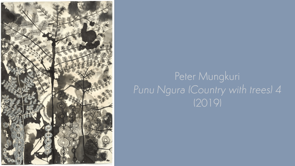
The Kick-About #37 ‘Punu Ngura’
philgomm
August 31, 2021
The Kick-About #35 ‘Souvenir’
philgomm
July 20, 2021
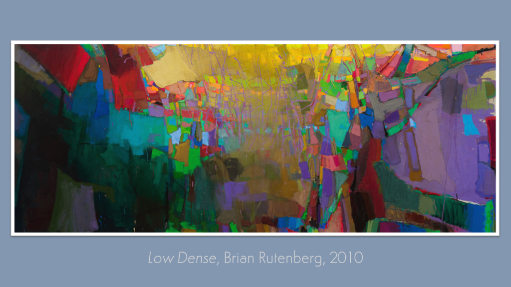
The Kick-About #32 ‘Low Dense’
philgomm
1
2
Next Page
Subscribe
Subscribed
Red's Kingdom
Join 286 other subscribers
Sign me up
Already have a WordPress.com account?
Log in now.
Red's Kingdom
Subscribe
Subscribed
Sign up
Log in
Report this content
View site in Reader
Manage subscriptions
Collapse this bar