Skip to content
Red's Kingdom
Home
philgomm.com
Behance
Chimera Trilogy
Chimera Book 1 / The Audiobook
Even The Most Shunned Of Things
Patience Kite
Search
colour
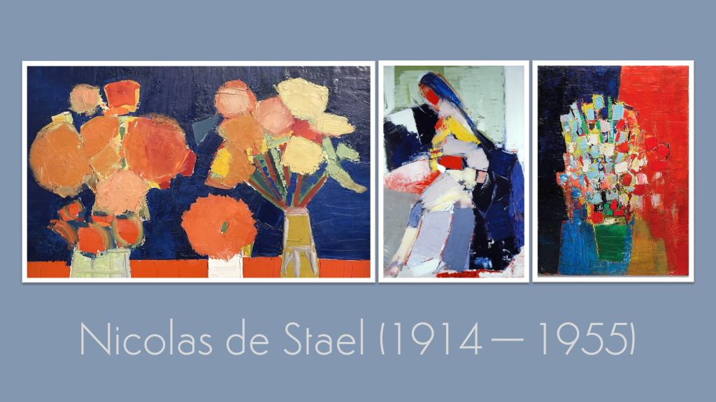
March 10, 2026
The Kick-About #153 Nicolas de Stael
philgomm
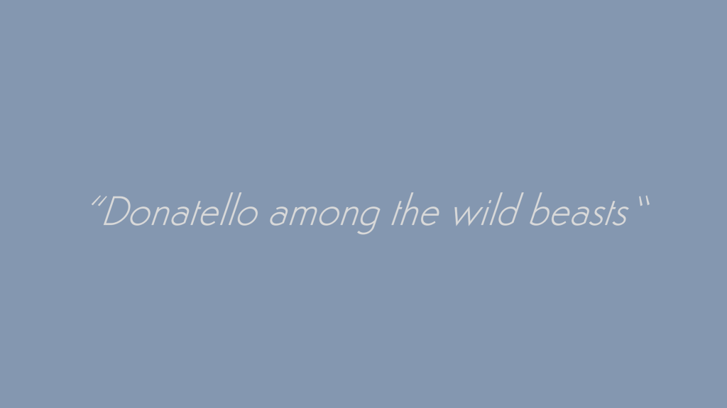
November 4, 2025
The Kick-About #144 ‘Donatello Among the Wild Beasts’
philgomm
June 3, 2025
The Kick-About #133 ‘James Turrell’
philgomm
October 12, 2022
Glove #1 (2022)
philgomm
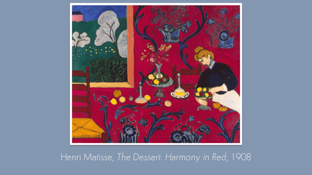
July 19, 2022
The Kick-About #58 ‘Harmony In Red’
philgomm
March 2, 2022
After Baldwin #1 (2022)
philgomm
July 20, 2021
The Kick-About #32 ‘Low Dense’
philgomm
Subscribe
Subscribed
Red's Kingdom
Join 286 other subscribers
Sign me up
Already have a WordPress.com account?
Log in now.
Red's Kingdom
Subscribe
Subscribed
Sign up
Log in
Report this content
View site in Reader
Manage subscriptions
Collapse this bar