
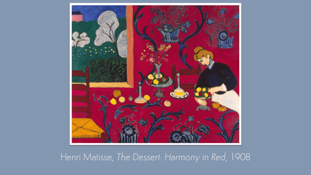
Our previous Kick-About was inspired by the sometimes sombre, monochromatic, and richly atmospheric drawings of Mervyn Peake. Never happier than when making break-neck changes of direction, this latest gathering of new works made in a short time is inspired by Henri Matisse’s celebrated punch of fauvist colour. Boom!
Jan Blake
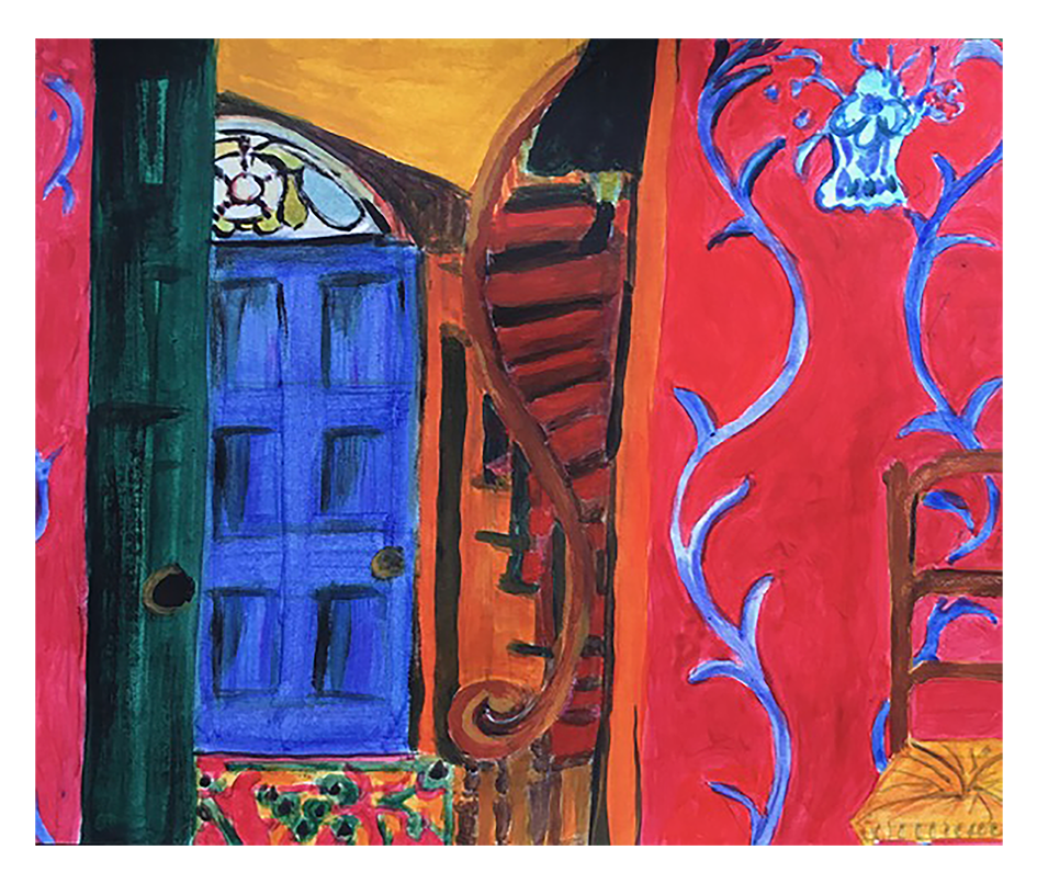
“I’m looking at the other side of this red room, and for inspiration, I went to my hallway, as it is possibly built in the same era but a different country. There are remnants of servants quarters that have survived its conversion into flats. I’m thinking that there would have been a door on that opposing wall. Who had just left? Where were they going? Mimicking the style of pattern and flatness, I have attempted to continue the story.”
Charly Skilling
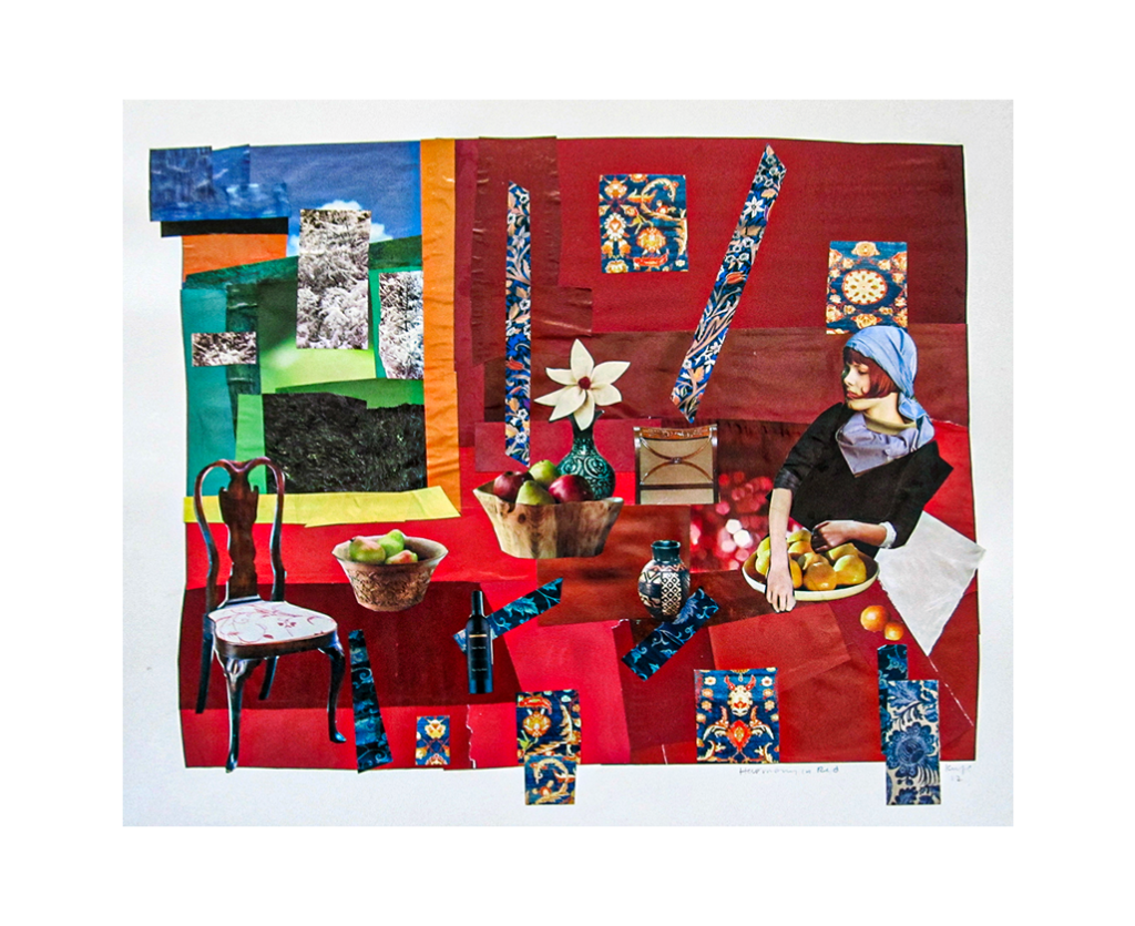
“The first thing you notice about Matisse’s Harmony in Red is that it VERY RED! Saturated with the colour! Indeed, it is difficult to describe this painting without using the word RED over and over again. So I got thinking about synonyms, and how many different ways you could describe something that is RED and how such décor might impact upon the people sat at that table to dine.”


Jordan Buckner
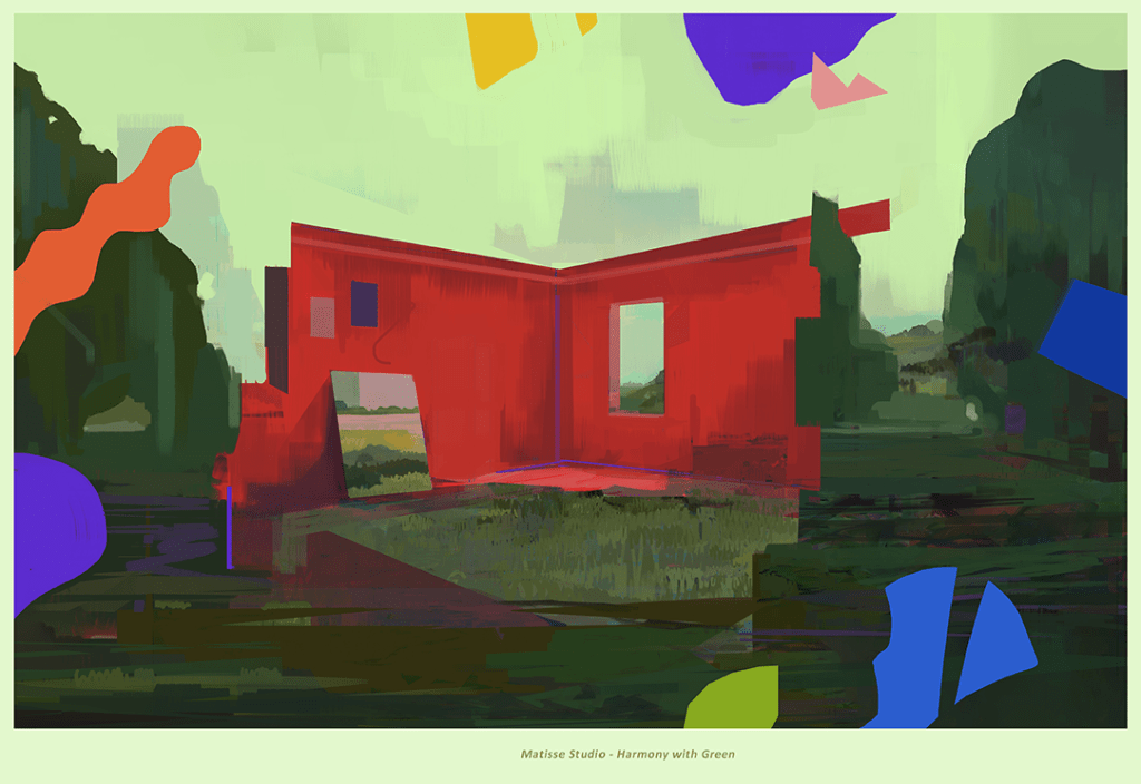
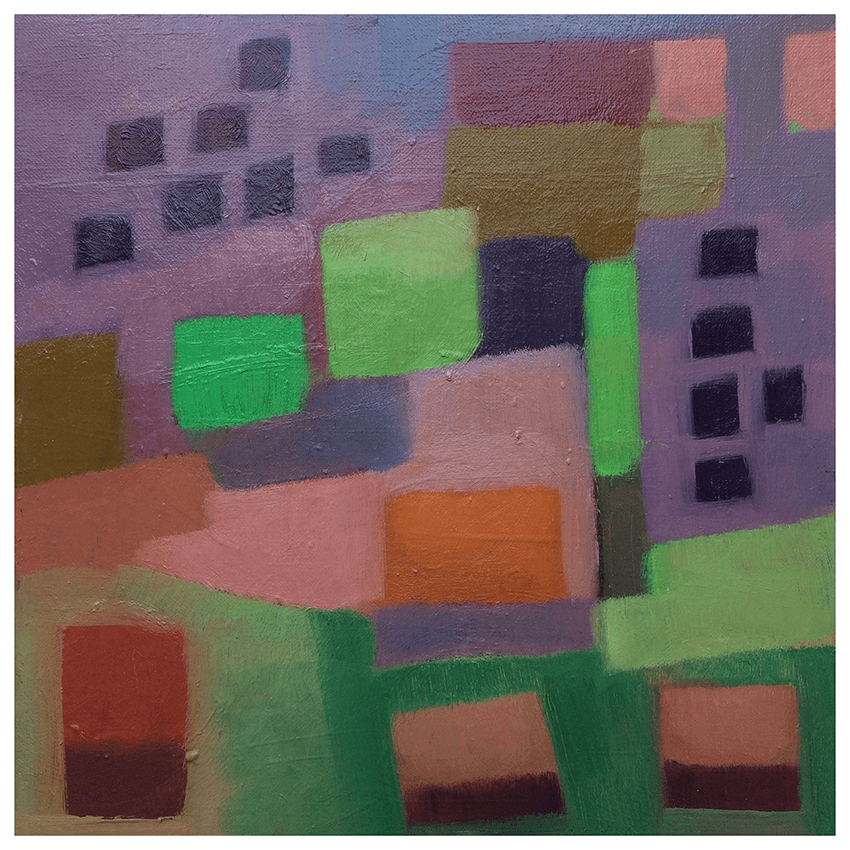
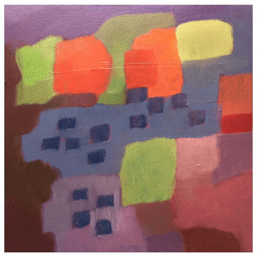
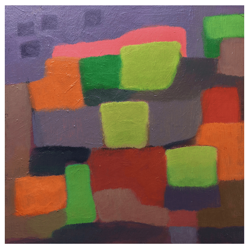
“Really enjoyed where this one started to go. Matisse’s use of colour, shape and composition are legendary, but this study really made me think about how flatness, depth and differing spaces can collide. The flat window landscape of the original Matisse painting is really where it all started, and here’s where I ended up.”

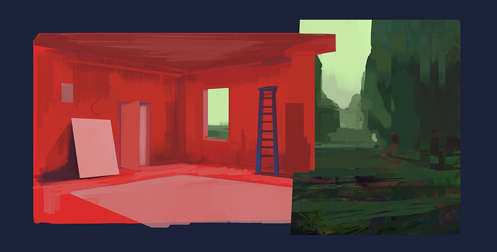
Graeme Daly
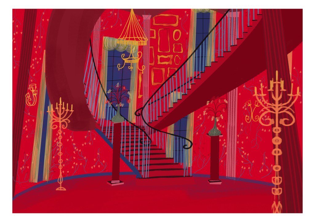
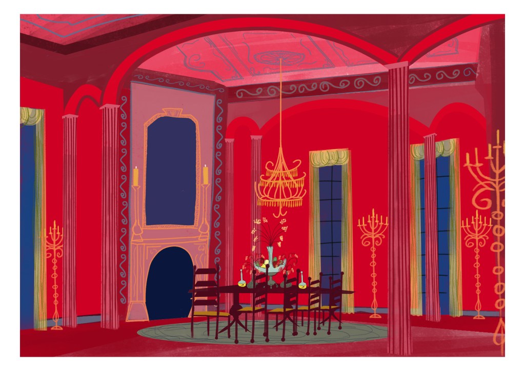
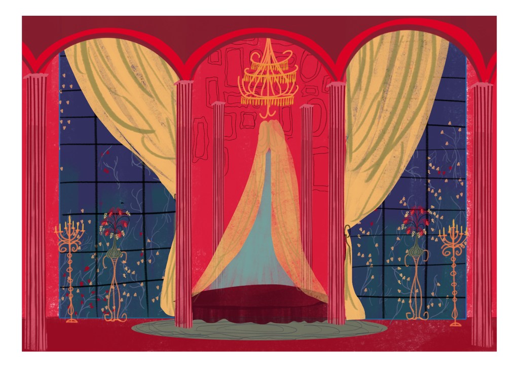
“All I really want to do right now is draw. I latched onto the royal reds of Matisse’s painting and the quirky perspective. The red made me think of opulence. I envisioned a glamorous home with large ceilings, grand staircases rimmed with gold, framed pictures and floral designs throughout the home. At first I was a bit intimated by the brightness and saturation of the red; I didn’t want to burn anyone’s eyeballs with these illustrations, and with the first illustration of the bunch I had the back walls a much darker maroon, but then, with the second illustration, I jumped in with the same Matisse Red, determined to make its high saturation work. After adding in the details, such as the swirly designs, the gold rimmed edges and vaulted high ceilings, I was able to make the vibrant red work and decided to switch the first illustration to match! I am glad I did. I usually don’t do a lot of interior illustrations, but this bunch quickly become some of my favourite paintings thus far.”
@graemedalyart / vimeo.com/graemedaly / linkedin.com/in/graeme-daly / twitter.com/Graeme_Daly / gentlegiant.blog
Gary Thorne
“This is not a spot the fruit competition. However, there were tempting delights for this still life comprised of apricot, apple, pear, orange, berries and grapes. Another influence was certainly the abundance of garden and flowers situated between the back door and the garage/studio. Nice to be indoors at a time when the ‘heat’s on’. This started as one still life painting, however, as we know, stuff happens…”

Marion Raper
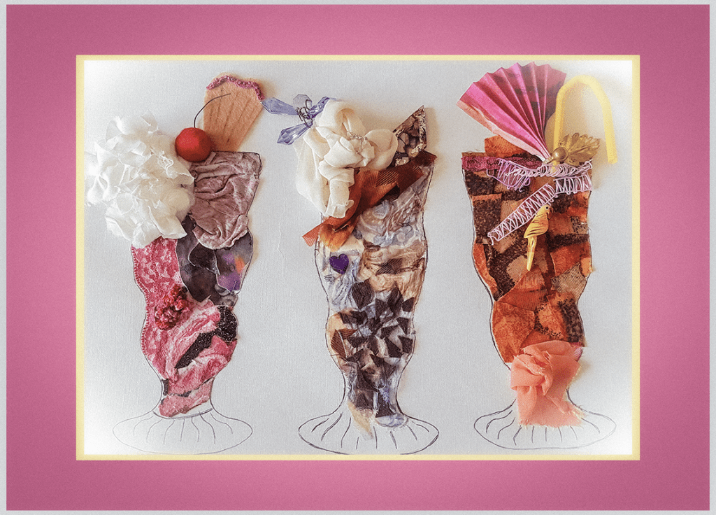
“This Kick-About ties in wonderfully with the hot sunny weather and thoughts of summer parties and picnics. I really enjoyed constructing my collage of ice cream sundaes. It seemed as if the scraps of pink lace were real raspberry ripple, the lilac chiffon was swirls of blueberry and the scraps of brown felt were real pieces of chocolate. However my Red Dessert is a tribute to my cousin Brenda, who sadly passed away with Parkinson’s disease. She was always full of fun, and my last memory of her was when we went out for a meal recently. For her dessert she ordered a huge Knickerbocker Glory and began to tuck in. However, with her jerky arm movements, she proceeded to catapult large spoonfuls of ice cream everywhere and, all the while, with a big smile on her face!“
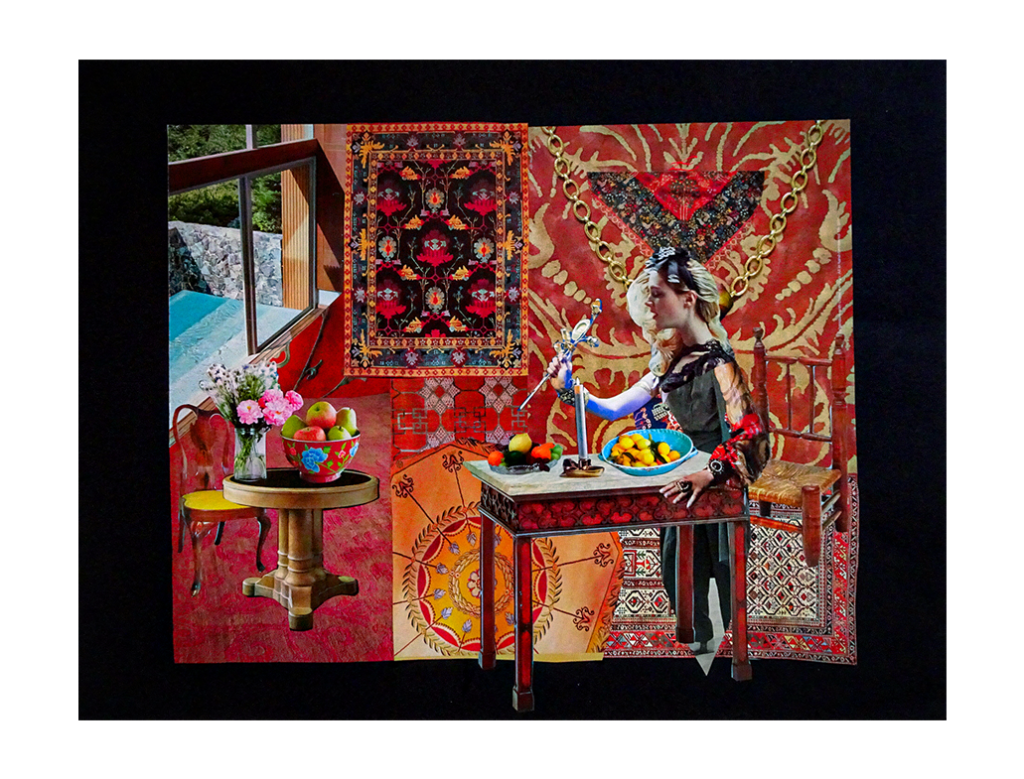
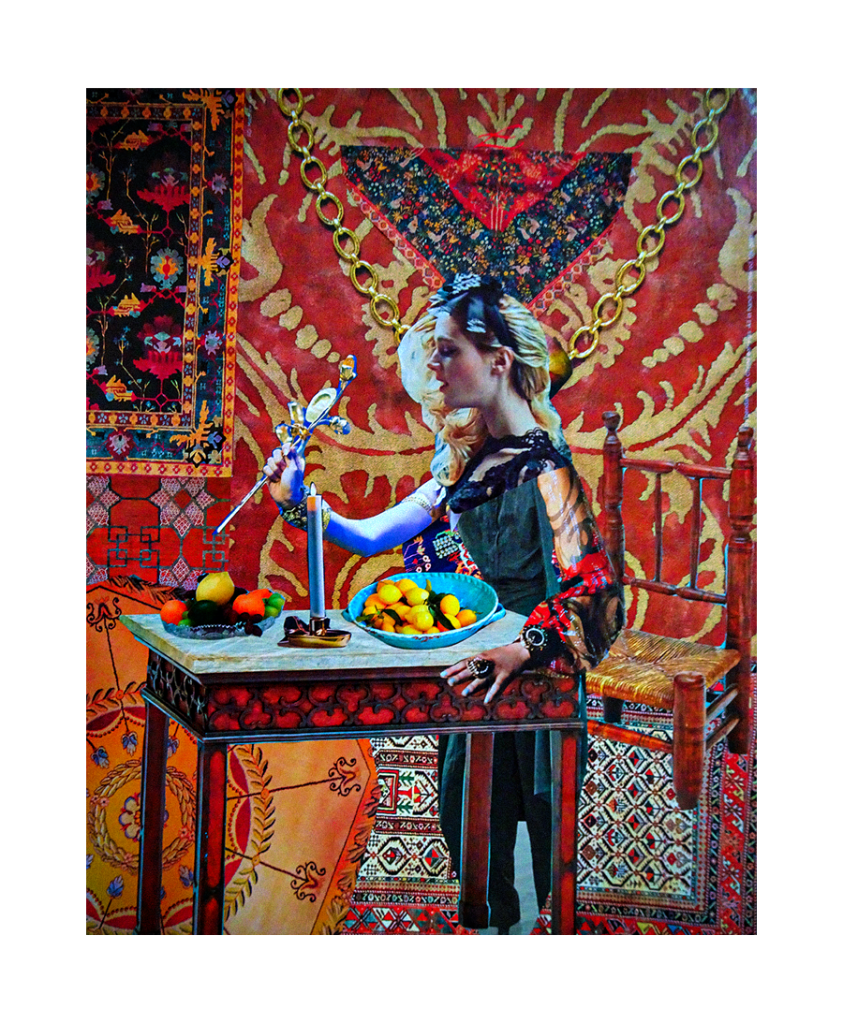
Kerfe Roig
“I was pretty sure I’d done a collage based on this painting maybe 10 years ago, and figured I’d do a new one and then look for the old one to compare. But while I was looking through my pile of decorating magazines for things to use, I came across an ad that made me want to paint it in the style of Matisse. It was that intense blue wall. So I did. Then I did the collage. My old collage is very literal. The new one takes a lot of liberties. I think the woman in it has some kind of magic in mind. As always, grateful for the push to do something new.”

kblog.blog / methodtwomadness.wordpress.com
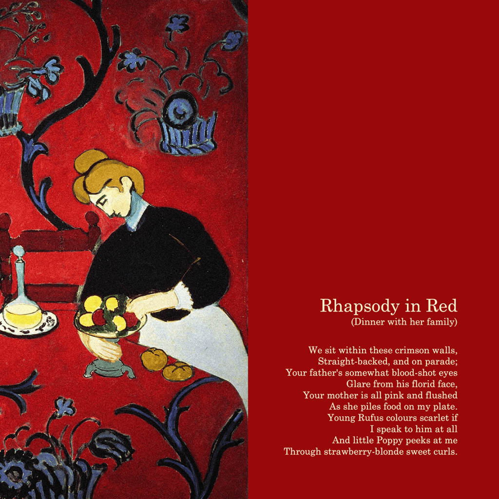
Phil Gomm
“The idea for this story came quickly, inspired in part by the conflict going on between the domesticity of the subject and the roar of all that colour, like a sudden rush of feeling, something eruptive and less civilised. I was excited too by the strangeness of Matisse’s perspective, a world shunted off-kilter so unexpectedly, and likewise by the very idea of Fauvism itself and all its ‘wild beasts’.”


You can find a PDF version here.
Courtesy of Jordan Buckner, our next Kick-About prompt is the life and work of Augustus Osborne Lamplough, an English Orientalist painter and illustrator; known for his sunset scenes of North Africa. Happy travels.


Leave a comment