Skip to content
Red's Kingdom
Home
philgomm.com
Behance
Chimera Trilogy
Chimera Book 1 / The Audiobook
Even The Most Shunned Of Things
Patience Kite
Search
3D modelling
October 12, 2021
The Kick-About #38 ‘White Alga On Orange & Red’
philgomm
August 3, 2021
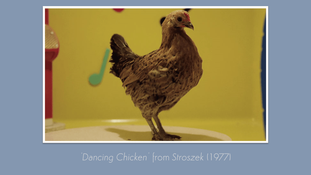
The Kick-About #33 ‘Herzog’s Dancing Chicken’
philgomm
July 20, 2021
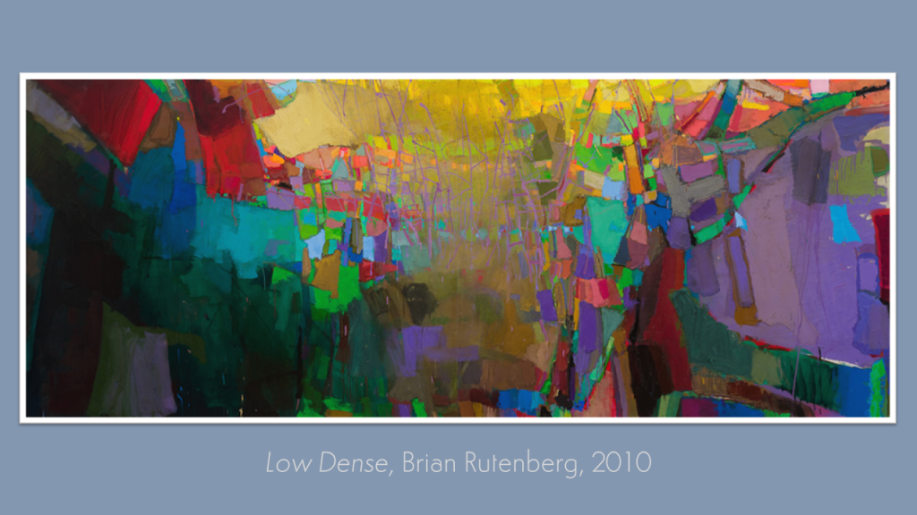
The Kick-About #32 ‘Low Dense’
philgomm
May 11, 2021
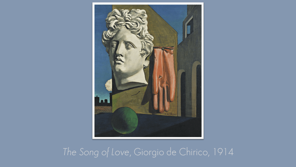
The Kick-About #27 ‘The Song Of Love’
philgomm
April 27, 2021
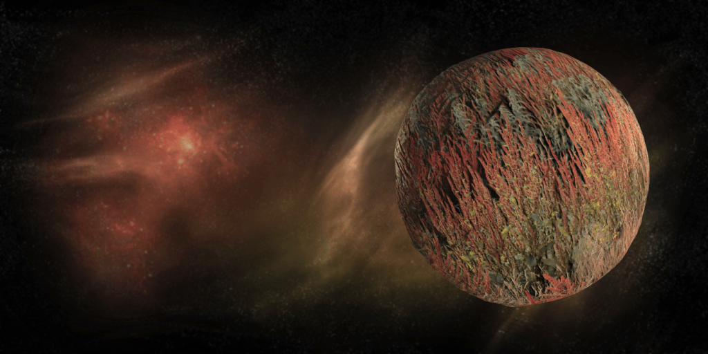
The Kick-About #26 ‘52.1429’
philgomm
February 2, 2021
The Kick-About #20 – The Ashley Book Of Knots
philgomm
October 1, 2020
Spotlight #5 Deanna Crisbacher
philgomm
September 30, 2020
Wanderer (2020)
philgomm
September 23, 2020
Artist-In-Residence: Tom Beg #7
philgomm
September 1, 2020
The Kick-About #9 ‘Short Ride In A Fast Machine’
philgomm
1
2
Next Page
Subscribe
Subscribed
Red's Kingdom
Join 286 other subscribers
Sign me up
Already have a WordPress.com account?
Log in now.
Red's Kingdom
Subscribe
Subscribed
Sign up
Log in
Report this content
View site in Reader
Manage subscriptions
Collapse this bar