
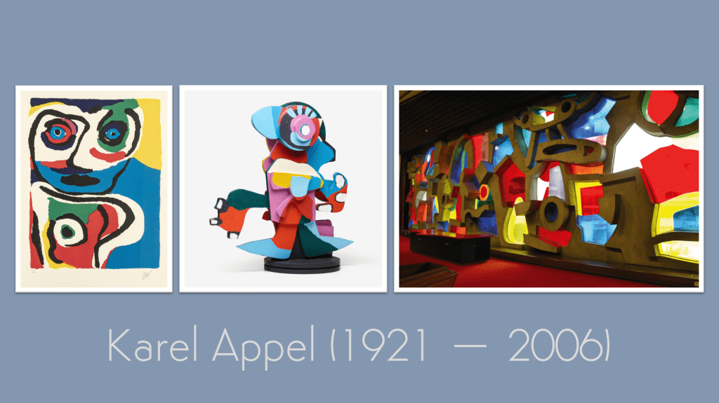
In our last Kick-About, we spent time with the bold planes and quiet intensity of Nicolas de Staël. This week, things take a more unruly turn. Our prompt is Karel Appel—an artist of instinct, colour, and raw energy, whose work embraces a more playful and untamed approach to making. As always, the works that follow were made in a short time—and for all previous editions of The Kick-About, go here.
Lewis Punton
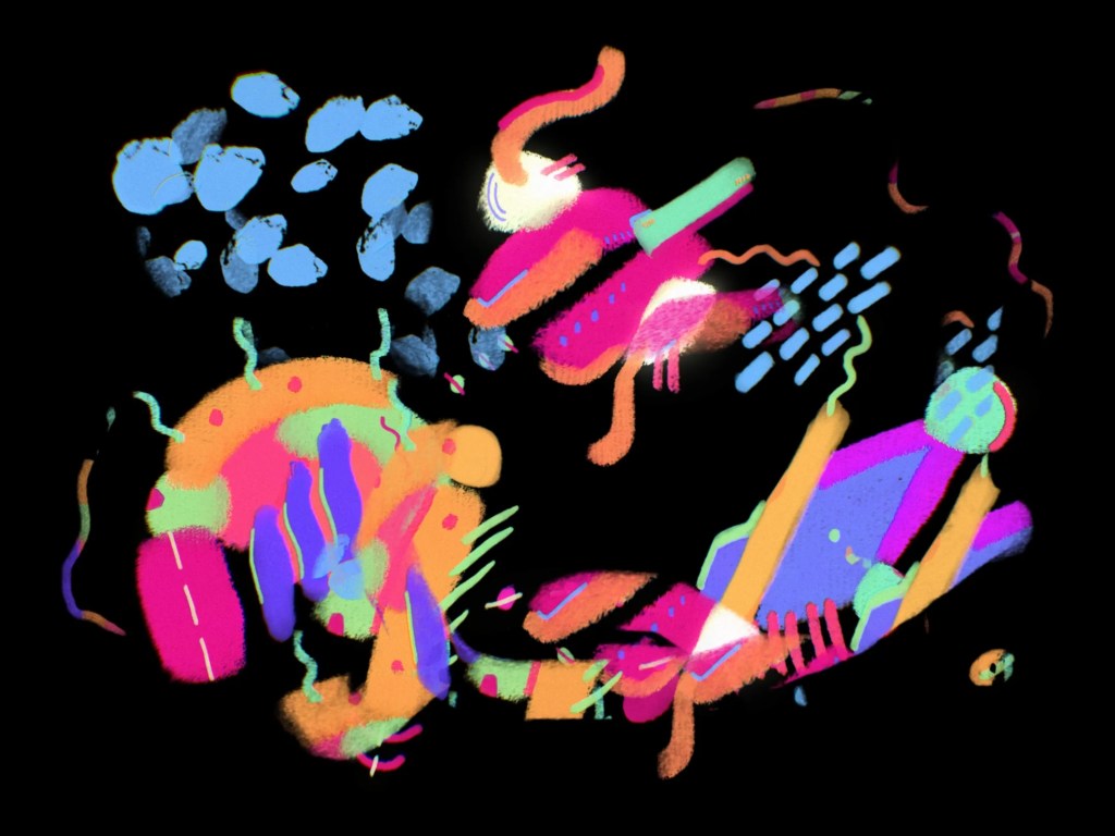
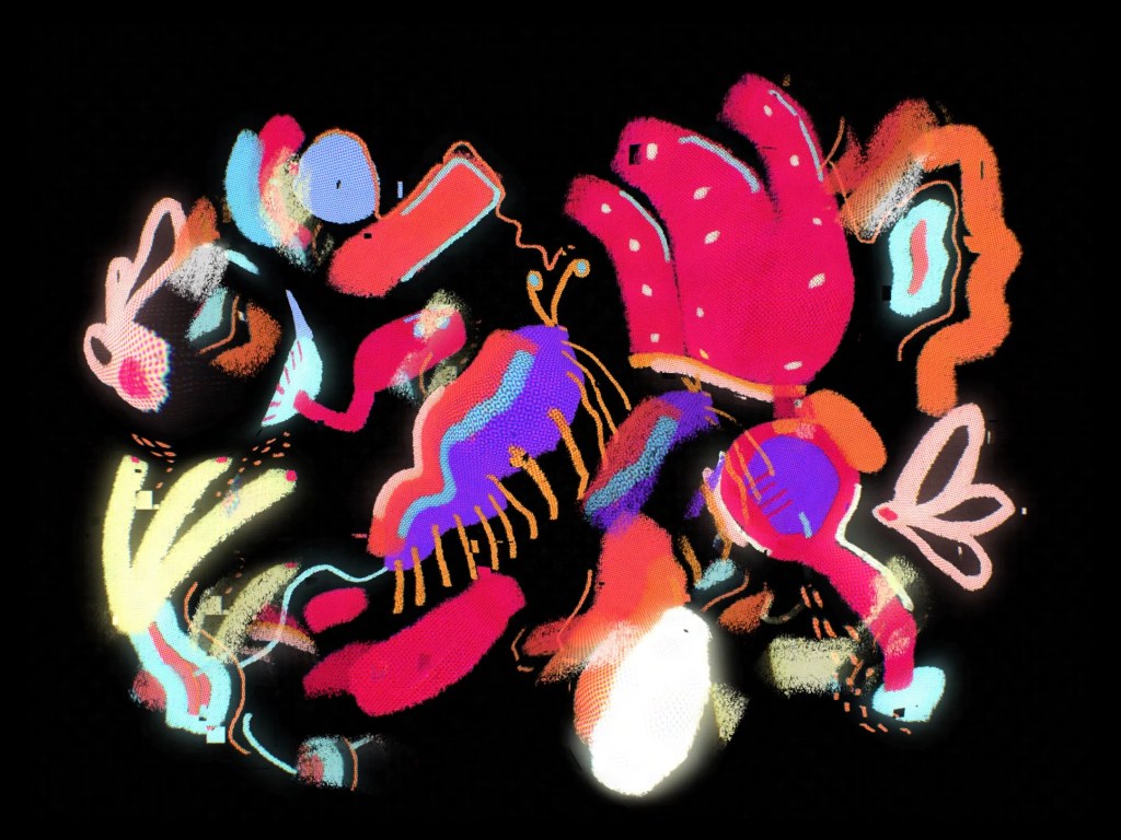
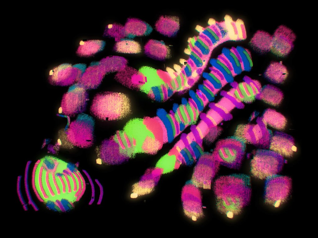
“Karel Appel was a particularly fun Kick-About prompt, a real excuse to lean into the instinctive nature of making something automatic and care free – a thing for the sake of making a thing! I didn’t have a plan, but sometimes that’s enough of a plan in and of itself. I could try and dress this up as a being some grand execution of layering colours, shapes and textures, but in fact all that took place below was a series of digital doodles over a morning coffee followed by fiddling with some settings in Procreate. Nothing special in isolation (and nor do they need to be!), but I happen to quite like the effect achieved once the three are stacked on top of each other!”
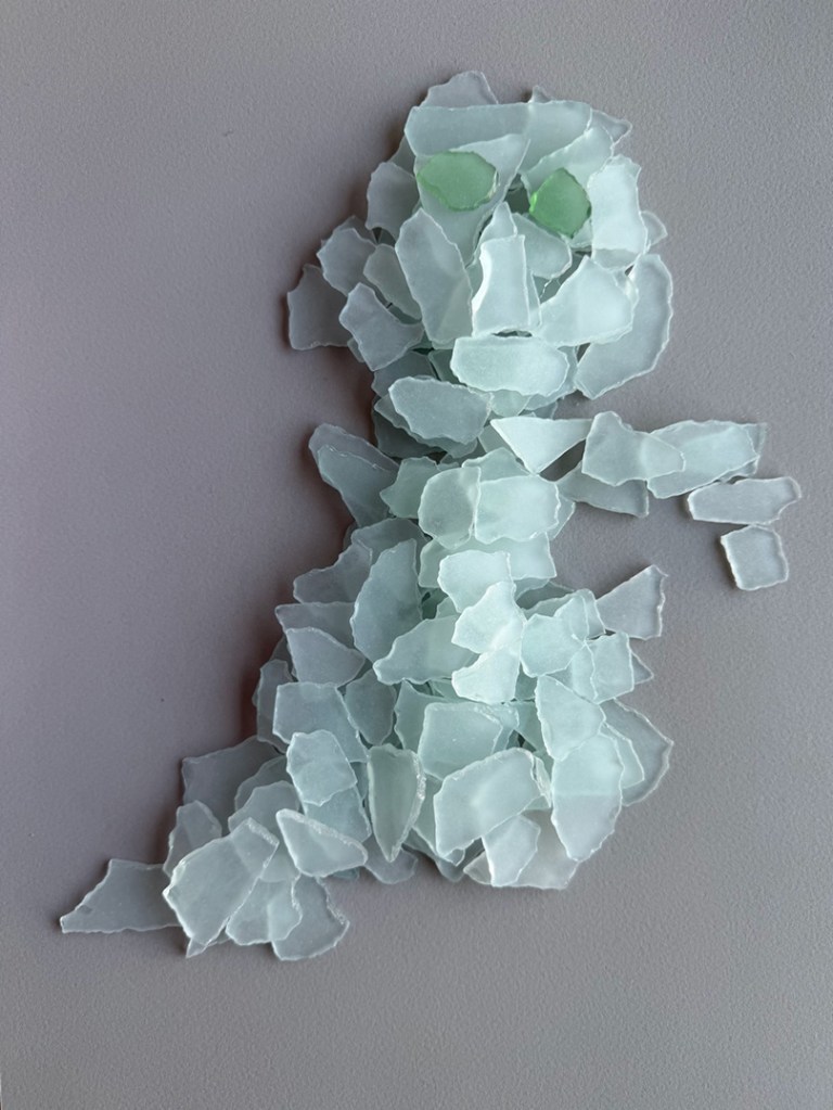
Francesca Maxwell
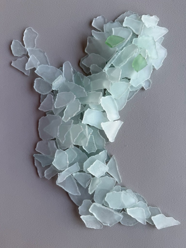
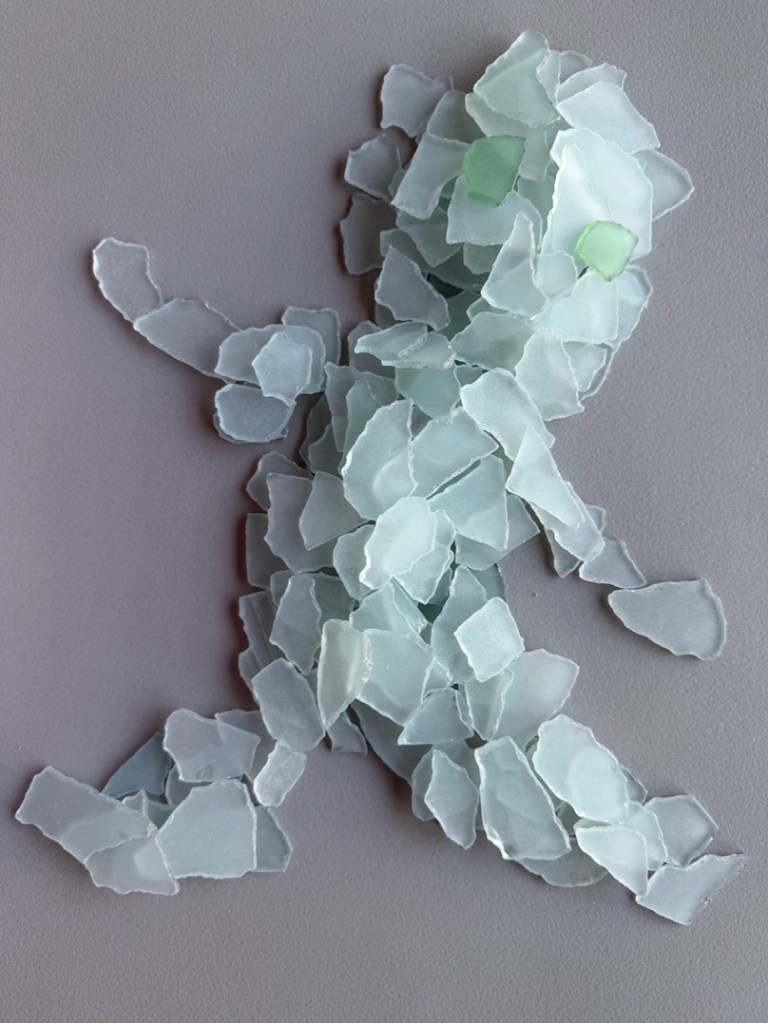
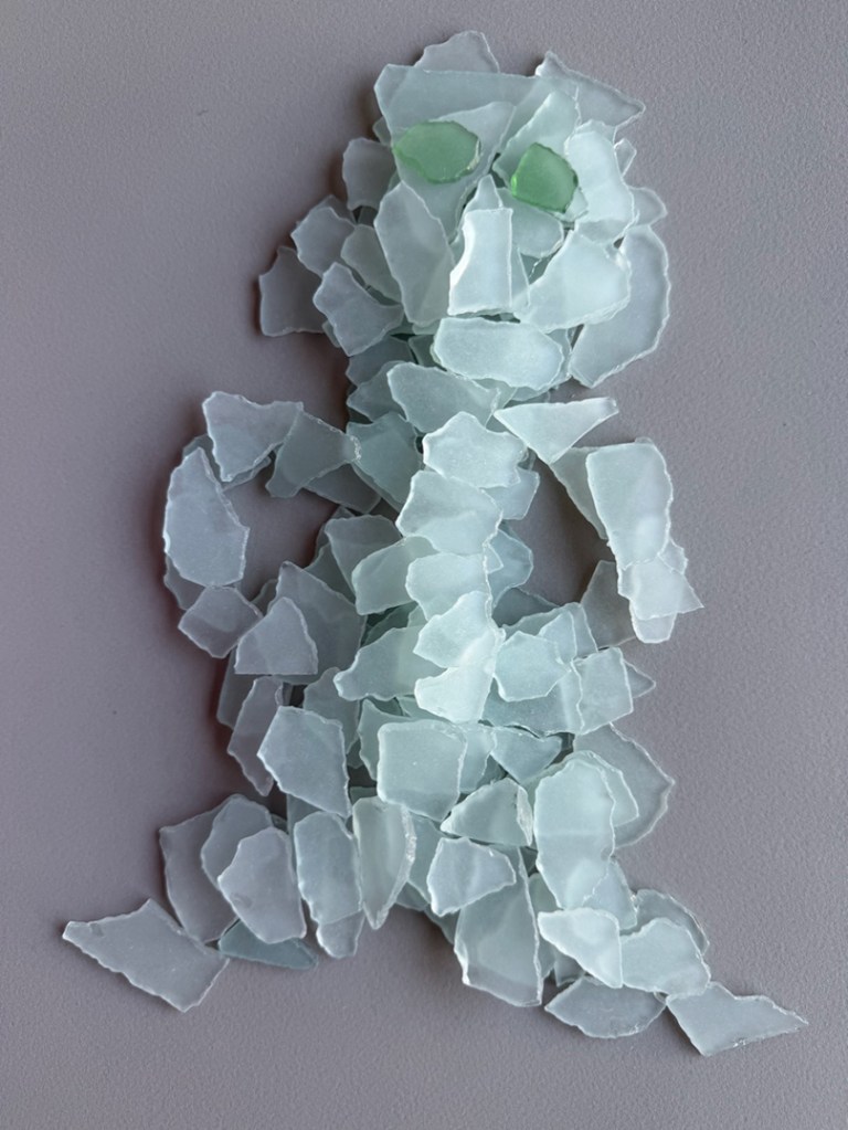
“What fun Karel Appel is. I couldn’t decide what technique to use — everything was so inspiring. In the end, I decided to play with some glass pebbles I got from a friend, creating characters out of objects and things that surround us. An infinite game.“
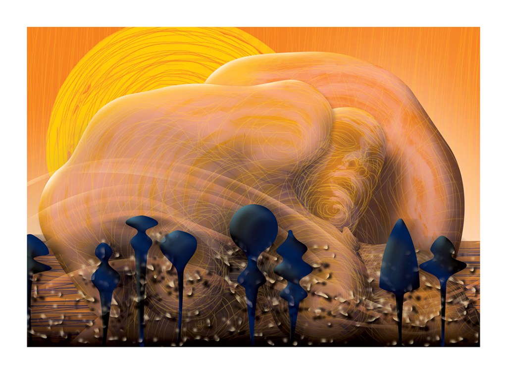
Graeme Daly
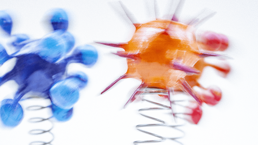
“I particularly loved Appel’s sculptures and wanted to latch onto that, so I opened up Maya for some 3D work. I started by creating a bunch of primitive shapes of every sort and then colouring them in various hues. I then arranged those shapes into something resembling a face, mixing, pulling, and extruding them until something interesting happened. I particularly liked rendering the side angles, as you can see the depth and shadows more clearly, so I stuck with those. It was good to dust off the old Maya skills after so long!”
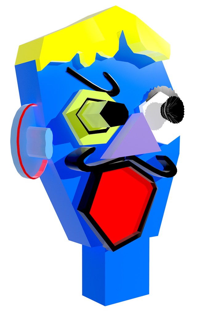
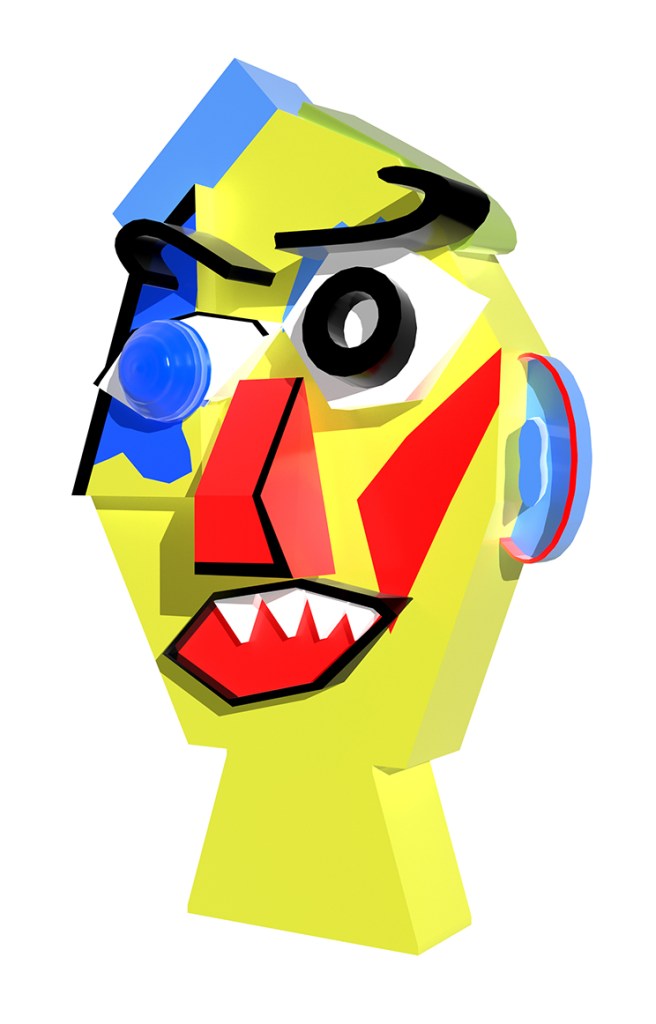
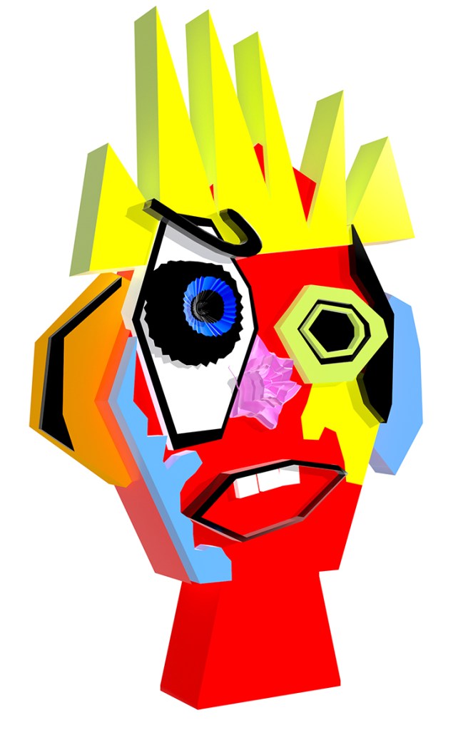
@graemedalyart / vimeo.com/graemedaly / linkedin.com/in/graeme-daly / twitter.com/Graeme_Daly / gentlegiant.ie
Phil Gomm
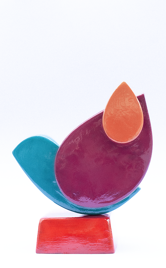
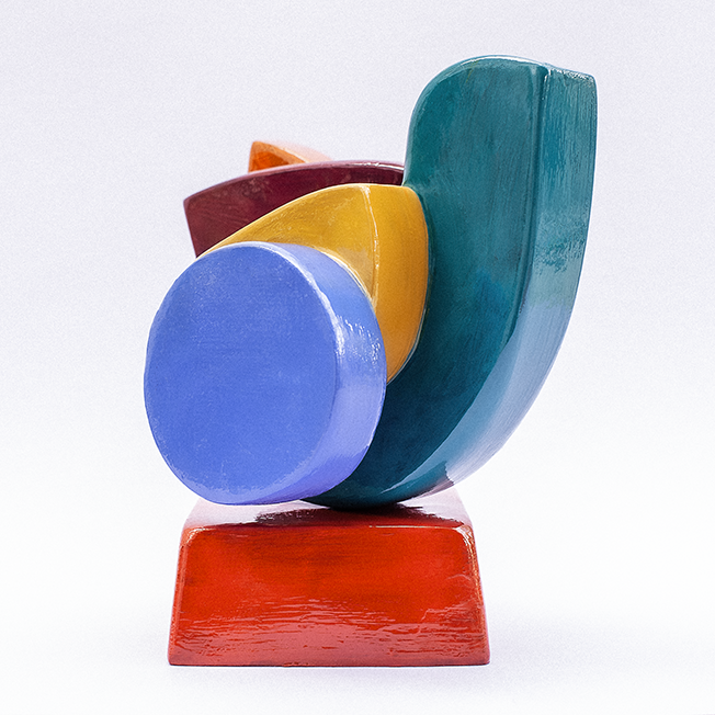
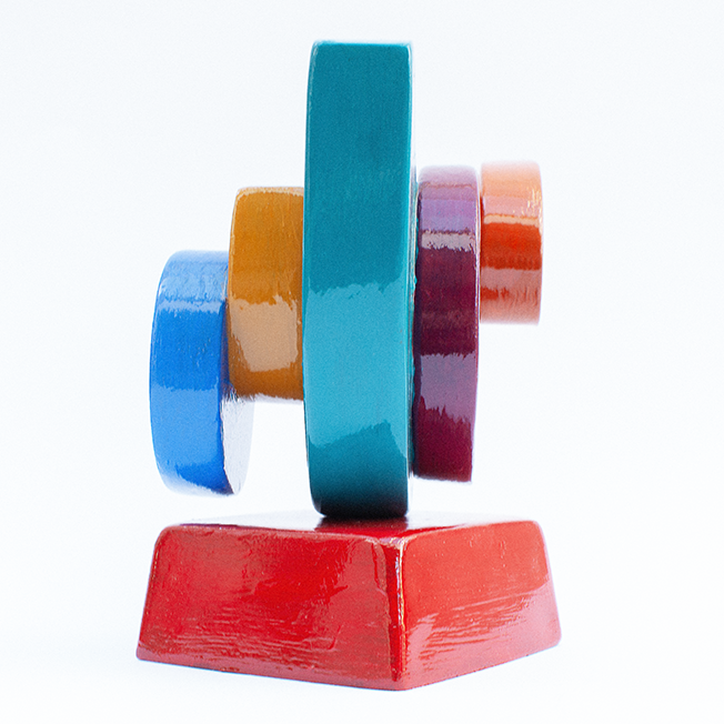
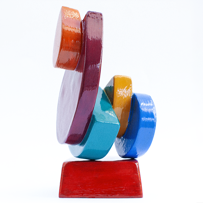
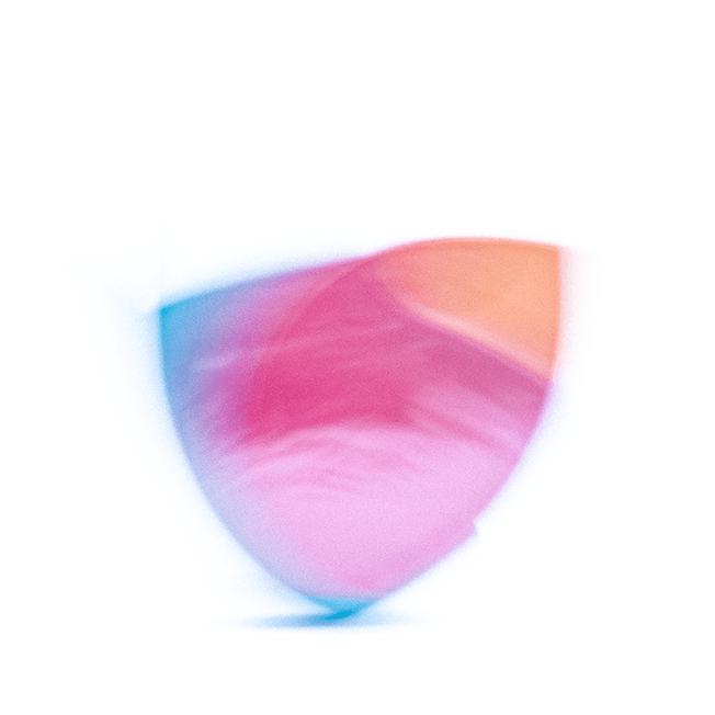
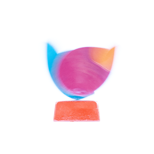
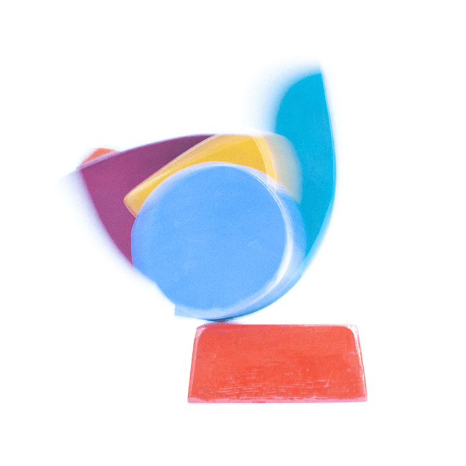
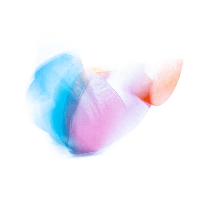
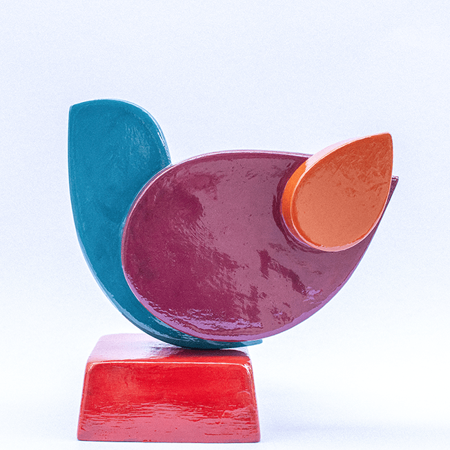
“I was very drawn to the ‘buildability’ of Appel’s sculptures, with structures comprising sandwiches of flat, simple shapes. With no real plan in mind, I set about creating some quick moulds out of Sellotaped belts of acetate, then filled those shapes with some skimming plaster I’d bought in error. The plaster was lovely to work with, and I soon had this chunky set of shapes, which I then glued together to create this semblance of a bird — a dove, maybe?
I then painted the different sections in Appel-inspired colours and gave the whole thing a rich coat of varnish. The resulting sculpture actually sits, unfixed, on its red plinth, which meant I was able to set it rocking while I was photographing it — hence the more impressionistic images that resulted from the pre-Kick-About photoshoot. My effort this week lacks the ‘punk’ of Appel’s more energised sculptures, settling instead for Fisher-Price meets Duplo.”
philgomm.com / behance.net/Phil_Gomm
Charly Skilling
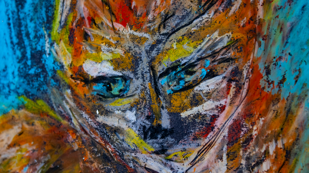
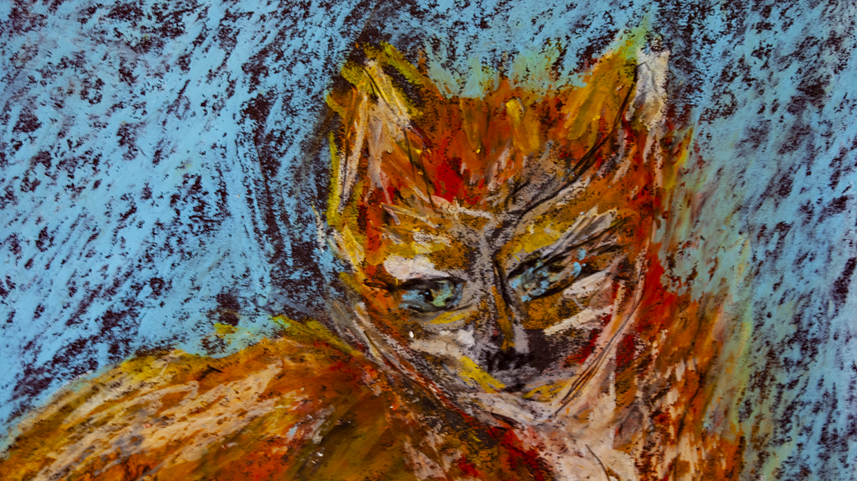
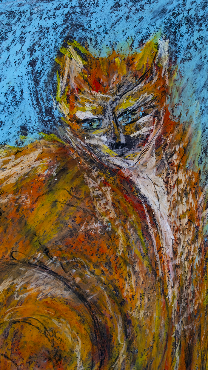
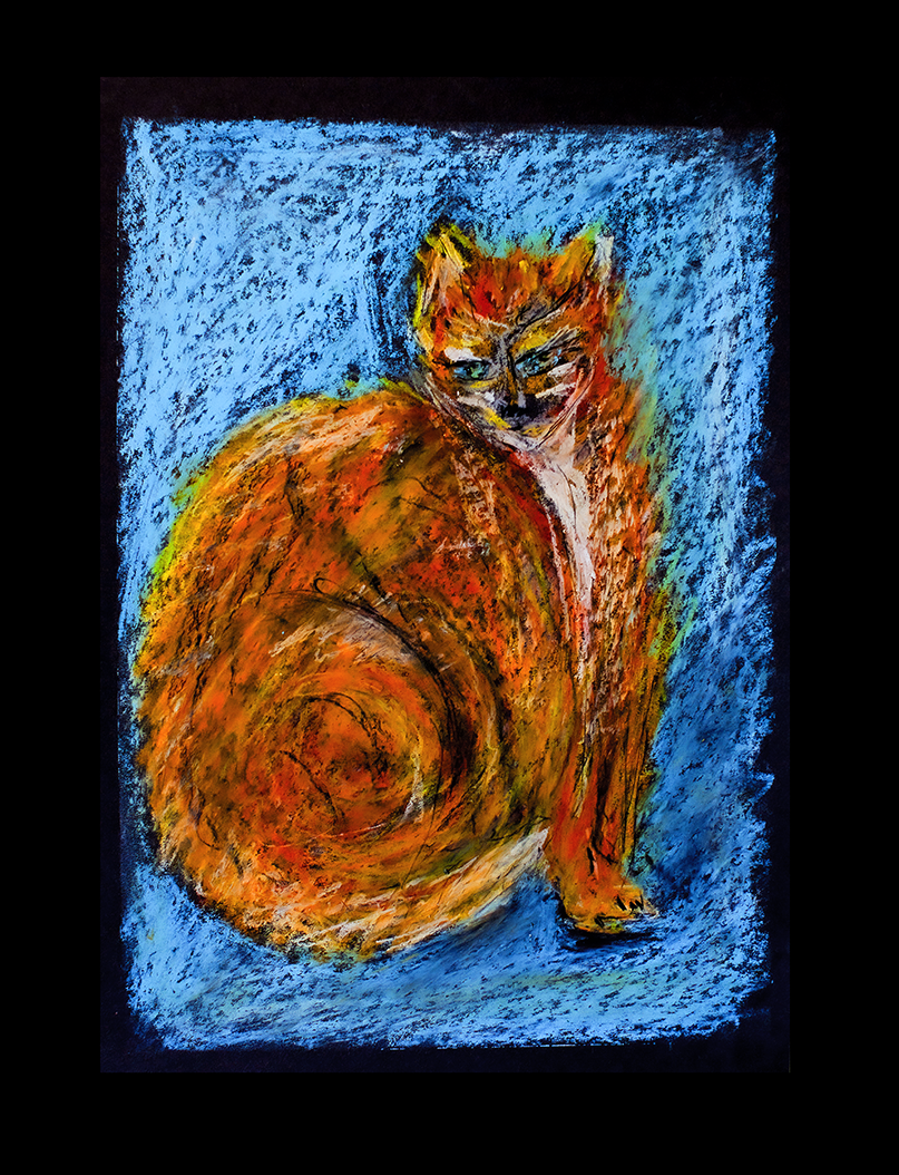
“Karel Appel’s work is joyful and bright. It made me think of playschool, and crayons, and poster paint. Not in a bad way, like “my four-year-old could do better than that!”, but in remembering the fun and excitement of working with young children as they played with colours and shapes and mark-making (and gluing and sticking and building and everything!).
And then I came across Appel’s Cat Collection, and that made me think of our own cat collection. When the children were young, my first husband had a habit of finding stray kittens and bringing them home. At one time we had six of them living with us — all colours, all shapes, and all temperaments. To be fair, they settled better than the husband, were far less trouble, and stayed around rather longer.
So I picked up my crayons and drew myself a cat. And thanks very much, Karel Appel, for leading me down this happy byway.”
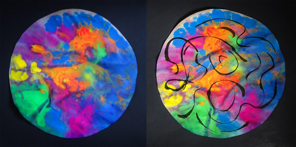
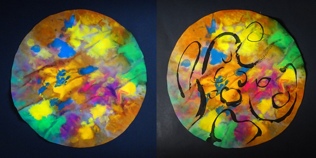
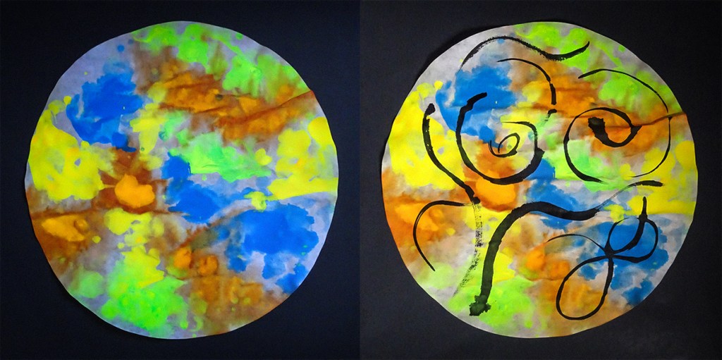
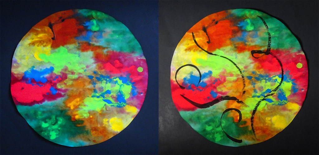
Kerfe Roig
“A few years ago — OK, a lot of years ago — I did a bunch of collages based on Appel’s work. So this time I decided to paint some mandalas inspired by his colours and add some ink brushwork on top, influenced by his use of black accent lines.“
James Randall
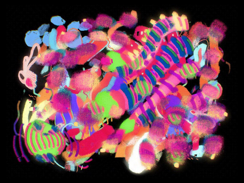
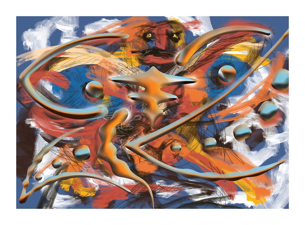
“Karel Appel — never heard of him, but I looked him up. I put together a landscape of body parts (really more about the Middle East than anything). Then I watched an action-packed film of him running around — maybe Paris — before throwing paint at a canvas, and began to understand more about his emergence from war and his interest in innocence.
I threw some Procreate paint around, which felt more appropriate, and then took the image into Illustrator, where I added a more formal layer of shapes to emphasise the movement. I then took this file into Photoshop to colour the new shapes and add some bevels, and the forms began to look a bit like a butterfly.
Later, at the QAGOMA gallery, I saw an exhibition with a film and a caption explaining that, in Japanese culture, butterflies can represent a person’s soul — living, dying, or dead.”
Vanessa Clegg
“I had a look at Karel Appel’s paintings and was drawn to Untitled (from Jorn, 1975–76). It reminded me of the old art school exercise of looking at an object and drawing without looking at the paper. My spatial awareness is hopeless, which is borne out by the resulting response… but I enjoyed doing it!”
vanessaclegg.co.uk / vanillaclegg
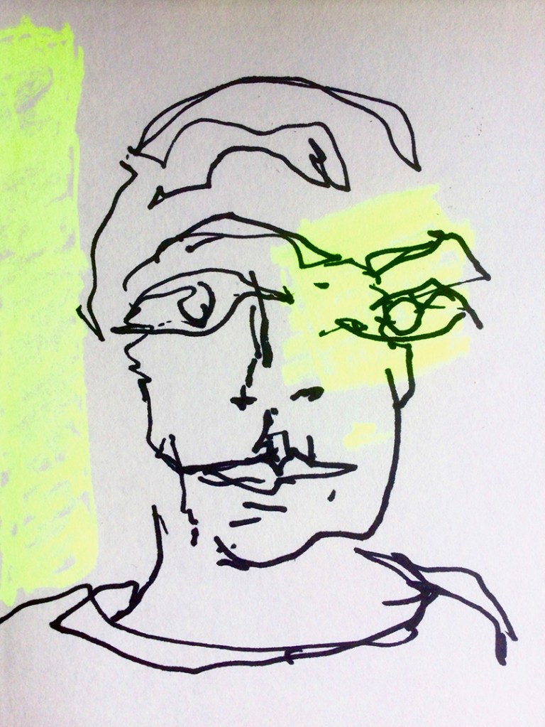
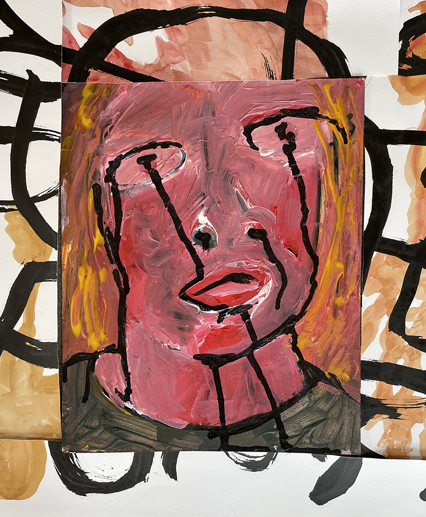
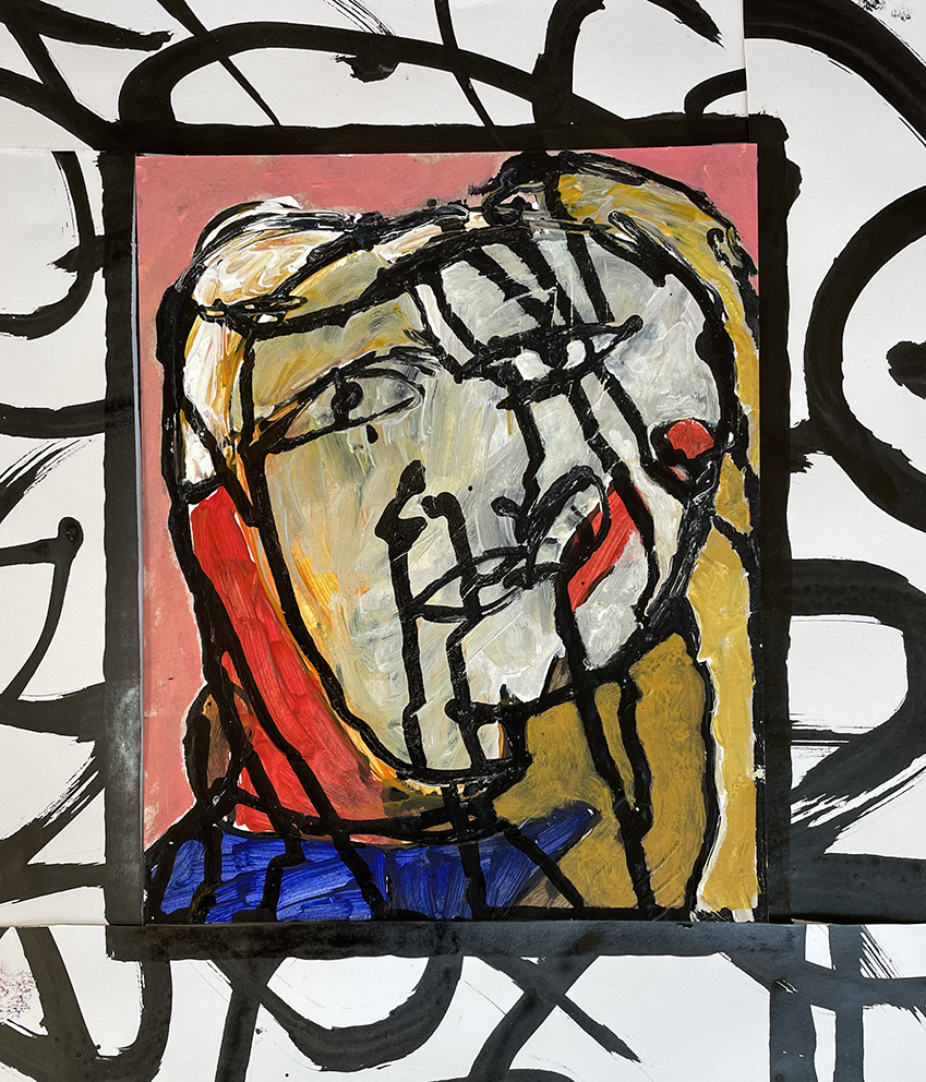
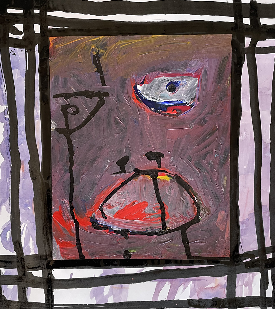
Gary Thorne
“James Randall generously offered me some insight, through his love of research, which kick-started this lashing-out — something I’ve read can help relieve tension. To support you with my train of thought, these are the labels: #1 Fergie’s lament, #2 Melania’s lament, #3 Donald cries crudely...”
Next time, our prompt turns to energy, momentum, and those forces — human or otherwise — that set things in motion and keep them there…


Leave a comment