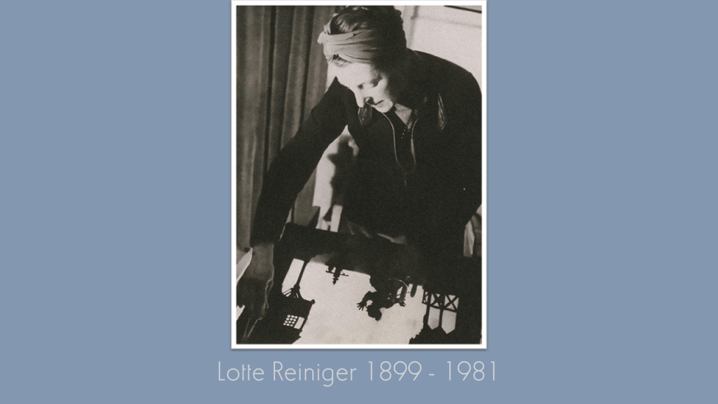
The Kick-About #31 ‘Lotte Reiniger’


Our previous Kick-About together was inspired by images of the human eye, resulting in an abundance of other-worldly imagery and one short story, in which an elderly man vanishes magically away in the middle of an art exhibition. The pioneering silhouette animations of Lotte Reiniger are likewise preoccupied with all things magical: magical lamps, magical slippers, and magical beings. This week’s showcase of artists’ work riffs on Reiniger’s unique aesthetic and narrative milieu. Happy browsing.


Tom Beg

I always enjoy looking beyond the silhouettes of Lotte Reiniger animations and into the exotic and intricate backgrounds that she made. I get a simple sensory pleasure from the illusion of depth that can be achieved in black and white, just using the basic principles of foreground, midground and background. Visualising big worlds is not something I am particularly good at, but as I started to develop these images, I couldn’t help imagine them as big structures in some vast desolate landscape, where few living things remain.


twitter.com/earthlystranger / vimeo.com/tombeg


Phil Cooper

“I live in Berlin, just round the corner from where Marlene Dietrich was born, and I’m a big fan of Lotte Reiniger and early German cinema. love the theatricality, the creativity and technical ingenuity that went in to making these animations, as well as the fairy tale subject matter.

A few years ago I was involved in creating some animation sequences and images for screen projection for a stage production of Hansel and Gretel. Lotte Reiniger’s 1955 film of the story, as well as earlier German expressionist cinema were certainly in the mix when I was making this work, and I thought it would fit the bill for the Kick-About prompt this week. I’ve included some images that were made to project onto a screen behind the performers during the scenes when Hansel and Gretel were lost in the forest.”


instagram.com/philcoops / hedgecrows.wordpress.com / phil-cooper.com


Graeme Daly

“When doing research for the Howard Sooley – Prospect Cottage prompt, I came across the inspiring work of Lotte Reiniger, and since then I have been busy cutting, glueing and making for a shadow puppet animated short entitled The Lighthouse Keeper, which centres around the peculiar landscape of Dungeness and a couple of burly blokes. Creating something for the sake of creating and figuring out the hurdles and bumps along the way is what is most enjoyable about delving into a fresh medium I have yet to attempt. The stage is now set, the characters are ready to move, the lights are on and with it, the sheer joy of seeing the cut-out shapes and silhouettes lit up, ablaze. Moving from behind the messy, makeshift backstage to the front brought the biggest smile to my face, which makes the absolute bomb site of my shrinking bedroom all worth it! I am sharing the majority of the cut-out shapes, the stage and silhouettes that will feature in the film, as well as some lighting and staging tests with the main protagonist – while I wait for the delivery for the all important light source before the real fun begins.”


@graemedalyart / vimeo.com/graemedaly / linkedin.com/in/graeme-daly / twitter.com/Graeme_Daly / gentlegiant.blog


Kerfe Roig

“I realized immediately I had seen Lotte Reiniger’s work before. It did not surprise me to hear Reiniger say, ‘I could cut out silhouettes almost as soon as I could manage to hold a pair of scissors’. Her work is, yes, ‘astonishing’. Me? I never had that dexterity, not even when young. I also don’t work in film, which was Reiniger’s medium. So how to respond to this prompt? I was going to work with simple bird silhouettes, but was unhappy with the ones I made myself. Once again, I had constructed a 3-D collage environment with cardboard pieces inside a paper bag. I decided to use photos of bird silhouettes, and hang them from strings at the top so they would move. I used circles to enclose the bird forms so I could put different photos on each side–the images would change when the dangling circles turned. Using the ceiling fan to create more movement, I began to take photos.”


that song that your words called
into my mind, that song is like
a lost world, just images
in fragments, suspended like
a raincloud without rain,
a weight that refuses
to dissipate–I can almost
feel the memory but it won’t
land, it keeps circling
through the things that aren’t
quite there–like a bird
call I can’t locate, disembodied
wings hovering invisible
inside my head


kblog.blog / methodtwomadness.wordpress.com


Emily Clarkson

“Lotte Reiniger’s beautiful silhouette works appeared to largely focus on fairy tales, so I wanted to come at it from a different angle. Taking inspiration from something short, like a poem, I delved into some of my childhood books and lit upon Edward Lear’s ‘Complete Nonsense.’  With my poem selected I created the scene with some coloured paper, and rigged up my phone for stop frame-animation. This was quite the challenge without a proper lighting set up, or the ability to ‘onion-skin’ my images, so there are some interesting colour variations caused by cloud cover and some rather choppy movements. But perhaps that adds to the charm of the ‘Young Lady of Portugal’! (Or perhaps I need some more practice and MANY more inbetweens!).” 


instagram.com/eclarkson2012 / twitter.com/eclarkson2012 / linkedin.com/in/emily-clarkson


Marion Raper

Silhouettes have been around for many years and I know that they are very tricky to work convincingly. Lotte Reiniger must have been a very clever mistress of this craft and way ahead of her time. I decided to do some cut work on the facade of a decorative little theatre and inside put a small montage – since my animation skills are nil and it uses up some of my mountain of collage papers! I’m not sure if The Owl and the Pussycat by Edward Lear is still as well known as it was in my schooldays, but its entertaining characters are great for paper modeling, plus the tiny details of jars of honey, runcible spoons etc. So now all that’s left to do is settle back and sing along – ‘The owl and the pussycat went to sea in a beautiful pea green boat…'”


Jan Blake

“I loved these early animations. So full of energy and passion. I remember the fascination I felt as a child when adults amused me by making rabbits with their hands on the walls when the sun was out, and in the evenings with little table lights. I love watching moving shadows, and when I was in Mexico there were always shadows, as there never seemed to be a day without sun. A little different here in the past two weeks, so here are a few snatched mages and sounds of PLACE. Guess the Mexican one!”


janblake.co.uk


Gary Thorne

“Thank you, Graeme, for the inspiring venture into action. Months have passed without life drawing so, the recreation ground provided observation of the figure in motion. This playful solitary kick-about prompted a series of sketches, which later, shifted to paint in the studio. Perhaps a bit of Lowry, if I may indulge myself. The second motion-based work is a spin off from the online RA Saturday Sketch Club which thankfully James Randall introduced me too, I’ve added in the mask which dates the work.” Oil on prepared paper 24 x 65 cm.


linkedin.com/in/gary-thorne


James Randall

“There is an apartment block just across the road from ours – floor to ceiling glass – a very Rear Window stage. Nice simple shapes too. And a jumping off point for fantasy and metaphor.”


Phil Gomm

“I remember the first time I watched Reiniger’s Cinderella, thrilling at the moment when we see the ugly sister cut off her own toes in order to make the glass slipper fit her foot – a reminder that fairy stories, as written originally, were hardly short on violence and darkness. Take that Walt Disney, with all your syrup! Inspired by folk-tales, and by those who live in the shadows, I’ve written my own fairy story for the Kick-About, crammed with impossible things presented as commonplace, thought probably not anyone’s idea of a bedtime story…’


You can read a PDF version here.


With thanks to kick-abouter, Phill Hosking (who has just recently started this new blog), we have, as our new prompt, a 2010 oil painting by American artist, Brian Rutenberg, Low Dense, which is just a little over four metres wide! What a welcome kick of mouthwatering colour. Have fun.


Throwback Friday #24 A Quick Thumbnail Sketch (2017)


And now we see what has brought everyone here under the guidance of the conductor’s organizing light. Now we understand this urge to converge. Now we see what Red is looking at: there, in the velvety dark circular basin before us is a glowing facsimile of the entire Kingdom of Sound. Think of it as mostly line drawing, but with block lustrous colours we’ve come to associate with the various districts. The camera is tracking slowly around the facsimile, which is extruding as we watch…

From the script for Red & The Kingdom of Sound, August 2016


Back in August 2016 I finished writing the script for an animated adaptation of Benjamin Britten’s The Young Person’s Guide To The Orchestra. Script-writing is a funny thing; you’re essentially describing the action of a film or animation that exists very completely in your own head, but nowhere else. More peculiarly, you’re watching something that already exists in your mind’s eye and transcribing the action onto paper in order for someone else to ‘remake’ it.

It is one thing to describe something in words, quite another to translate it onto the screen. I started this Throwback Friday post with an unspecial thumbnail drawing I did on the back of an envelope – literally – before hastily photographing it and sending it to Red & The Kingdom Of Sound’s production designer, Emily Clarkson. This untidy little sketch was my attempt to show what I was seeing at the climax of the animation – a hovering, extruding citadel, comprised of musical instruments, hovering within a deep architectural basin, while a giant modernist effigy of a conductor towers above it…

Yes, you’re quite right; my small quick sketch conveys very little of that grandeur and spectacle, but when you have the good fortunate to work with people who likewise have very powerful film projectors installed in their heads, a small quick sketch is often enough.

So from a few describing words on a page, via that hurried thumbnail sketch, we arrive at these concept paintings by Emily Clarkson…


Emily Clarkson, concept drawing of the maestro’s city in Red & The Kingdom Of Sound, 2017

Emily Clarkson, concept drawing of the maestro’s city in Red & The Kingdom Of Sound, 2017


… and, eventually, from these concept paintings – via the ingenuity and hard graft of an entire team of other creatives – we arrive at the climatic scenes as seen in the final animation, which has now been enjoyed by thousands of people all over the world in concert halls and at film festivals.


The maestro’s city in its full pomp at the conclusion to Red & The Kingdom Of Sound (2018)


Trailer for Red & The Kingdom Of Sound (2018), including the Maestro’s City


Sometimes, particularly at the moment, there are days when it’s harder to apprehend the value in what we do, or to find the motivation to keep doing it. On days like that, I take comfort from what is unremarkable about my quickly-scribbled thumbnail sketch, and the world it went on to build with the help and vision of so many other talented people. I think to myself, ‘yes, this is how everything of value begins’ – with a big idea made visible and shared.


Artist-In-Residence: Emily Clarkson #3


Last time, I caught up with artist-in-residence, Emily Clarkson, I was able to introduce the new project we’re developing together, an animated short entitled Gertie. Things have been moving on since then; the song that underpins the whole story is finished and was given some much-needed spit and polish by a freelance arranger courtesy of the Fiverr site. There’s so much more to be done musically – not least sourcing the vocal talent – and I’m working on that too.


Emily has been working hard on finalising the character designs for the animated short, before turning her attention to some of Gertie‘s more highly-strung set-pieces. Em and I caught up on Zoom a few days back to talk character design and possible stylistic approaches to ‘bringing the mayhem’. You can listen in below.


Emily Clarkson’s character design development drawings for the trio of bullies in Gertie

Emily’s design development drawings for Gertie’s teacher character, Mrs Mason

Emily’s Mrs Mason’s death-scene developmental thumbnail sketches

A few of Emily’s experimental thumbnail sketches for Gertie’s climatic scenes


Artist-In-Residence: Emily Clarkson #2

Character design development for Gappy Gertie / Emily Clarkson


At some point in the middle of the lock-down, Emily Clarkson and I had a heart-to-heart on the phone. We talked about ‘what to do?’ in response to COVID. It was an existential question, and one being asked by creatives of all stripes in 2020. Emily and I are both freelancers and grimly aware things are not going to be getting any easier for creatives any time soon. There is the phrase that goes ‘content is king’, but producing content is salve too. Right now, making new work and supporting other creatives through collaboration looks like a sort of power in an otherwise disempowering moment. It was certainly the thinking behind the fortnightly Kick-About. Again and again during these unsettling months, I’ve returned to the Philip Larkin poem, To Put One Brick Upon Another, for guidance and resolve:


To put one brick upon another,
Add a third and then a forth,
Leaves no time to wonder whether
What you do has any worth.

But to sit with bricks around you
While the winds of heaven bawl
Weighing what you should or can do
Leaves no doubt of it at all.


By the end of our telephone conversation, Emily and I had come to a similar conclusion. In preference to biting our nails or throwing rocks at the moon, we too decided to put one brick upon the other. In common with Tom Beg and Graeme Daly, Emily and I would work together to develop a new animated short, and we weren’t going to think too much about the nuts and bolts of it either. Who is going to fund it? Don’t know. Who is going to watch it and where? Don’t know. How are we going to make it, using which techniques, which programmes? Again – don’t know, but to make something at a time when lots of other things feel as if they’re coming unglued seemed like a plan as sane as any other.

That was then, and now I’m happy to reveal we have a story, a finished script – we even have a song! – and the pre-production phase is underway, as Emily begins the character design process.

And the name of our new project?

Gertie.


Arranging the song Gappy Gertie on Sibelius / Phil Gomm


You haven’t heard of Gertrude, but Gertie is a girl you know
Because always there’s a Gertie. You’ve likely bullied one, although
Her name was probably Constance, Simeera, Chen or Sue.
You’ve forgotten her most likely, but she hasn’t forgotten you.


It’s early days, so we’re keeping the exact size and shape of our story under-wraps, but it’s a school-based narrative about a girl called Gertie, who is bullied horribly by her peers. Gertie is inspired by one of her teachers to ‘search for the hero inside herself’ and a series of events are in this way set in motion. The story is built around an original song, and you might say my eureka moment came when I realised I could happily make the name Malala (Yousafzai) rhyme with Brian De Palma! It’s blackly comic – very black in fact – and I must say I enjoyed writing it very much.

There’s been a lot of back and forth between Emily and myself via email, but we caught up again recently when Emily set-up shop at Red’s Kingdom and here’s what she had to say as our work together on Gappy Gertie continues:


Gertie character design development #1 / Emily Clarkson


Phil: Hey Em, so here we go again then! We have another animation project in the offing together, a project with no established funding, a project taking up time and energy when we should both probably be doing more sensible paid things… So, why are we doing it? Why start something new when everything looks so gloomy? Have we lost our minds?

Emily: With things so gloomy, I think if we don’t do such things, we will lose our minds! Or at least, I certainly will. Starting something new creates a space to pump some energy, practice some skills and express ideas.

Phil: Absolutely! This isn’t the first time a new script from me has landed with you – a wall of text, description and some fudgier, spongier bits. What do you do first (apart from sigh inwardly!)?

Emily: Usually, I read it through, picturing the concept, and if it strikes a particularly excitable chord, I’ll find myself muttering ‘oh we could do this…or this… oh I wonder if that thing would be good to riff off…?’ and so on. And after that I’m usually falling over the questions I will inevitably ask in the next email.

Phil: So, what do you think about Gertie? What were your first impressions of the story? 

Emily: I felt an immediate sadness at the cruelty towards Gertie. I was never bullied at school, so I can’t speak from personal experience. I went to an all-girls school. I remember there being very distinct friend groups in my class, but there wasn’t any animosity between them (that I remember). In terms of drama within my class, we were fairly low key! What made you want to write a jaunty tune for a horrendous bullying experience?

Phil: Haha! Blame Lars Von Trier’s Dancer in the Dark! I’ve always enjoyed the way music is so immediate and invasive. Music goes in really quick and I think there’s some fun to be had with the form of the musical short. We assume stories driven by songs and singing must always have great big grins slapped on their faces, but, come one, The Wicker Man is largely a folk musical and I love the way the music in that film works to draw you in, but shock you too – all those people singing along so happily at the end of the film as Edward Woodward goes up in smoke.

You’ve already made a start on character designs for Gertie and her tormentors. Apart from the pointers in the script and in some of our conversations, what are you riffing on?

Emily: I am absolutely riffing on my school experience in regard to the aesthetics. Female students between the ages of twelve and sixteen come in literally all shapes and sizes, so the uniform fit everyone completely differently. For example, it was standard to roll up our elasticated, box-pleat skirts. Some rolled well above the regulation ‘four fingers above the knee.’ (Yes that was a real rule.) It wasn’t all about showing off your thighs though. For some of us it was to make sure the skirt hem wasn’t dangling half way down your calves! Not a good look.

You made Gertie a young traveller/Gypsy girl. Was there a reason you chose to represent the travelling community over other communities?

Phil: There’s no overt identity politics agenda about that, no – likewise the decision to make the bullies themselves a mix of ethnicity. Every community makes targets out of people considered different to them, that’s all. No one is above it or better than anyone else. Gertie is more based on some vague recollections of kids at my primary and secondary schools who came and went, kids who were in someway out of the usual routines, who appeared suddenly, and then vanished again. They were regarded by some in the class as poor and dirty. It was all that stuff about not ‘having a proper home’ – whatever that means, as there’s plenty of dysfunctional families living in ‘proper homes’ too. Sadly, I think everyone is looking down on someone for some stupid reason or another. My experience at school was it was mostly about how someone looked, so their red hair, or a big mole, or too short trousers – or a strange smell – oh yeah, and being a virgin or not being a virgin. That was always a very big deal!


Developing the bullies #1 / Emily Clarkson

Developing the bullies #2 / Emily Clarkson

Developing the bullies #3 / Emily Clarkson


Emily: Have you experienced or witnessed bullying growing up yourself?

Phil: I was bullied pretty unpleasantly for year or so at my secondary school. I kept it a secret. I used to get the train to-and-from school, and the bullying would take place on the platform in the afternoons when everyone was waiting to go home. I also need to admit I bullied someone once – when I was much younger. For a short time, I was pretty loathsome to a rather over-weight boy in my class. I got in so much trouble for that. I still remember standing in a room at my primary school and being utterly eviscerated by the head teacher. It was an early lesson in understanding your victim is a person. I think about that boy to this day (I’m thinking about him as I write this) and I was thinking about him when I was writing the script. I was thinking about my bullies too, wondering if they still think about me.


Sissy Spacek as Carrie (1976), directed by Brian De Palma


Emily: Your script pays homage to Brian De Palma’s horror film, Carrie. Was Carrie White a beacon for ‘poetic justice’ for you as a young cinema goer? Or was she more a terrifying monster?

Phil: My sympathies were always with Carrie! I don’t know anyone who hasn’t at one point or other dreamed of burning everything down that way. Carrie does what we dream of doing, but fortunately, we’ve got Carrie to do it for us, so we have the catharsis of that high-school conflagration, the spectacle of someone failing to ‘rise above it’ in such spectacular style. There is some other less-well thought out concern of mine floating about in here, something more serious about the way young people keep being encouraged to rise to the ‘opportunities’ presented them by the failures of others; to be obedient and mild-mannered, to not give their energy to their fury, but to go to school, go to work, to be good. In light of climate change, Brexit, Trump etc., I do sort of feel as if going ‘full-on Carrie White’ might be what’s needed sometimes!

On a side note, I think I might be one of the few people on the planet who actually saw the original UK version of Carrie – The Musical. I saw it on a school trip when it was staged by the Royal Shakespeare Company in 1988. Carrie is infamous for being one of the biggest flops in theatrical history, but I was blown away – I was thirteen! Perhaps this also explains why I don’t think it’s weird to put horror and musical theatre together…


Original poster for the musical Carrie (1988)


Phil: So I’ve got the song to finish arranging, which is taking me longer than I hoped. I’m nearly there though. What’s next on your to-do list?

Emily: More character designs. I need to nail down how the bullies look. And in addition to that, design their various outfits. After that I need to design our teacher, Mrs Mason, and move onto the environments. And then, to the storyboards! Lots to crack on with!


Gertie’s school disco outfit development sketches / Emily Clarkson


Emily and I will be updating our progress on Gertie here at Red’s Kingdom as-and-when we make some. Like I said, the content is coming first, because that’s the bit we can take control of now. Regarding the future of the project – funding etc – we are interested in hearing from anyone with a fabulously rich very elderly relative… More seriously, we’re also looking for a musical director/singer interested in working with us to get Gertie’s song up off the page. If you’re reading this and you know someone who knows someone, then do please get in touch, if only to put one brick upon the other while the winds of heaven bawl…


Artist-In-Residence: Tom Beg #6


Phil: Hey Tom, how goes it in Japan?

Tom: It goes hot and sweaty. Fallen cicadas dot the streets alongside the occasional spotting of a lizard, beetle, praying mantis or worse yet, a dreaded cockroach trying to make its way inside my humble abode. One thing I didn’t know about Japan before I came here is that it has a lot of bugs, and even though they are fascinating, they are still quite terrifying. I think because somehow, they always manage to find a way in.

Phil: I always forget to ask – what’s the view from your window? I always wonder what you’re looking out at when you’re procrastinating or taking a screen break from your Miro-verse project?

Tom: I look at the same thing that 90% of people who live in an urban area of Japan look at: blocky residential buildings and ugliest power lines you will ever see. Lots of them too. I used to be able to see Mt. Fuji from my old place but these days I’m fortunate to at least have the privilege of seeing the tops of some trees behind the rooftops and masses of wires. But if I walk a few minutes down the road, and climb some steps, I can at least see some…more residential buildings. It’s higher up, so it’s cooler I think?! Here’s a picture of said view:


Phil: Given the exuberant other-worldliness of your creations, people might be expecting your work-station to resemble a laboratory – lots of flashing lights and twitching dials… What’s the reality?

Tom: I live in a fairly small place so I try to reduce the stuff in my immediate vicinity to the bare essentials. My home office is just my laptop, a second screen, a portable speaker, a lamp and an analogue clock. I’m not really big on collecting trinkets and figures (a potentially dangerous game in Japan, the land of such things) so it’s all a bit sparse. I’m hoping to upgrade my set-up soon though, so there might indeed be some cool flashing lights to suitably disrupt my sleep pattern and REM cycles.


Phil: So, we’ve got a double-whammy from you this time; you’ve been in the business of producing swarms. In some ways, these appear simpler than some of your other critters in terms of their physiognomy?

Tom: Yes, it was a lot easier to recreate my original sketches for these into 3D models and instil them with some personality. As always there were issues, but overall, I think they came out looking pretty nice. These days I have a good grasp of the 3D processes for creating these characters individually so the challenge going forward is how to give them life as a cohesive group of characters. I’ve been researching and experimenting a little bit with a tool in Maya called MASH. It’s something that I was unfamiliar with before but has become quite relevant to my needs recently. I hope to be doing a lot of MASHing in the coming weeks.

Phil: I think you’re going to have to explain that, Tom; people reading this are going to think you’ve gone a bit ‘Richard Dreyfuss’ in Close Encounters of the Third Kind

Tom: I want to populate my world with lots of these characters, but more characters obviously means more work! MASH is a nifty tool that can be used for animating large groups of characters and objects with relative ease. There’s still a lot I have to work out, but I think it’s going to be another good tool for bringing this world to life.


Phil: There is something particularly joyous about these creatures – something delightfully rambunctious. I know you’ve been staring at them on screen for hours on end, but what are your feelings towards them? Do you have a strong sense of where they fit in the Miro-verse and how they might conduct themselves? The red ones look very disobedient to me!

Tom: I’ve been working hard to make sure all of the creatures have joie de vivre when it comes to their look and movements, and at the same time I’ve tried to make them very robust. I mean, I’m quite satisfied that they basically function and look exactly as I want, and if any changes do need to be then it’s a case of just fixing rather than throwing everything out the window. I really want this to look like a classic animation with lots of exaggerated and unusual movement. I think these little guys can pull it off!

Phil: And only one more creature to go right? Have you been saving the best for last… or putting it off?

Tom: The last creature I’m going to make is the first one I sketched so in a way it’s come full circle. It wasn’t a case of putting it off, more that for each creature I have incrementally built up my skill set and pipeline methods while learning from the mistakes I’ve made along the way. This character was kind of the natural end point as it’s a mix of abstract shapes and more human-like forms. The challenge of this character is it’s going to be a lot more modular. What I mean is that rather than the model shape essentially being fixed, this one will made of multiple models that can be moved and placed individually. I’m still working out the finer details. Stay tuned.

We certainly shall!


Artist In Residence: Emily Clarkson

Emily Clarkson, concept painting for the Overture, Red & The Kingdom Of Sound (2017)


I’m delighted to announce Emily Clarkson is taking up a residency at Red’s Kingdom, joining Tom Beg and Graeme Daly as featured creatives.

Truth be known, I’ve been badgering Emily to get her feet under Red’s table for a while now and we’ll be talking about her initial reluctance a little later. Before that, I just want to say a few words about Emily as they’re words she would never use about herself, but someone has got to say them. Emily is one of the most commensurate animation-centric creatives I know, and it’s been my pleasure (and saving grace) to work with Emily on a bunch of very challenging, time-pressured and under-funded projects. Emily has seen me at my best – and at my very worst – absorbing my stress, my ineptitude and my poor temper without rancour. Emily can build entire worlds in her mind and communicate them to other people through ravishing production art; she is a designer of charismatic characters, and a skilled animator with nifty comic timing.

If Emily is reading these paragraphs, her first instinct will be to bat these endorsements away. Okay, her first instinct will likely be to blush rather unhappily, and then bat these endorsements away, but don’t listen to Emily, listen to me. Better still, before we meet Emily for a proper chat (and while her blushes subside), I’d like you to watch Marcus & The Mystery of The Pudding Pans (2019) commissioned for The Seaside Museum Herne Bay and funded by Heritage Lottery. Everything you see here, Emily envisioned for us first.


Welcome back (oh, and I will be asking questions later on the provenance of the pudding pans, so I hope you were paying attention!). So, let’s meet production designer and all-round class-act, Emily Clarkson, and begin by finding out why, on God’s green earth, she was worrying about taking up her rightful place as an artist-in-residence at Red’s Kingdom…


Emily Clarkson, concept painting for the Harp District, Red & The Kingdom Of Sound (2017)


Phil: Hey Em! You’re here then? I’m very happy about that, but when I originally asked if you wanted to take up residency in Red’s Kingdom, you were definitely a bit reluctant! I’m going to take a guess and ask if you’re suffering from ‘imposter syndrome’?


Emily: I guess the answer is yes? I don’t feel like a fraud who is about to be exposed, I just don’t think I’m capable a lot of the time. My experience of imposter syndrome is characterised by performance anxiety, obsessive comparing, (‘at this age, I should be here… etc’) and a lack of confidence. When you asked me to take part in the A.I.R (Artist-in-Residence) I just felt a bit odd, as I see it as a spot for those who are successful, experienced and who can share lots of wisdom.

Phil: You realise how crazy that sounds to me, right, given everything I know about you and everything we’ve accomplished together? My own experience of imposter syndrome is that it is rarely evidence-based; it’s a ‘feeling’ and not based on any empirical observation. If the real test of a creative’s legitimacy is that they often undertake creative projects – sometimes for actual cash! – so you pass this basic test?

Emily: Yes, I would pass the test. Yes, I make creative work (and have been paid to do so in the past!). However, I’d say my imposter feelings aren’t rooted in doubts about my creativity, but more in my capabilities in a professional setting. Being creative doesn’t feel like a high stakes situation; it’s freedom of expression, exploration, experimentation and sometimes just a fun way to chill out. Being creative in a professional setting is achieving very specific tasks in a concrete time frame, with the added stress of mistakes having consequences. That is the root of my imposter fears – messing up badly and having a directly negative impact on my employer’s credibility and mine.

Phil: Tell me more about ‘obsessive comparing’. I’m sure this is something most of us can relate to, given the likes of Instagram etc. Do you have any advice for ‘breaking the cycle’? How do you get past it?

Emily: The obsessive comparing comes out of (what I perceive to be) society’s expectations. By the time you’re 30, you’re supposed to be in some kind of stable job and living independently at the very least. Social media makes it very easy to see the accomplishments of others. It’s hard not to look around and feel like a failure and far behind those who appear to have their lives more together!

I don’t have a fix for breaking the cycle of comparison. It’s something I’ll always do. More recently I’ve taken comfort in tweets by professional artists and creatives who point out age means nothing in this field. What I took from them was everyone makes their own unique journey in the creative world. Two people in the same career will have arrived there in entirely different ways, at different times, with totally different experiences and credentials! I just have to remember that. Maybe I should turn it on its head and think instead of being ‘behind’? I’m taking the scenic route and meandering my way through different possibilities.

Either way, I’ve learned a creative career isn’t necessarily time sensitive. It’s there, waiting for the moment you choose to do it. Being successful at it depends on how long and hard you work at it!


Phil: You and I have worked together on two big projects, Red & The Kingdom of Sound and Marcus and The Mystery of The Pudding Pans. For both projects you were the principle production designer. What is it about production design you enjoy?

Emily: Have you ever read or heard a kick-ass concept, where you can’t help your imagination running away with designs, solutions and ideas? You just have to nail the ‘feel’ of that idea. That’s it. The act of doing justice to the concept is the bit I enjoy. Bringing to life what may never have existed visually before is thrilling, especially when it inspires an emotional or thought-provoking response from other people who see the end result.


Inside the Seaside Museum, the digital set derived from Emily’s concept art, Marcus & The Mystery Of The Pudding Pans (2019)


Phil: Are you able to talk about some specific examples of production design in these projects – how you resolved particular designs or made sense of something that was otherwise poorly described in my scripts? Hahaha!

Emily: In Red and the Kingdom of Sound I was assigned environmental design initially. The big deal about R&tKoS was the world was built entirely out of musical instruments, entire cities of them. The art style was based on UPA (United Productions of America, a kind of Looney Tunes and old Pink Panther-style, line art and block colours, which I love. One thing I was intimidated by was the colour scheme, so I took colour-picking out of my hands by using real world reference. Red’s adventure takes place over the course of a day-to-night. I colour-picked from photographs of instruments, and the sky at different times of day.


“The horn district gleams in the last light of day… The music here is characterised by a quick succession of notes that align with a montage of shots compressing Red’s journey through the Horn District. We’re shown him going under arches, ascending staircases, arriving on bridges etc…” from the original script for Red & The Kingdom Of Sound.


One of my favourite environments to design was the Percussion District, also known as the construction site. Unlike other segments of the orchestra, percussion entailed multiple instruments, so I had LOADS of structures to play with; drums, xylophone, cymbals, tambourines – all sorts! That segment of the script was chock-full of moving parts, like a wildly swinging wrecking ball and a conveyor belt of doom, which made everything fun and exciting! It was even more fun to animate the shenanigans!


For Marcus and the Mystery of the Pudding Pans, I started with the characters after visiting the museum and actually HANDLING 2000 year old pottery! The script clearly described our four main characters personalities, so it was just a case of marrying up their shapes to their characters. The Drama Queen (Gaius) was cracked and smashed. The Old Bore (Saturio) was covered in barnacle-like structures, the Sage (Belsa) was a round welcoming-shaped bowl, and our protagonist, Marcus, was the new and smallest member. My favourite character was Scuttle, the crab. He was the perfect mime in the script with great character. His physical design was purely trial and error until he jumped off the screen at us.


Phil: You were also the storyboard artist for Marcus & The Mystery Of The Pudding Pans. Can you give some insight into what that process is like? You’re essentially ‘directing with a pencil’ and likewise adapting someone’s words into images. Your ‘mind’s eye’ is very powerful, Em! Do the images arrive fully built in your head? What does it mean to storyboard?

Emily: My mind’s eye is an instinctive thing. My vivid imagination has been picturing stories since I was a child. In storyboarding, I use the same skill to picture events in a script, but then embark on the huge challenge of getting it down in a visual way and framing it for a camera. (I find framing for camera is the hardest bit!) Super-descriptive, evocative writing practically appears fully-formed in my head. Other times, things can be foggy until discussed with the author. A lot of my creative thought processes are about whether it ‘feels’ right. When I’m trying to storyboard a script, my main goal is to communicate what I’m reading as authentically as possible, without spending too much time on it (You can’t spend years and years on a storyboard!) I usually feel out the rest in the animation process!

Phil: Any sequences you particularly enjoyed storyboarding?

Emily: I enjoyed sketching out the shipwreck sequence because of the silliness of it all. Gaius recounts such tall tales! It really lent itself to a cartoony-style of storytelling. The studio ‘reveal’ and fake tentacle was a funny punch line, especially when Scuttle is highlighted as the stagehand managing a bunch of props at once. I enjoyed designing fake cardboard tentacles for Scuttle to dangle from his stepladder!


Phil: You were also an animator on both Red & The Kingdom Of Sound and Marcus & The Mystery Of The Pudding Pans. Animation is a laborious, slow job, but I think you find it rather thrilling – why?

Emily: Granted, animating is long winded, BUT that’s literally the moment the production comes to life and it’s really satisfying. Character models start to feel like actual beings and people. It’s the turning point in production when you can start showing clips to people and there’s a reaction, a suspension of disbelief. You connect to what you’re watching. That bit is always exciting to me.

Phil: Can you recall a particular moment in a particular project when that connection to a character first happened?

Emily: I know I got very excited every time I saw team submissions of Red moving during the production of Red & The Kingdom Of Sound. Those developments genuinely felt like unwrapping Christmas presents! My personal ‘it’s alive’ moment came from my first major character scene, chapter 14, shot 9. The Percussion District...


‘Imagine a montage of shots that begins as a wrecking ball swings into shot followed by Red ducking, swerving and dodging… the overall impression should be dynamic and exciting’ from the original script for Red & The Kingdom Of Sound.


I was given all the freedom to play with Red as a character, and I felt it was my first major animation accomplishment on the film. The character went from being essentially a 3D puppet, to a panicked character, whose evasive techniques were ridiculous but balletic.

The big difference with Marcus & The Mystery Of The Pudding Pans was the speaking characters. (Red was always silent.) Also, this time the characters were bowls, who didn’t have limbs with which to act! One of my favourite sequences to animate was Scene 14 (it must be my lucky Scene number.) All the pots sink to the ocean floor, then, at the prospect of sitting dormant for a thousand years, the big old boring one starts gasbagging about their history. Each pot had to react differently as time passes and it was fun applying their personalities to the situation.


Phil: You’ve always been very honest about freelance life. What are the highs and lows, and what is your advice for anyone trying to make a living on the strength of their creativity?

Emily: Freelance life is a perpetual state of ‘where’s my next job?’ So when a client decides you’re the one to solve their creative problem, that’s already a bit exciting. The work is unbelievably varied and it depends who’s asking for your aid! I’ve had calls from advertising, filmmaking, live events, you name it! If you like variety, it’s brilliant. You never know how high profile your projects could be. Your work could turn out to be something for a big brand or feature celebrities or it could turn into a viral sensation.

Every job comes with its own challenges. Sometimes the best bit is nailing down something that’s been particularly prickly only to find the client loves it at the end. It was amazing the first time I had someone I’d worked for come back with another job for me months down the line. It was exciting to be doing more work, but I also had concrete evidence I must have done a good job before – something to stick to that imposter syndrome!

Freelance is completely unpredictable. You never know how long you’re going to need your money to last. There are times when a job ends and there’s nothing coming up. It gets worse when that period of silence extends. It’s prime territory for some dodgy mental health; doubts surface, about your skills, about whether you can make it in this line of work… It can be really, REALLY hard to stay positive and keep the faith.

No one really teaches you how to go from school to freelance. I’m bumbling along and learning as I go. What I have learned is, when things get quiet, keep busy. Practice something new. Explore creativity and go in a weird direction to your usual methods. Stagnation is an awful, negative, place to be.

Networking is everything. And it’s something you have to constantly work at. I’m led to believe consistency is key. If you have a constant presence in the online universe, you’re more likely to be spotted in the vast digital sea of creatives. At least, that’s what I am hoping!!!

Phil: Can you tell me about some of your other projects you’ve worked on? Any favourites? Any really challenging projects? Any personal projects?

Emily: My favourite project to-date was Red and the Kingdom of Sound. There was a really amazing sense of community throughout. I unexpectedly had multiple roles throughout and really enjoyed each of them. The best part was witnessing an audience’s completely honest, joyous response to the final film – with live orchestra! – auditoriums of smiling little faces, madly clapping at the end of the performance.

Marcus & The Mystery Of The Pudding Pans was probably my biggest challenge because of the level of responsibility and again, I had multiple roles. (It was a very small crew.) The last few months of production gave a new meaning to the term ‘crunch time’ haha! But the final live exhibition was well worth it.

Towards the end of 2019 I worked on a project featuring David Attenborough for the Wildlife Trusts, called ‘the Nature Recovery Network.’ Which was amazing. The short film entailed segments of 3D animation with live action footage- something I had zero experience in. Fortunately I was able to contact Ethan Shilling to help me fill my skill gaps with his 3D wizardry!


For personal projects, I tend to go traditional, card making, scrapbooking, or art journaling. More recently, I’m playing in digital. I made animated holding screens for a Twitch streamer. Then, in place of a birthday card, I sent my brother a homemade Final Fantasy themed gif. I have started a mini project in After Effects that came out of missing a job opportunity. Shortly after the role went to someone else, I discovered a physics-based plug-in that would have been ideal for the job. (Sod’s Law!) So I took the plunge and bought it, making it my mission to work out how to use it to make cool things!


Phil: What or who are your creative inspirations? Who do you look to for inspiration? What gets the juices flowing?

Emily: I don’t think I look to any one particular source for inspiration. Over the years I’ve been building myself an art book library. Whenever I have a new project to work on, I like going through my books to see if there’s anything that will spark something. Some favourites I tend to grab first are ‘Illustration Now! Volume 2’, and ‘Sketching from the Imagination: Sci-Fi’. These two contain dozens and dozens of varied artists work, which is a great starting point. Then I’ll look to the studios, ‘The Art of Blue Sky Studio’, ‘The Art of Pixar’...

Beyond there, I’ll pick up graphically interesting books (The ‘Art of Juan Ortiz: Star Trek’.) Instructional books, kids storybooks, pop up books. (Robert Sabuda is an incredible Paper engineer). Of course, graphic novels or comics, absolutely all sorts. I’ll refer to films, TV and video games and their behind-the-scenes. And when all else fails, there’s a whole universe on Pinterest!

I tend to take inspiration from stuff I consider textured or quirky in some way. ‘Coraline’ springs to mind. It had a wonderful dark, whimsical style, and everything was totally tangible having been almost entirely handmade for the stop motion production. More recently I saw ‘1917’ and was utterly awestruck by the camera work. I can’t forget the hauntingly striking lighting in one scene. (Flares over a ruined French town. You’ll know it if you see it!) The behind the scenes revealed that the sequence was sussed out using scaled models, which is something I really admire. One of the best examples of a textured animated film is ‘Spiderman: Enter the Spiderverse’. The mixed-media type approach opened my eyes to the limitless ways you can present animation. (I’d never have dared to animate some elements on one’s and other elements on two’s). The three-dimensional smearing, the sound effects as text onscreen, and textures – like colouring outside of the lines – blew my mind. I’ve never seen such an organic, moving, representation of a comic book before.

I’m often inspired by art style in games. So off the top of my head, fun silly games would be ‘Kirby’s Epic Yarn’ and ‘Paper Mario’, where the developers literally play with yarn and paper textures. Big strong art styles that spring to mind would have to be ‘Journey’ and ‘Abzu’. (I’m a sucker for a view, scale and scenery) Then, to contrast completely and delve into horror, the sound and environment design in ‘Alien: Isolation’ blew me away. It balanced the look of the original ‘Alien’ film with the projections of future space travel beautifully, and I always liked the gritty, chunky, mechanical nature of it.

Pinterest – okay, I’ll admit I probably don’t use it properly. I just pin a ton of stuff to a couple of badly organised boards!

I essentially have three art folders; 1) Art Journal/ Book, where I pin anything and everything I’m inspired to try myself, things like sketchy life drawing, graphic posters, character design, abstract watercolour, and illustrations. 2) Travel journaling, where I’ll pin other people’s beautifully artistic travel journals. I adore urban sketching, pasted with nick-nacks from adventures. And finally 3) Scrapbooking, where I pin other people’s beautiful and ingenious methods of photo and memory keeping, in the hope it’ll spark ideas for my own scrappy stuff.


Emily’s travel journal on a theme of Barcelona


Phil: I’m curious. How did you manage the lock-down, Em? How have you been pushing things along and not twiddling your thumbs too badly?

Emily: I’ve tried to keep busy! I started out with some painting and decorating; then I got back to the sketchbook. I’ve got a tiny square art journal – The Book of Mish-Mash – which I’m trying to post to Instagram as I go. It’s very much a freeform art book, no rules, just full of mixed media and creative whims. I’m hoping I’ll complete it before the year is out…


‘The Book Of Mish-Mash’


On a completely different tangent, I’ve taken on a digital marketing course, the intention being to learn from it, then build a decent website and make myself an efficient business hopefully. It’s given me some valuable pointers I can turn toward freelancing. Beyond that, I feel like I’ve seen the matrix in online advertising! (The course is free and run by Google if anyone is interested- Google Digital Garage).

Besides the little After Effects plug-in experiment I mentioned earlier, I’m hoping to take part in the ‘Kick-About’ every two weeks here at Red’s Kingdom. The prompts have been brilliant so far. It’s fun just bashing out artwork so freely, and the community, and variety of work produced, makes for brilliant viewing, reading and listening to! More please!


The Sun In A Jar, Emily’s Kick-About response for Prompt #1


And after that, my conversation with the always lovely, multi-talented Emily Clarkson turned to the idea of how we might collaborate together on a new project. We chucked a few ideas about and we might have the beginning of a cunning plan. More as and when it happens.


Artist In Residence: Tom Beg #4


Phil: Hey Tom. Nice to catch up with you this week. I always look forward to seeing what you’ve been up. This image is joyous – like a shoal of outlandish helium balloons. It looks to me like you enjoyed translating your Miro-verse ‘anchovies’ into 3D existence…

Tom: Yes, the Miro cinematic universe, otherwise known as the Miroverse, is starting to come together but there is still a long way to go. I don’t consider the creatures and critters I’ve made so far to be finished, but now I have a pipeline of sorts established, it’s certainly quite enjoyable to be able to pop them into an empty scene and play around and pose them, or see how they interact with light and shadow. This has always been my favourite part of the 3D process. Also, all of this is a bit of testing and planning for when the time comes that I have to make these things come alive. It’s good to get a feel for what the possibilities and limitations might be.


Phil: I have many questions when I look at your characters, and they create an impatience in me to see them come alive and exhibit their signature behaviours. Any thoughts on how these critters might express their physicality? They look as cheeky and social as house sparrows…

Tom: Each of the creatures have their own bespoke control system that allows them be animated and manipulated in various ways, so this will certainly give a lot of opportunity for them to be able move and behave uniquely. That being said, there is likely going to be a lot of these things inhabiting a scene at any one time, and I’m a one-man studio making this in my free time. I’m going to have establish a kind of formula for animating them and giving them personality.

Phil: Another of my ‘many questions’ regards vocalisation – what these creatures might sound like? What are your current ideas in terms of potential sound design strategies?

Tom: I’m not a musician and I’ve never created sounds or soundscapes from scratch myself so it’s definitely going to pose a big challenge. I’m thinking about how I can use existing sound libraries to my advantage by manipulating, layering and distorting them until something interesting emerges. When I look at these creatures there are so many real-life sounds that immediately spring to mind, and since Miro’s paintings are an expression of the real world, it would make some thematic sense to use the real word in humorous and interesting ways.


Phil: A bit of an aside here, but producing work like this on the computer is a long-haul; what do you listen to while you work to keep mind and body together?

Tom: I like to stick to my comfort listening when I’m building stuff and doing somewhat repetitive tasks in computer software. I’m not sure it’s the right time to branching off and dabbling in some 1980s experimental Japanese noise rock or something like that. Here’s a little selection of the movie soundtracks that are often circulating around on my YouTube playlists while I’m moving the vertices and orienting the joints. Star Trek: The Motion Picture by Jerry Goldsmith, Walkabout by John Barry, The Empire Strikes Back by John Williams, Aguirre: The Wrath of God by Popol Vuh, Cannibal Holocaust by Riz Ortolani, and Transformers: The Movie (if solely for Death of Optimus Prime.)

Phil: And finally, who is up next and what do you predict the creative and technical challenges to be?

Tom: It’s these floating balloon whales with giant “cone things with tentacles” attached. I think with that description I’ve roughly summed up the creative and technical challenges I might face…


some floating balloon whales with giant “cone things with tentacles” attached


Artist In Residence: Tom Beg #3


Phil: Hi Tom, how are you doing? How are you finding the ‘new normal’ in Yokohama?

Tom: Not bad. I’m back to my regular day job (with all sorts of social distancing restrictions) which means I have to balance doing my regular thing and this other thing. I’m just getting used to working out exactly how much energy I can put into both without suffering a full-blown burnout breakdown. It’s also just transitioned from spring into summer here, so I’m coated in a layer of sweat at all times. The humming air-conditioning unit becomes your best friend at this time of year.

Phil: First you gave us a goggling cluster of eyes, next a gaggle of jellied Sea Monkeys, and now we appear to have a bristling asteroid field of jaunty traffic-cones… What creative and technical challenges did you face bringing this latest cg asset to life?

Tom: One thing I needed to work out was how the blue cloud blob could have some variation if it needed to be duplicated, and also give it a sense of alive-ness. I experimented with quite a few methods of modelling, and in the end I went for a design somewhere in-between my initial drawing while allowing some flexibility and ease of variation within the 3D software. I think when it’s all animated, and all the parts are spinning and bending, it should look quite hypnotic and weird. There’s a load of moving parts, so I needed to make a control system robust enough to control each individual piece, but also not so finicky it would takes hours and hours just to get a few things moving about. It’s made me rethink some of my previous models and I’m already considering how they could be refined at some point.


Tom’s original Miro-inspired sketch


Phil: When I was little, there was this weird underground shopping centre I’d visit on Saturdays to spend my pocket-money; there was this toy shop down there selling all-manner of wonderfully rubbery toys – dinosaurs, giant insects, blobs, slime, bugs. It was heaven. When I look at your Miro-inspired creations, that’s where I expect to find them. How’s you’re thinking coming along in regards to what sort of story world your characters might inhabit?

Tom: It’s going to be like a big toy box of Pokemon outcasts and Digimon misfits wrapped up in this Miro-inspired universe. So far, I’ve just been making the characters, but there is a world they need to inhabit too. I feel like these characters and creatures are trapped in this bizarre universe and have to go on some kind of hero’s journey narrative to uncover what their purpose is.


The 3D model

Materials development – designing the look and feel of the surfaces of Tom’s ‘traffic cone asteroid’


Phil: You’re a bit of a film buff with some suitably eclectic tastes (I still remember a screening of Street Trash you organised which fairly traumatised an entire demographic of young impressionable adults!). I’m going to assume you’re already having lots of ideas about potential visual strategies for new animation; any existing filmic references that are feeling particularly pertinent to your project?

Tom: As you know, I love films that straddle the line of obscenity and the ridiculous but at the same time have a kind of artistic credibility (so maybe not Street Trash.) I’m not looking to go that far into the realms of the obscene but I am looking to create something unusual and a little bit ‘out there’. In all of my images so far there something totally zany and cartoonish about everything, but even so I want to capture them filmically with some elegance and reverence. The likes of René Laloux’s Fantastic Planet and the way that film plays with scale and space is looming large in the background. There is the sheer weirdness of Kenichiro Mizuno who is a renowned artist, animator and filmmaker here in Japan. He is the kind of the guy whose images you instantly recognise but have no idea what kind of imagination could produce such wonderfully bizarre creations. Finally, as a filmmaker I love the way Werner Herzog films nature and imbues our reality with a feeling of strangeness, the surreal and the otherworldly, such as in his documentaries: Encounters at the End of the World, Cave of Forgotten Dreams, Fata Morgana and Lessons of Darkness etc. But the way he can film anything, no matter how seemingly comical or unsophisticated, such as the dancing chicken in Stroszek, with such sincerity is something I really admire


The completed model and friends


Phil: Which of your drawings is next in line for the 3D modelling treatment?

Tom: Next up is a kind of anchovy, seahorse, dolphin, jellyfish hybrid. I’m chipping away at it slowly in my free time.


a kind of anchovy, seahorse, dolphin, jellyfish hybrid


Phil: Finally – can you describe your ‘work station’? In his last update, artist-in-residence, Graeme Daly, described his own ‘creative station’ as a bit ‘sad’, so not the pristine laboratory of dreams people might assume he’s working in. What’s your set-up like and any advice for other creatives who are trying to get cool stuff done in less than ideal home-working situations?

Tom: I’m actually just building all this stuff on my laptop in my one-room Japanese apartment. Honestly, I’ve never had the latest LED illuminated gear, the powerful graphics cards or the liquid-cooled systems. Perhaps it would help in some way and of course this kind of stuff has its place in the production pipeline, but having big, badass tech has never really been the motivation for me to make stuff. Tech make your life easier but at the same time I personally feel like it very rarely helps you make anything significantly better than on a more modest setup. I like to think of all the wonderful, timeless things that have been made on the humblest of equipment, with the most primitive methods, on the tightest budgets, in the most restrictive environments. I’m quite sure every filmmaker you have ever heard of got their start that way. When it comes to art sometimes limitation is freedom because you stop thinking about what you could be making and just make it!


Artist-In-Residence: Graeme Daly #2


Phil: Hello again, Graeme! You’re back then? Great – so what’s the latest on the development of your new animated short? Where are you at and does it have a title yet?

Graeme: Hey Phil. I’m glad to be back at Red’s Kingdom to share some animation shenanigans. I’m thrilled to announce the film has a title, and it’s called The Green Glider. Currently, the main development has been translating the style of the illustrations into Maya and really knuckling down to nail the story, so lots of drawing, plus sound design for the animatic to really get into the nuts and bolts of what The Green Glider will look and feel like.

Phil: One of the loveliest things about your developmental sketches and production art is their illustrative style, but when it comes to moving your 2D ideas into 3D, what are the challenges?

Graeme: The challenges are always to maintain that quirky style within Maya. I love painting and illustration because imperfection adds charm, and many times with my sketches and illustrations I’ll do a scribble without thinking too much into it or “colouring within the lines”, and then that one line makes things more visually interesting. Translating that into the glum greyness of Maya is always a challenge, as the program runs on maths and numbers… and I failed maths in school. But I love trying to manipulate Maya so that it bows down to me…!*

*(Graeme gives an evil laugh!)

I was told in uni to treat the developmental stage like a laboratory where I have my beakers and potions and I just experiment. I always do that in the pre-production phase to see what sticks.


‘Evil’ bubble car thumbnail sketches

‘Evil’ bubble car turnaround


Phil: You’re obviously an artist who likes to keep things loose and expressive and you work things up quickly, which gives them their charm and their energy. Do you find the more exacting rigors of 3D animation frustrating?

Graeme: It’s definitely frustrating, but so rewarding when things do work and look how you want. With sketching and doing illustration I can trust the process; there’s always this period where everything looks like shite. I call it… the “shite zone”, but then, from just playing around and trusting the process, I most of the time end up with an illustration of something that looks evocative in relation to what I wanted.

In regards to 3D spaces such as Maya, you can’t be as lackadaisical and free-form – at least to an extent. If you do, your resulting models will have horrendous geometry and nothing will look right or function properly. You’ll end up modelling something a few times because you didn’t take a step back and think about how to model it before tackling it. It is something that goes against my free-flowing nature, but I always take a step back, put on my thinking cap and ask myself, “Graeme, how are you going to go about this?”

Phil: So The Green Glider, Graeme… What is it?

Graeme: The Green Glider is the macguffin of my film. Its pertinent and really important in bouncing the story along. It completely changes the outlook and ambitions of the main character Ash, and propels him into an unknown world full of mystery and magic.


The green glider developmental thumbnails

The green glider turnaround


Phil: You’ve included a test render of a scene from your film in this week’s update – the bubble car against the backdrop of the city. How many different processes, techniques and tweaks have come together to produce this one proof-of-concept render?

Graeme: Wow! This is going to be lengthy with a lot of technical jargon, but here goes… So as mentioned I wanted to get across the feeling of the original concept art, so that was the main goal.


Original concept painting

Test 3D digital set render

To start off with, I created lots of alpha maps for elements that are in the distance, such as those yellow window lights, and dialling down their transparency to get some nice atmospheric perspective; you’re not going to see those elements way in the distance, so there’s no need to have actual modelled geometry clogging up the scene and dialling up render times. An assortment of coloured blobs that move slightly can easily and more effectively represent the space of a city. Dialling things back to their simplest form is always in the back of my mind when I’m composing sets and shots.


Orange glow with windows Alpha Map

Orange glow with windows colour Map

Alpha maps are drawings turned into 3D geometry, which means I can preserve the original style of the concept art. I can even turn a full piece of concept art into an alpha if I want. You can put an alpha map on any piece of geometry – a sphere, a cube, anything! You can also have 2D animated textures, which takes things to the next level. Alpha maps are always my go-to when I want to translate into 3D the original style of my illustrations.

When I had a bunch of alpha maps finished for the background of my shot, I moved onto the central block of the metropolis. I realised the alphas would look flat when I move the camera, so to combat this I extruded the plane to give it more depth. When I animated it all for the fun of it, I loved how it looked, so this technique will be implemented into the final shots to express the constant movement of the city.


Moving City Block Plane


To bulk out the inner part of the city, I used simple blocks, some with the same texture as the city alphas and some with plain orange. Around the edges of the city to produce the impression of even more depth, I planted more alphas (which are just orange brush strokes) to make it seem as if the environment was being lit by orange street lights. I also added more yellow window alphas to more planes and more cubes to make things even busier.


The Cityscape from above Screenshot 2

The spiky triangle things are the pillars that will hold up the many roads that surround the metropolis. I want triangles in there because triangles are seen as negative shapes.  To get the gross green haze that is fizzing up from the water of the world I just plopped in a Fog effect, which really gives the scene a more hazardous vibe.  

I modelled and textured the little blue car for a collaboration project back in Uni. It suited my new protagonist’s personality perfectly, so I didn’t need to create a new one. Those evil looking bubble cars in the turnaround concept art will be surrounding him and over-populating the roads. I can’t wait to model and texture those nasty things! I was really inspired by Hot Wheels cars I loved as a kid.

Even now, there is still a way to go with the metropolis set; I have to texture the roads and bridges, but getting that analogue feel of my concept art is always my priority.


Phil: I understand you’re collaborating with a composer for this film, and that sound and music are playing a key role – how’s that side of your project development coming along?

Graeme: Brian Freeland is my composer. Brian created the music for my graduate film, Lost Boy. Yonks ago, I gave Brian a lengthy email explaining my idea for this new film and the vibe I was going for. Brian had a song composed that had never seen the light of day and gave me permission to use it as a placeholder for The Green Glider animatic. In the meantime, I’ve sent Brian an iteration of the animatic so he can work his magic on a new composition. I’ll be updating him with the latest animatic as soon as it’s done. I trust Brian completely, and it always feels like Christmas when he’s something new to share, so I try and bide my time patiently!

Phil: What’s your working day like? Or rather, when and where do you knuckle down and get on with your film? How are you making yourself get on with it?

Graeme: Honestly, I just really enjoying doing it – even the parts that aren’t so fun. I just have to suck it up and get on. I’m strict with myself and my work. It’s ingrained in me since my uni days and it’s a good trait to have or else nothing would get done. I try only to take breaks when something clicks or I get over the hump of something. It can be really easy to take a break when Maya is being a lippy little shit and won’t do what you ask, but I always have to get over that hump before taking a break because it makes coming back to it a lot easier – then it feels like something you don’t want to take a break from and you’re raring to get back to it. 

I pretty much start working from when I wake up – albeit it’s a later start than I would like, as my sleeping pattern is a bit shit right now, but that’s due to me being such a night owl. I LOVE working at night! It’s when I feel my most creative and I get a good chunk of work done when most people are asleep.

My little ‘creation station’ is really sad actually. It’s on the dining room table. My tiny London apartment doesn’t have space for a desk, so I mainly do my work there, but I also have a little garden, which is a luxury in London, so I spend a lot of time working there too… and also working on my tan. I like to bring my laptop and Ipad with me to our local park, where I’ll do some script writing or complete some sketches –  keeping my two metres distance of course! Being in such a small apartment means I have to get out, as sometimes a change of scenery does wonders for the mind and work flow and working in an open space revs my creative cogs. A library would work wonders too, or the constant lulling chatter and hiss of barista steam from a café is ideal, but they’re both off limits at the moment. These little excursions will have to do until I make my millions and put a down-payment on my industrial loft with floor to ceiling windows drenched in natural light, a mezzanine overlooking its mammoth grandeur and the warm rust tones of exposed brick…

Phil: Finally, what’s up next on your job sheet?

Graeme: Right now, I’m working on finessing the script for The Green Glider and nailing the storyboard and animatic, so the story is in its most definitive form. Then I can start rallying the troops and get a little team together that will hopefully like to hop on board. Then I’ll be on the hunt for some funding. I want the story as solidified as possible so when I do reach out, those creatives can see exactly where the film is heading. There’s loads of stuff going on behind the scenes too. I like to chip away at things constantly, so I’ll be doing 3D bits here and there. Soon I’m going to jump in and start modelling the characters. I think you have to learn to juggle and keep all these plates spinning when making an animated short. I will try and keep them spinning and not smash any of them with my clumsy ass. I know this time is precious and it will be a different ball game when I am back to work full time. so I’m giving it the full whack with the time I have! 

Artist In Residence: Tom Beg #2


Is it weird I want to eat this latest offering from Artist-In-Residence, Tom Beg? Is it in anyway strange this fruity, jellied character has me licking my lips in an involuntary Haribo-craving saliva response? Is it peculiar I just want to grab these cheery-looking creatures and squeeze them like those rubbery monster-shaped finger-puppets I adored as a nipper? Another powerful impulse is to take Tom’s latest creation and chuck them at a window, and watch them crawl down the glass like those wonderfully sticky stocking-fillers I likewise delighted in as a child. (These are all compliments by the way!).

Tom and I have been in touch regularly via Skype and in our most recent conversation, I asked him about this newest addition to his Miro-inspired cast of 3D characters…


Tom’s original sketch


Phil: I understand giving life to this second of your characters inspired by Miro’s painting proved quite challenging…

Tom: I have, for one reason or another, never really delved into the world of character production in 3D. On a technical level, character production locks you in quite severely into each process, and as someone who tries to make art and use software instinctively, this is somewhat intimidating because I don’t really like the idea of being tied into these processes so strictly. Any oversights or limitations with your work, however minor or innocent, can have some serious knock-on effects down the line which can cause anguish and many wasted hours.

For example, if your initial 2D design doesn’t make some sense in reality, then it will be very difficult to build it as a 3D model. If your 3D model and its underlying skeleton don’t adhere to the principles and rules of the 3D software, then the processes by which you build the tools to make your character move and come alive can become hampered and unwieldy. I’ll spare the grim details of my 3 a.m. battles, but in this case, I’ve been away from the software for a long time causing some, let’s say, ‘rustiness’ – and because my ‘character’ is a three-armed, nine-fingered, one-eyed, six-tentacled thing I dreamed up without any consideration for reality, I made maybe every possible mistake at every possible step. However, I needed to build and understand this one in order to get an understanding of all my other characters, creatures and objects. Making those mistakes and the battles to rectify those mistakes is just another part of the production process.


Building up the 3D model in Autodesk Maya

Tom unpacks the modelling pipeline


Phil: When I look at this latest character, I think of jelly sweets and all the rubbery toys of my late 1970s childhood.

Tom: That’s interesting! I‘ve been so wrapped up in just getting it made, I haven’t really paused to think about what this character ‘means’ to me. My initial goal was to just to translate the feeling of my initial Miro-inspired sketches into 3D, knowing that they were probably not going to look exactly the same once re-imagined. Seeing them now, I’m reminded of Sea-Monkeys and mini kids aquariums with plastic fish and decorations.


The completed model, rigged and ready to animate.


Phil: Any sense yet of the universe in which your characters might reside? Any inklings about the wider world of your short film?

Tom: At the moment the characters are occupying these infinite nebulas with very little sense of depth and space. Even when producing the last two images it’s been somewhat tricky to figure where things should be placed in relation to each other, or how big they should be, or how many there should be. The good thing is these sorts of ponderings are starting to define the world I eventually need to build. I do have some ideas floating around, so once all the initial assets have been made, I’ll be able to play around with the finished stuff – like toys – and get a better sense of what it is all going to be.


Tom’s ‘sea monkey’ in various poses


Phil: Finally then, who is up next and what are your predictions around the challenges you’ll face?

Tom: Even though I consider this character a big step forward for this project, and me personally, there will always be some challenges because no 3D model or design is ever the same. In terms of my initial sketches there are some which are more recognisable as typical characters, with eyes and arms, and there are others which look more objects. I want to start building a couple of these more object-like ones and work out how I can imbue them with that same sense of character and aliveness.


All of Tom’s initial drawings, two down, which one will be next?