
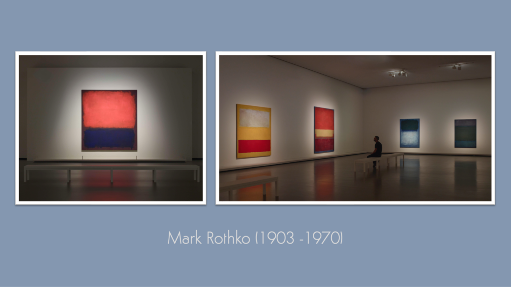
Our last Kick-About was a celebration of four years of having bright ideas and doing something about them. That makes this new edition the start of a new year of fortnightly creative challenges, and we’re kicking things off with Mark Rothko – who needs little in the way of introduction. You’ll find all previous editions of The Kick-About gathered here.
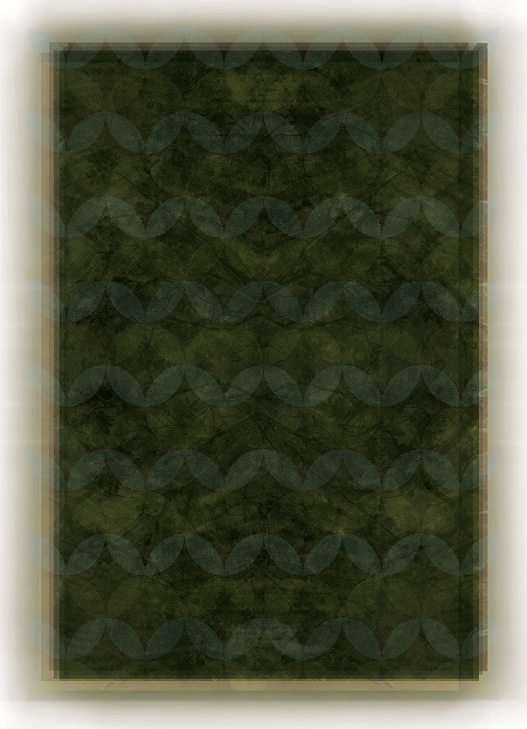
Vanessa Clegg
“I’ve based these on the dark paintings in the Tate or National Gallery? Anyway the beauty of black. I think it reflected a state of depression for the artist and many might see them in these terms… but to me, the sense of calm that the room evokes (often compared to a chapel) takes it into a more positive place that I think can be as life enhancing as the brighter paintings.” Gesso, wax, charcoal.
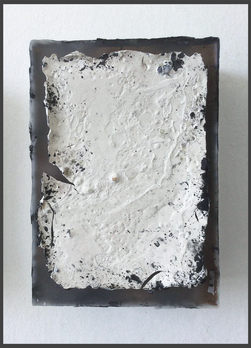

vanessaclegg.co.uk / vanillaclegg
Tom Beg
“I knew right from the start that I wanted to capture the essence of Rothko’s expansive walls of colour from a more intimate perspective. These images reflects this intention quite literally, almost as if you’re experiencing his artworks nestled amidst the spaces between those big blocks of colour.”
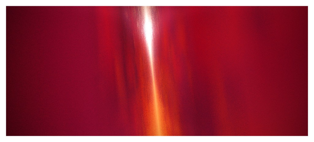

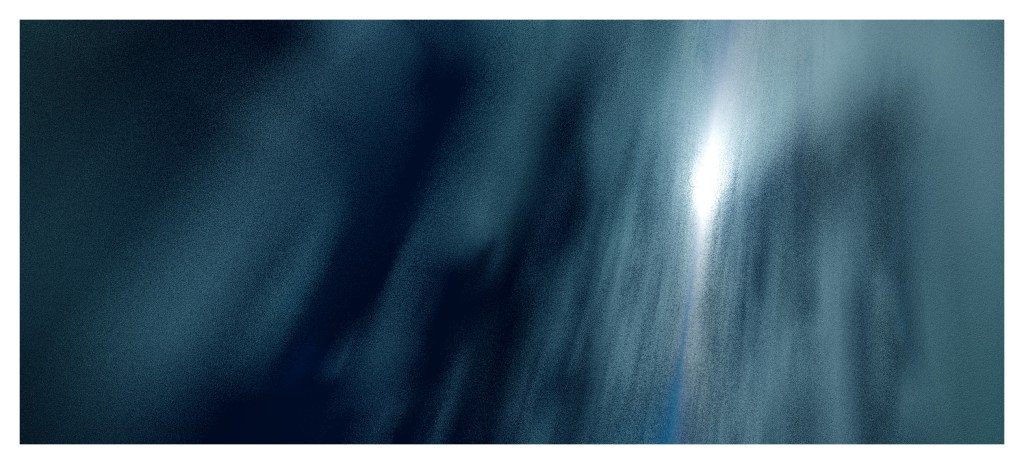

X / earthlystranger / vimeo.com/tombeg / tombeg.com
Tony Reeves
“Rothko’s paintings always remind me of those ‘magic eye’ pictures – the ones where the longer you stared at them, an image would appear. When I look at a Rothko painting, I feel like it’s a kind of overlay on top of another picture. As I stared at Rothko No.14, I started to see a stormy sky above the sea. I wanted to try and recreate the effect in the soundtrack of the picture ‘appearing’ as you listened through the track. So this composition consists of a layered synth pad which is gradually changing and undulating like the sea, and as you listen a storm starts to become audible. I also wanted to create the impression that the listened was on an old, creaking boat, so you’ll here some creaking gradually fading in. And I’ve always loved those old foghorn sounds, so one of those appears for good measure!”
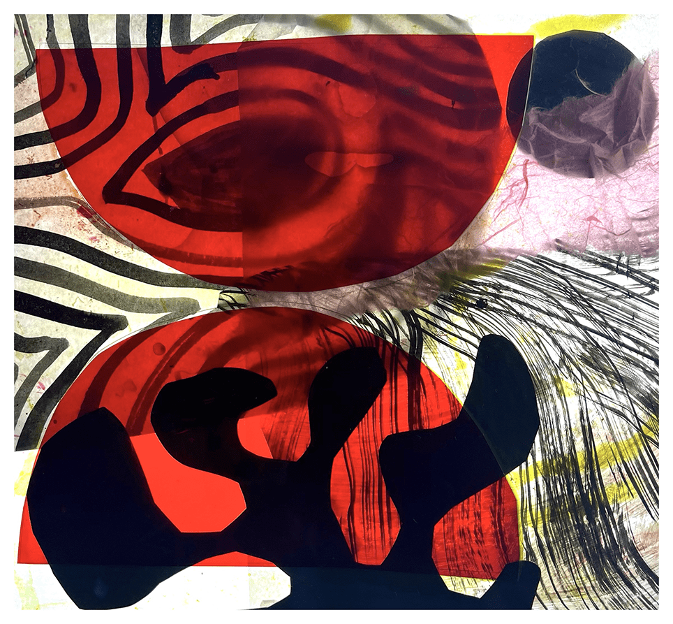
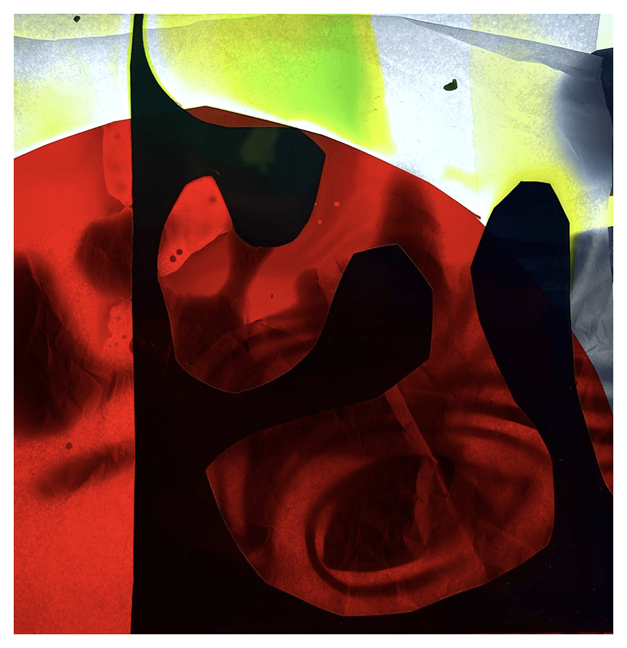
Phil Cooper
“Well you don’t get much more iconic than Mark Rothko. I remember I had a postcard of one of his paintings on my wall as a student, so I’ve been looking at these images for 40 years at least.
Like so many people, I love sitting in that gallery space at Tate Modern where the series of works Rothko made for the Seagrams building are displayed. I can’t think of any other paintings that declare themselves so strongly as objects for contemplation. The Tate gallery is a bustling space these days, full of young tourists with rucksacks, families with pushchairs, office workers who pop in on their lunch break, but the Rothko room always seems to be hushed, like a chapel. The veils of colour appear to glow in the dim lighting that Rothko had specified for these images. Even the canvases that are very dark in tone seem to throb with some kind of low frequency energy.
I’ve taken this notion of a painting that glows literally and photographed some abstract elements on a lightbox that pushes bright light through the mainly translucent shapes. I’ve always loved translucency and if I had several lifetimes I’d use one of them to be a stained glass maker. Rothko manages to get the same intensity using paint on canvas, it’s miraculous.”
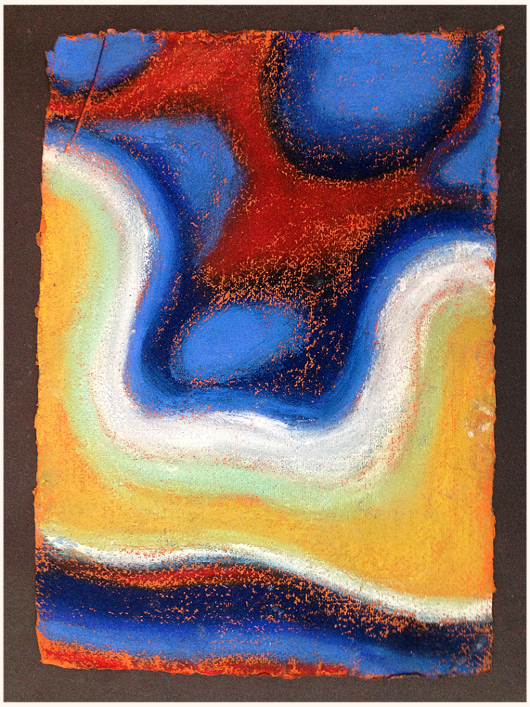
Francesca Maxwell
“I have been reading Rothko’s book on art, ‘Artist’s Reality: Philosophies of Art’, and I agree on lots of his ideas, too many to mention here; but I like what he says about painting being action and being an idea – and an idea that is always personal and a far reaching single impulse ‘that can effect the course of society more significantly in a single minute than a thousand other stimuli’. So I see his work as powerful and textural and a portal to other spaces. Here is my “idea” for this week.” Soft pastels on khadi paper.
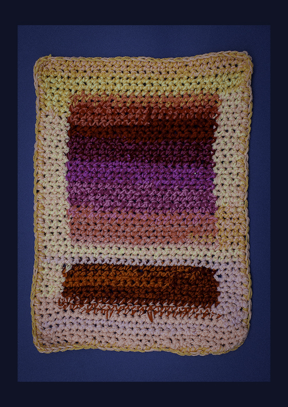
Charly Skilling
“Although it is easy to think of Rothko’s work in terms of “blocks” of colour, it is the layers and blends of colours that gives his paintings life and energy. Working with commercial yarns does not give itself to the same effect, but there is a technique I have used before with odd scraps of yarn, which I thought might create a similar effect. In essence, I worked two different coloured yarns together, as a single yarn, but switched the first colour out for another, proceeding to work the second and third colours together. Then I switched out the second colour to a fourth, which was then worked with the third for a while, and so on. My first effort (red/orange/yellow) created some interesting colour mixes, but I didn’t pay enough attention to the tension in the combined yarns, so ended up with rather irregular shapings. My second effort (red/pink/purple) is technically a better effort, but I feel the colour mixes are less free, somehow. However, an interesting experiment.”

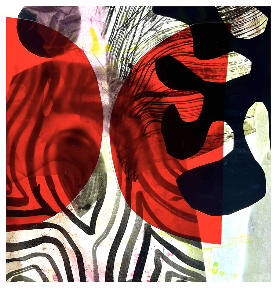
James Randall
Rothko is a supreme being. Looking into a late Rothko is like looking through the earth. So still and humbling, which took me back to the x-ray Kick-About – waves through substance – which made me approach this KA as a combination of energy and substance, where the substance is a layering of photos of rock – mirrored and offset in harmonious earth tones – and the energy (after several attempts with other visual elements) is an overlay of line work. The key seemed to be balance. I did water and forest versions as well.

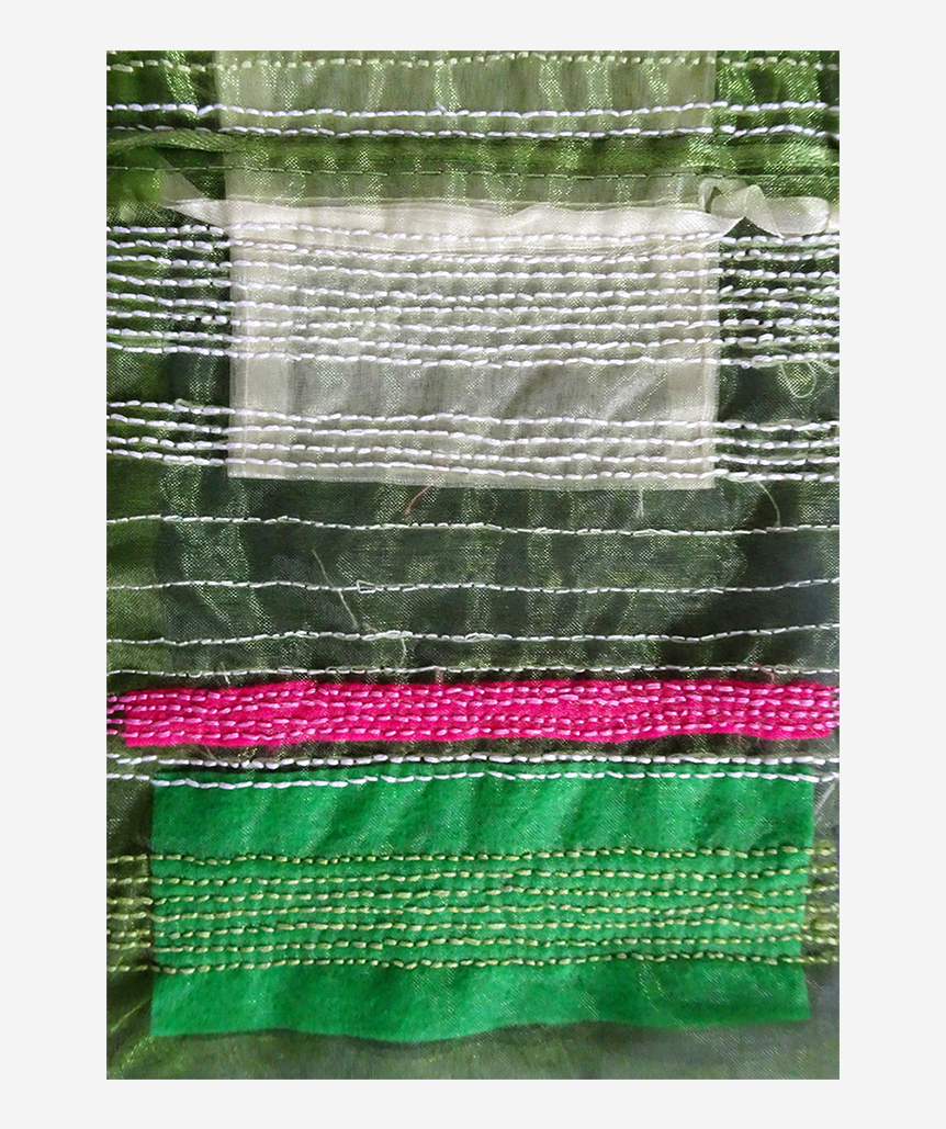
Kerfe Roig
“I have no elaborate explanation for this. I found some rectangular transparent bags and small pieces of felt in a bin of possibly useful things and appliqued and embroidered them. The black and grey one didn’t really photograph well, but I guess that means it captured some of Rothko’s subtlety with color. Also, because the bags were transparent, I photographed them on both black and white, which gives a different effect.”


kblog.blog / methodtwomadness.wordpress.com
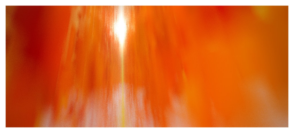
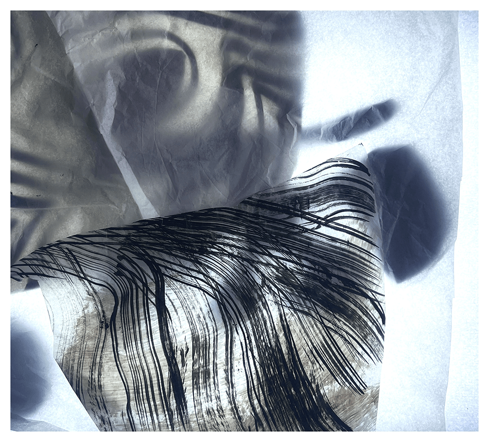
Phil Gomm
“As seasoned Kick-Abouters will appreciate, the muse, when it strikes, can take many unexpected forms; a few weeks ago, I was in the vicinity of an empty swimming pool, recently stripped of its waterproof lining. Unlikely though it may seem, the concrete interior of the pool was a rather extraordinary space, with surfaces so painterly, so textural and so spatial, I spent a good few hours in there with my camera. The concrete itself was wet, but as more time passed and it dried out, the colours and the patina of the swimming pool’s walls changed again, moving slowly towards something much less arresting. Anyway, I had a blast down there and the resulting images were certainly Rothko-esque, in so much as they seemed to open up and out into suggestions of wide, expansive dimensions…”
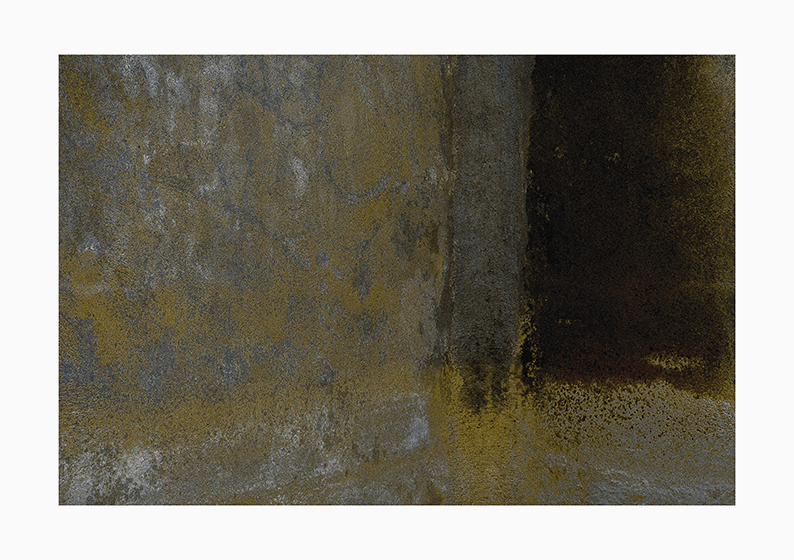
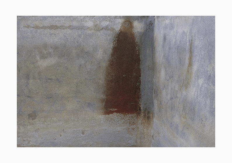
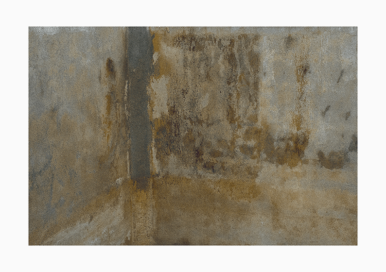
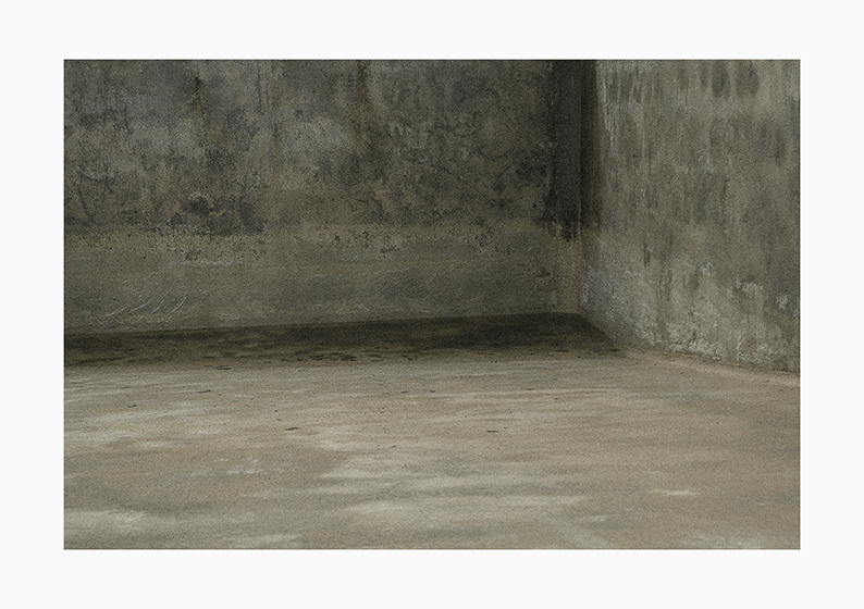
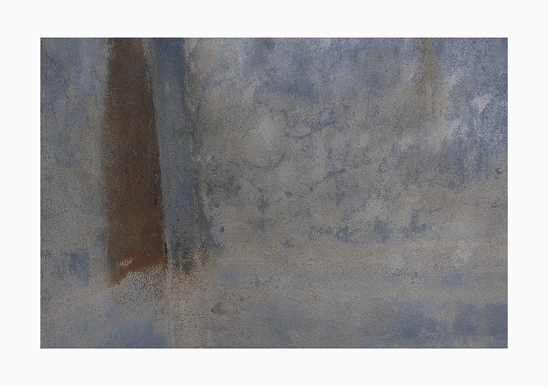

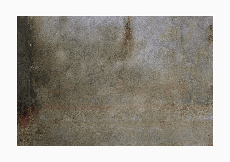
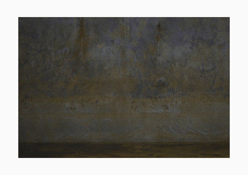
“… and to perhaps capture that experience of these surfaces transforming gently as they dried out, I put together this slow little something.”
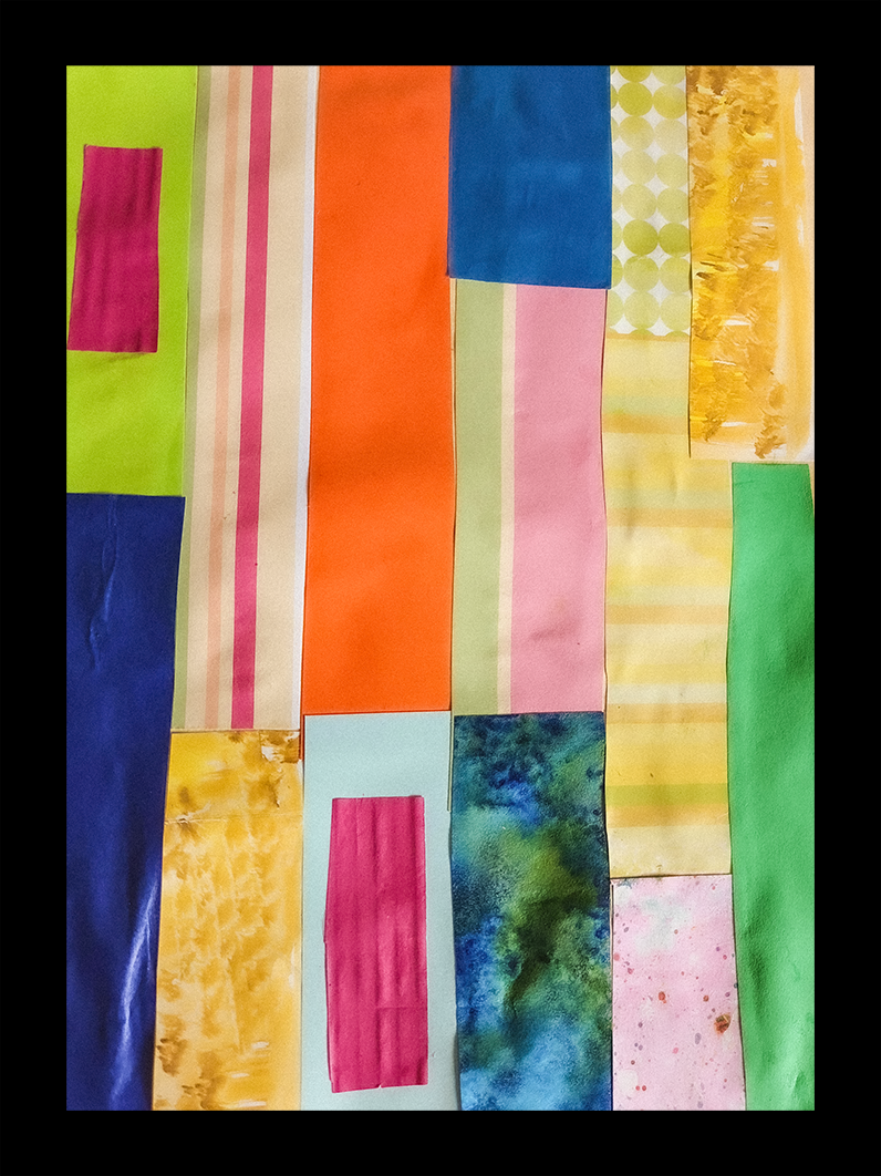
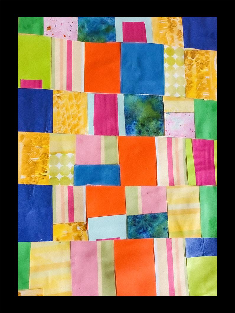
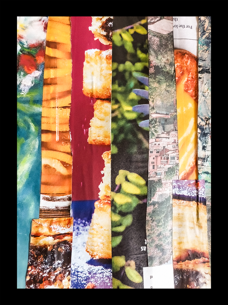
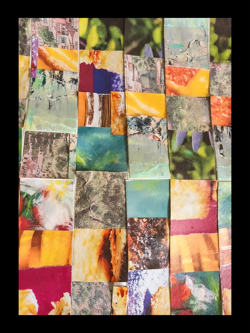
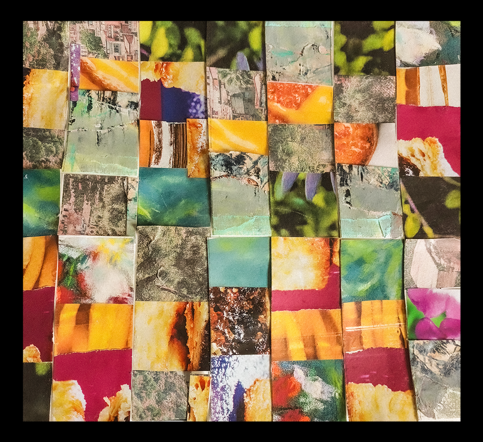
Marion Raper
“When I saw Mark Rothko’s abstract paintings I loved his use of colours with which he aimed to express human emotions. I am a lover of bright colours and however I begin my artistic endeavours they always tend to end up in a lively colour scheme rather than muted or dull. My thoughts straightaway arrived with the comparison of Rothko’s art to a type of patchwork made by the Seminole native people of America. They also used bold and contrasting colours, joining material strips before cutting them and joining them again to make beautiful but simple designs. Apparently this was originally a way of using up scraps of material to make clothing in difficult times but which developed into distinct designs. I decided to copy this intriguing method of Seminole patchwork but using paper strips, firstly with plain colours and then using more decorative and patterned pages cut from magazines.”
Gary Thorne
“I could not imagine crafting a depth of intensity alike to Rothko. This is a simple alternative offered up by the wood burner.”
Graeme Daly
“I wanted to exaggerate the scale of Rothko’s paintings and throw in a bit of those mysterious monoliths from Kubrick’s A Space Odyssey”
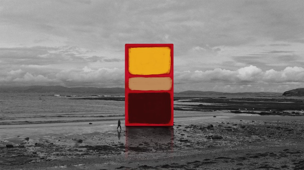
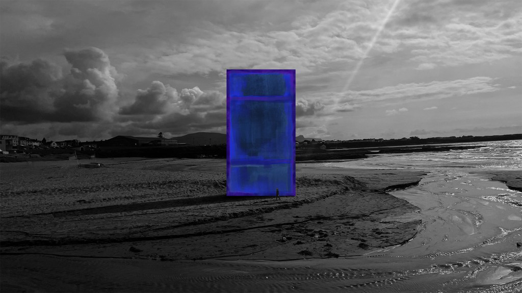
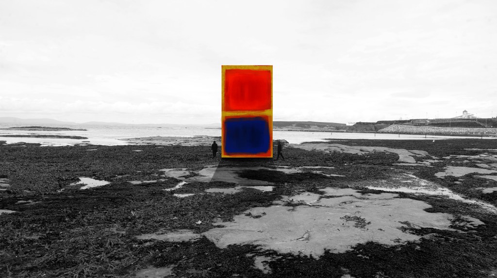
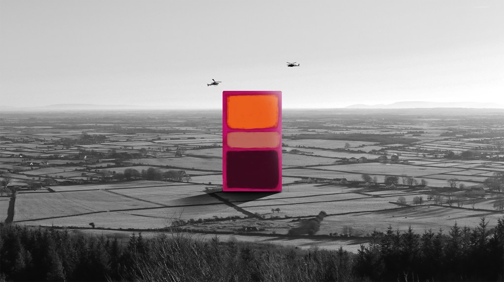
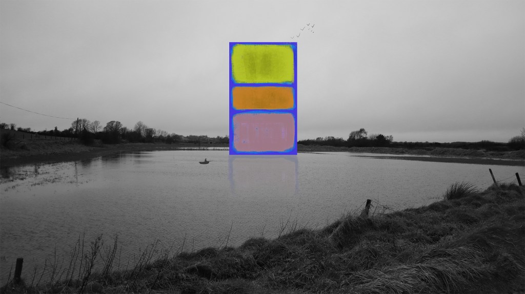
@graemedalyart / vimeo.com/graemedaly / linkedin.com/in/graeme-daly / twitter.com/Graeme_Daly / gentlegiant.blog
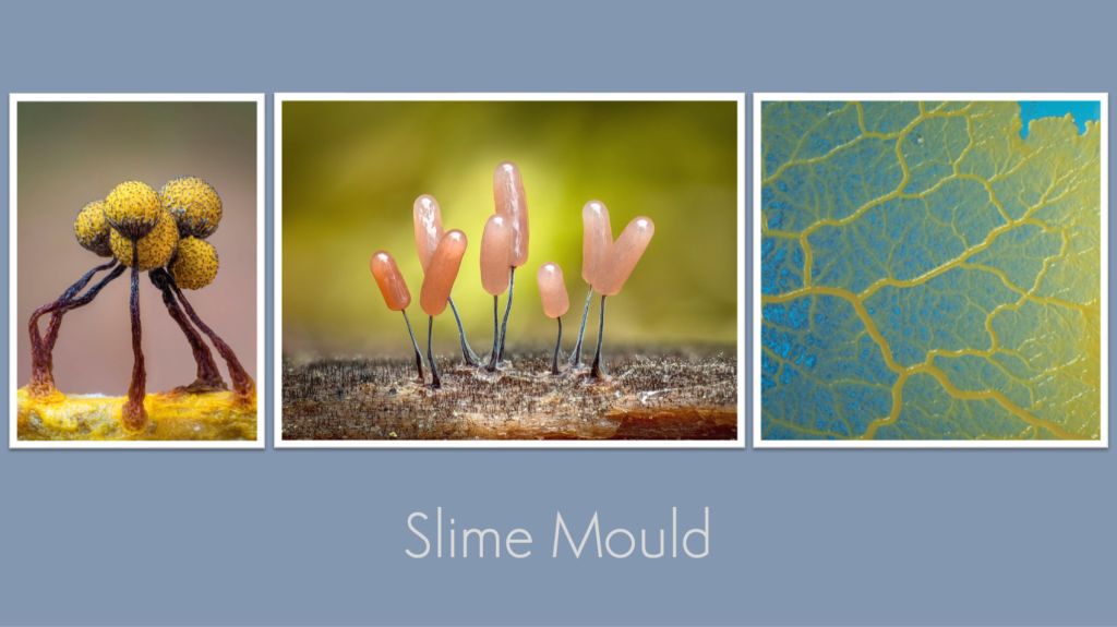
And from Rothko’s expansive horizons to some extraordinary realms on a much smaller scale!


8 responses to “The Kick-About #105 ‘Mark Rothko’”
-

[…] again, moving slowly towards something much less arresting. Anyway, I had a blast down there and the resulting images were certainly Rothko-esque, in so much as they seemed to open up and out into suggestions of wide, expansive […]
LikeLike
-
[…] response to the Rothko-inspired Kick-About this week, I spent several happy hours standing inside the concrete confines of a newly emptied […]
LikeLike
-
A wonderful array of artworks to peruse!
LikeLike
-
[…] Our last Kick-About inspired new works made in a short time exploring the wide, unbounded expanses of Mark Rothko’s paintings. This week, the Kick-Abouters turn their attentions to the weird and wonderful world of slime moulds. For all previous editions of The Kick-About, click here. […]
LikeLike

Leave a comment