
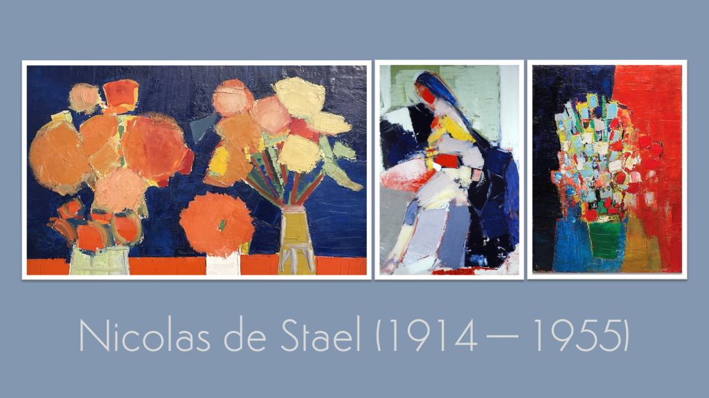
In our last Kick-About, we turned to finger puppets — small, handmade figures full of play and character. This week, the focus shifts toward something more pared back. Our prompt looks to Nicolas de Stael, an artist known for his bold planes of colour and quietly powerful compositions. As always, the works that follow were made in a short time — and for all previous editions of The Kick-About, go here.
Vanessa Clegg
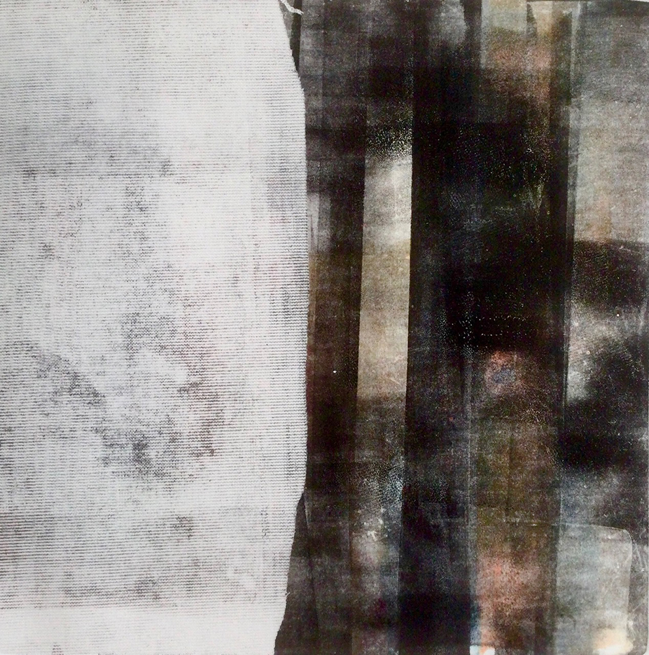
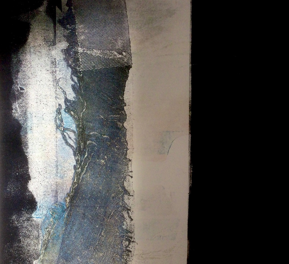
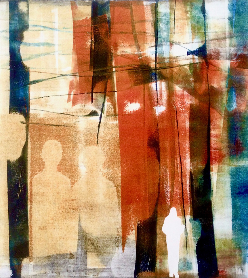
“I’ve recently been spending a lot of time in the print room experimenting with monotyping, and I thought I could tap into the abstract/figurative aspect of de Staël’s paintings via this technique. Also, unusually for me, colour actually came into it, so switching from painting and drawing to printing pushed my work beyond monochrome — well, a bit — which was a welcome change.”
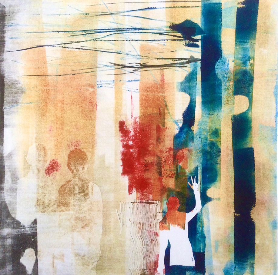
vanessaclegg.co.uk / vanillaclegg
Charly Skilling
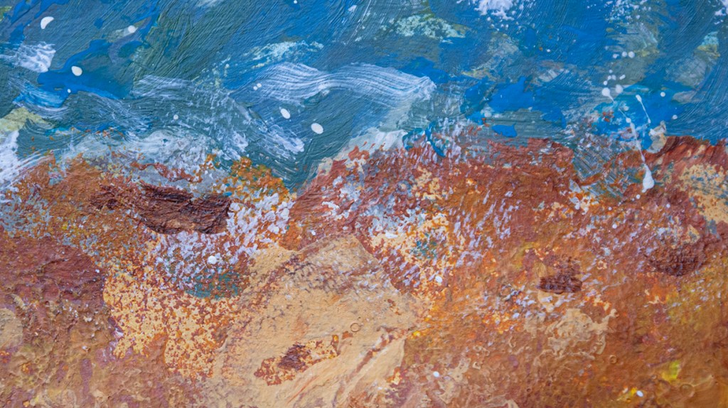
“Much of the commentary on Nicolas de Staël that I read seemed to focus on his semi-impressionist style and his use of impasto techniques. I haven’t used impasto in any serious way, so I thought this might be a good opportunity to try. I used acrylic paint on paper and kept the composition as simple as possible. I should have thickened the paint more and/or applied more layers — I shall know better next time. However, I was quietly pleased with the result and will definitely try it again.“
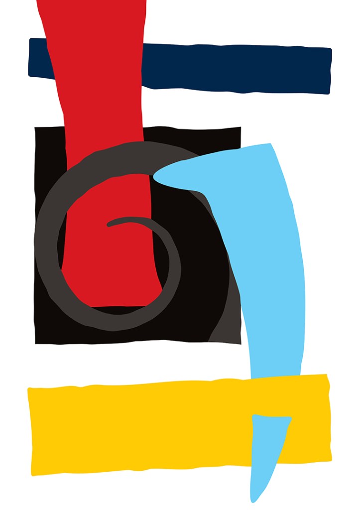
Kerfe Roig
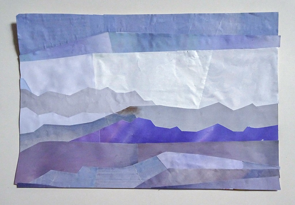
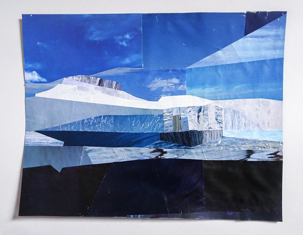
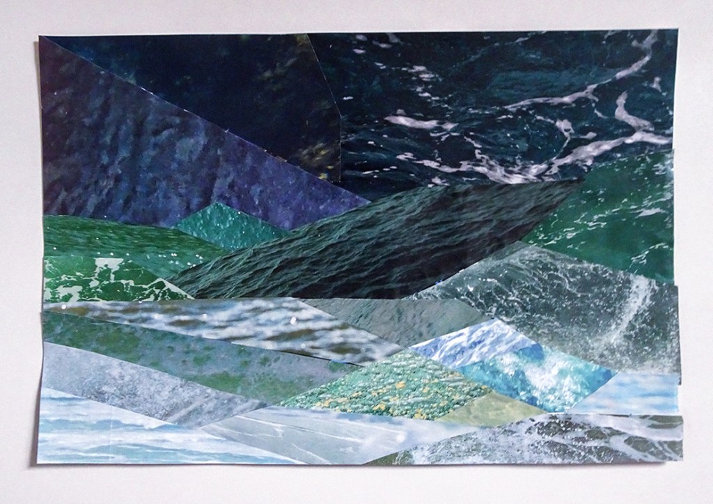
“I did some land/seascapes, fragmenting them into geometric shapes in an attempt to imitate de Staël… it’s harder than it looks.”
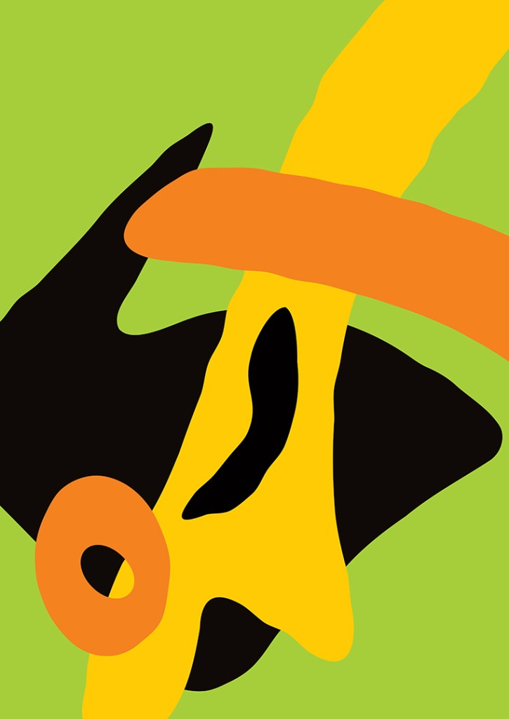
James Randall
“The simple shapes of de Staël’s work were a great jumping-off point, but as I went along it all became a bit florid. My first picture was an Orpheus riff, as were 2 and 3. Number 4 is a man with a chicken. Number 5 was toying with the idea of being in front of, and behind, a screen, and 6 went on from there!”
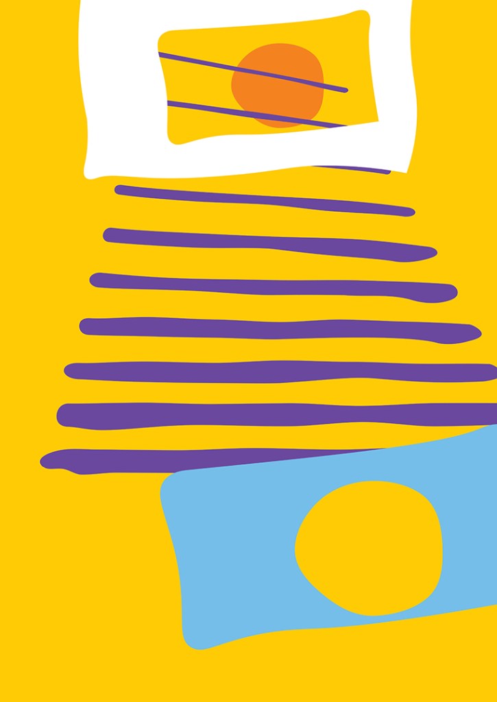
Jan Blake
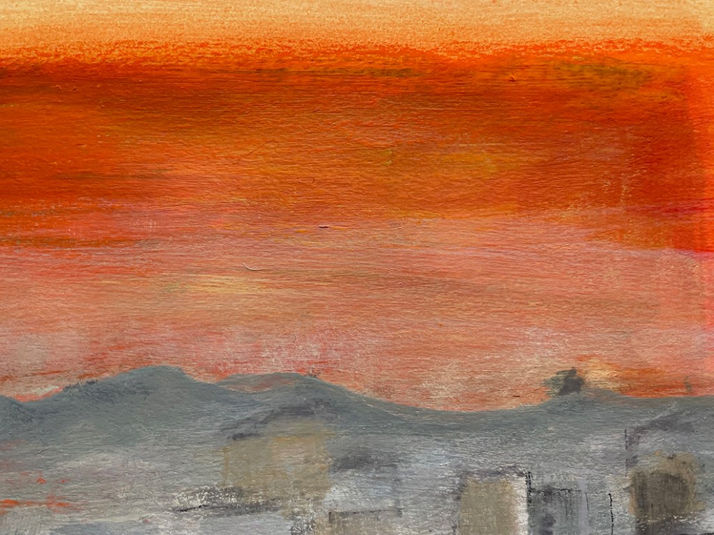
“I didn’t buy many books in the early days when I was at college. For some reason, I bought one about Nicolas de Staël that I still have. It was a total contrast to the hard-edged paintings we were being guided to emulate. Even with masking tape, that was always a disaster for me to accomplish. So I was intrigued to look at his work again and understand a bit more about his paintings — far more complex than a quick glance might suggest. During the last week, I woke up to this amazing orange sky, the result of the wind blowing sand from the Sahara. It turned a rather grey Bristol into something quite magical for a little while. Much harder to capture than I thought!“
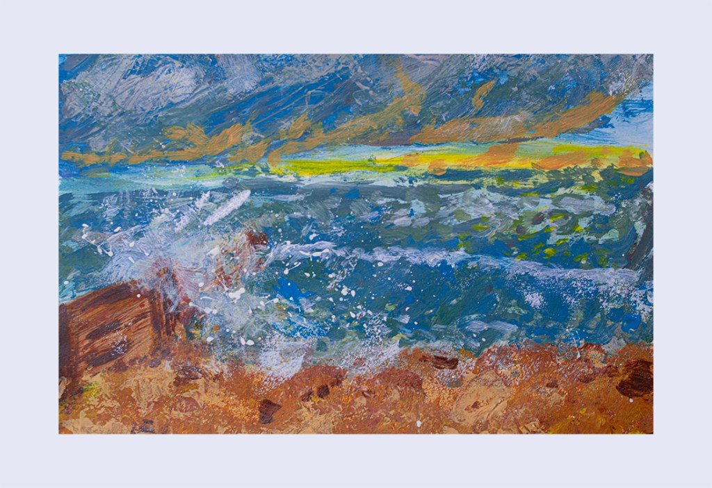
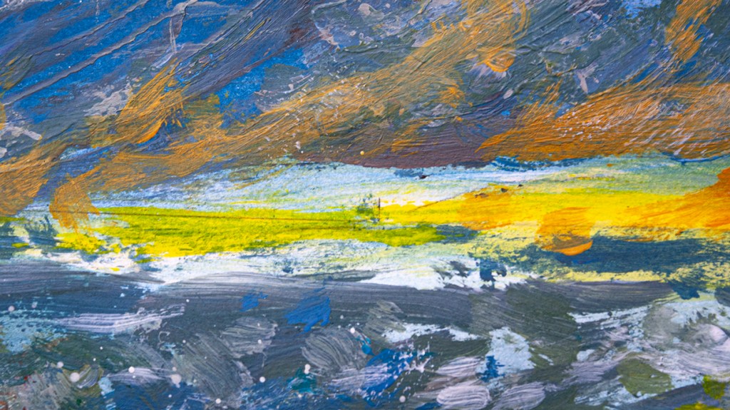
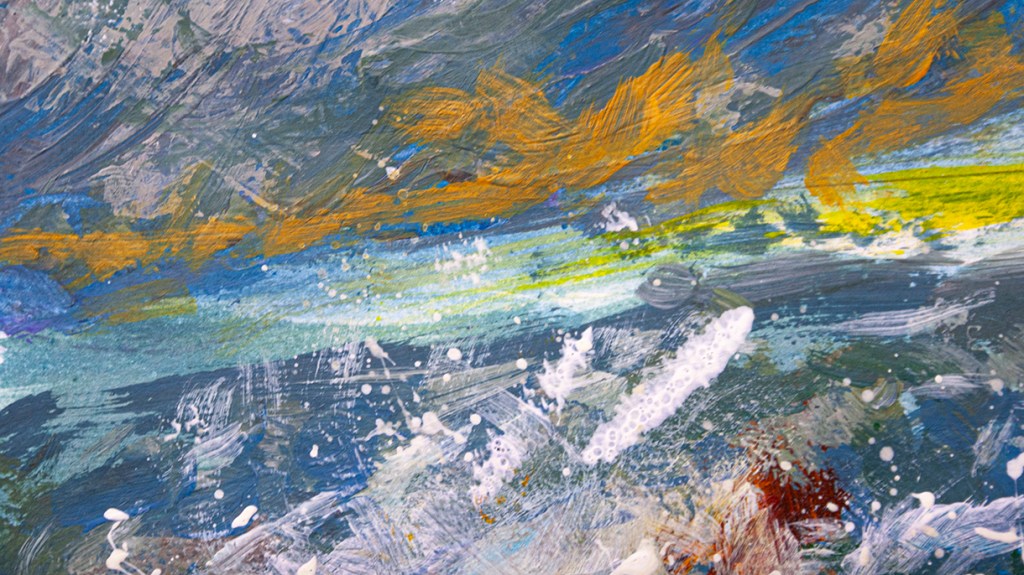
Phil Gomm
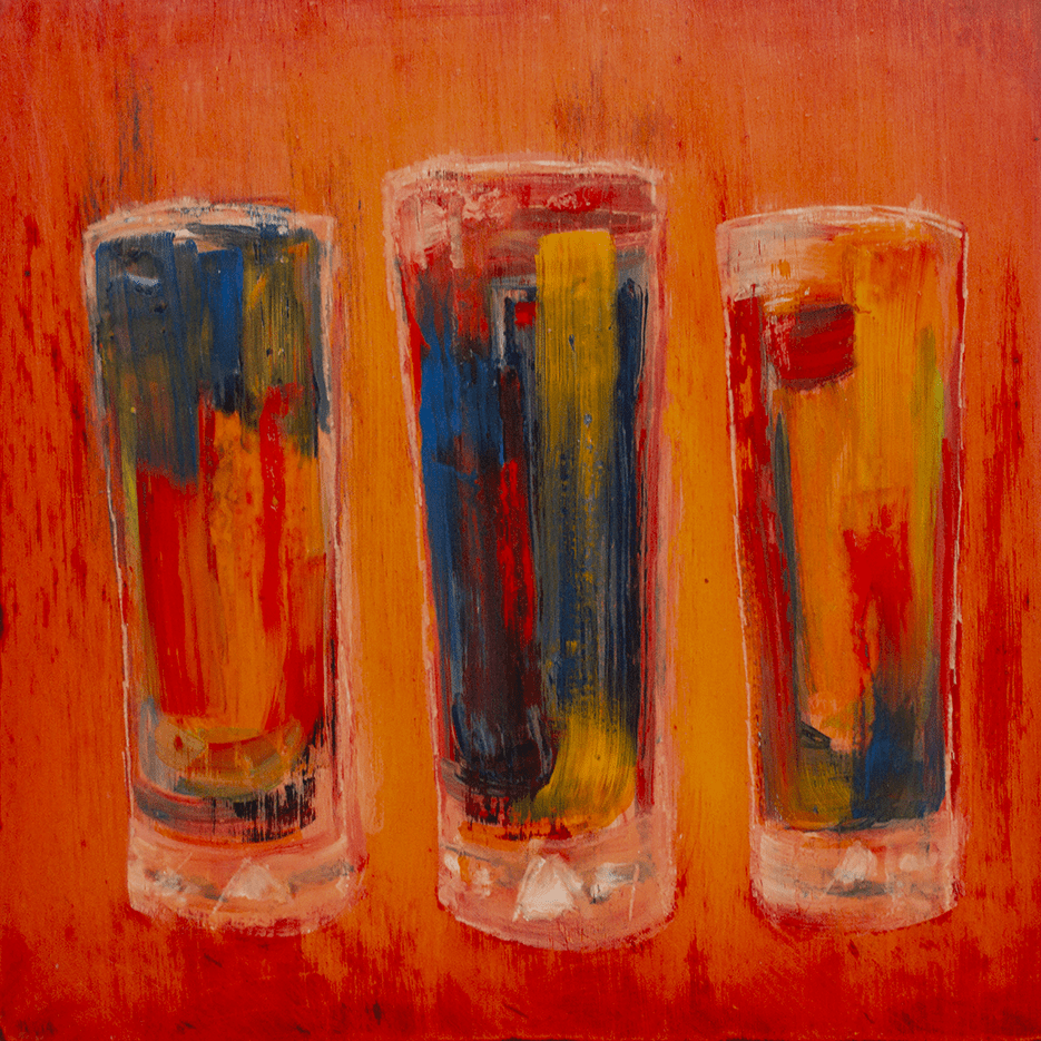
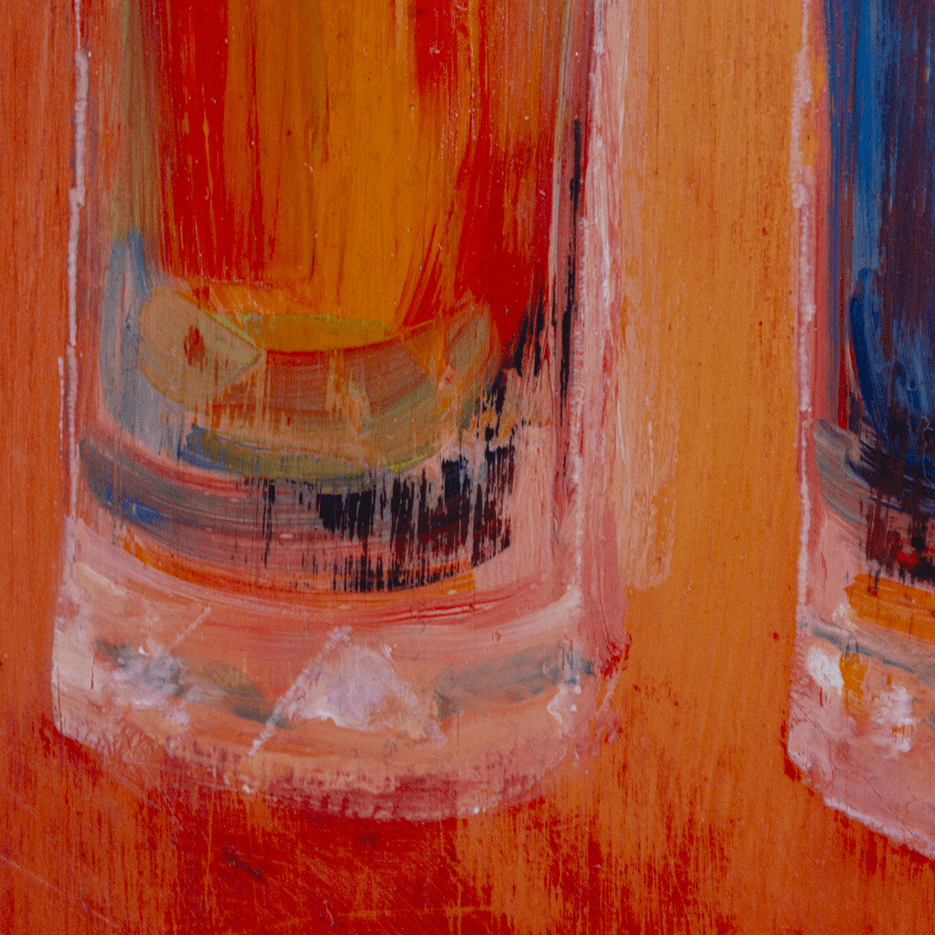
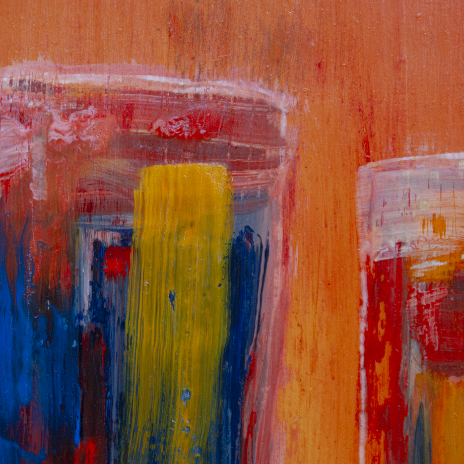
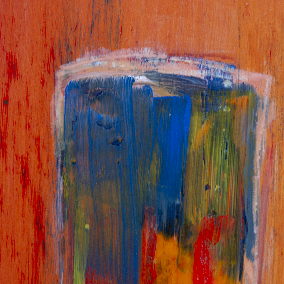
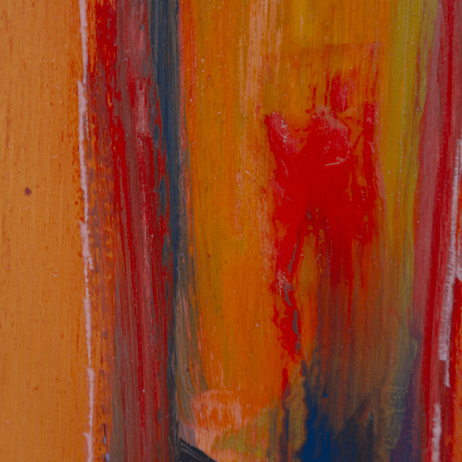
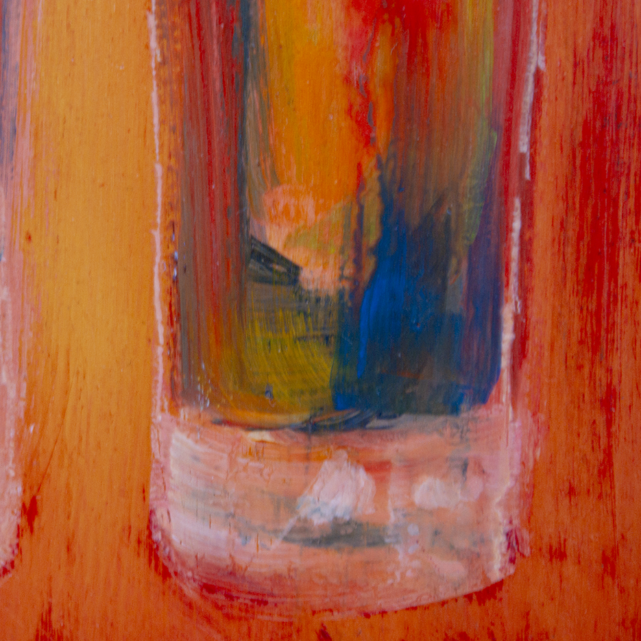
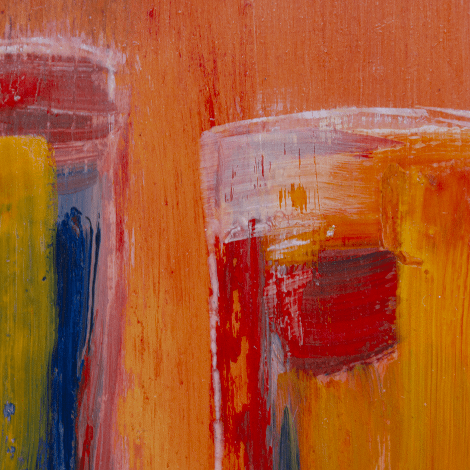
“In good Kick-About style, I took this prompt as an opportunity to try my hand at oil painting. I don’t paint much, and never in oils, so I didn’t quite know what to expect or what I was going to do. We have these three narrow coloured-glass tumblers, which I set on a bright orange background and lit from behind. I worked from a photograph of the set-up and simply made a start by painting my small wooden board with lots of orange. After that (and drying the paint in the oven to speed things up), I began to depict the tumblers, varnishing between layers, letting it dry again, and then using very fine sandpaper to work backwards into some of the colours. I continued this process until I arrived at something I liked.
I enjoyed myself — particularly the idea of using sandpaper as a kind of ‘putty rubber’ to pull out patina. Another happy accident was how the scouring would sometimes find thicker, wetter paint and drag it around a bit. Not sure if this counts as ‘painting’! Didn’t really notice how ‘on the wonk’ the tumblers were – leaning to the left a bit – until I photographed them and saw them on here…”
philgomm.com / behance.net/Phil_Gomm
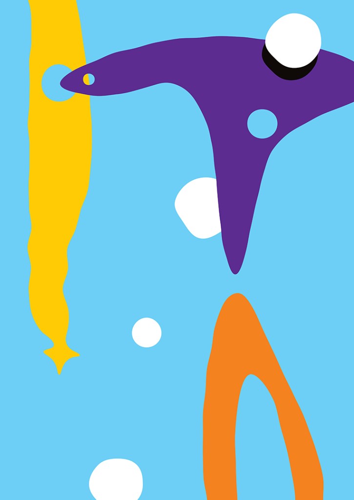
Francesca Maxwell
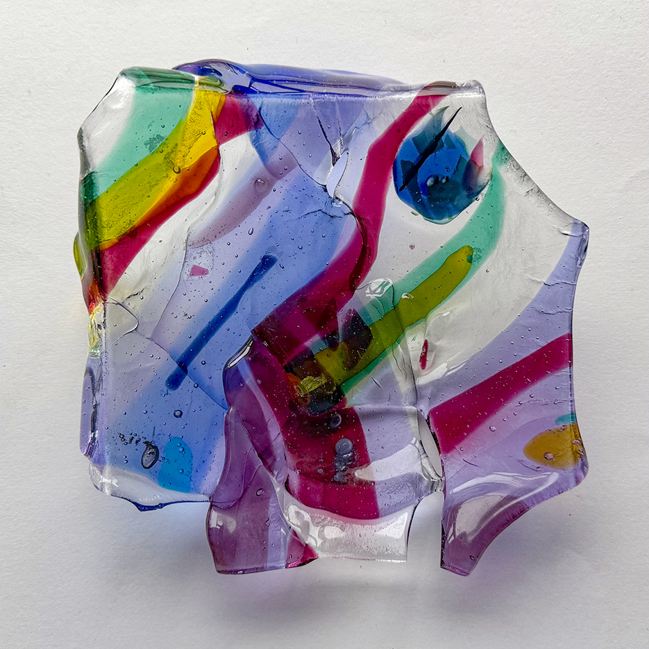
“I like de Staël’s paintings a lot, probably because they are so bold. They must have felt very new at the time, and they’re so different from mine. I thought the bold glass shapes might have a similar feel to his work, and I enjoyed fusing, breaking, and re-fusing this piece.”
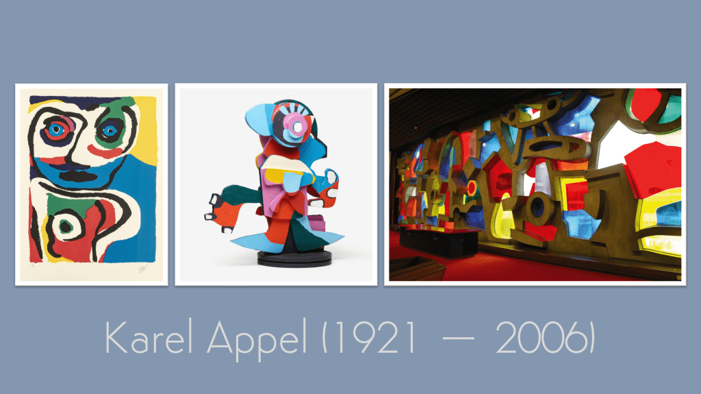
Next time, our prompt turns to the exuberant colour and childlike energy of Karel Appel, an artist who believed painting should be instinctive and free.

Leave a comment