

From the lovely free-wheeling associations of our last Kick-About together, to the pared-down, typographic compositions of graphic designer and film-maker, Saul Bass, welcome to another showcase of new works made in a short time.
Vanessa Clegg
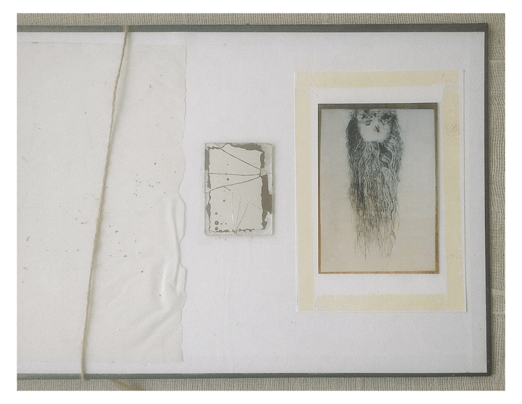
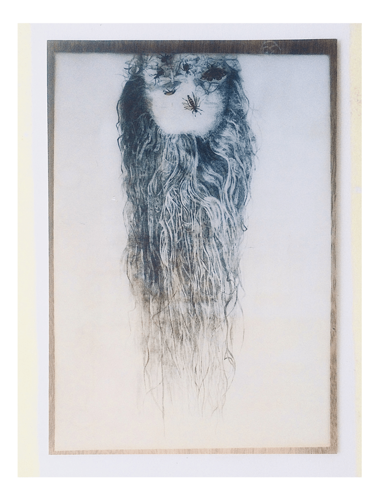
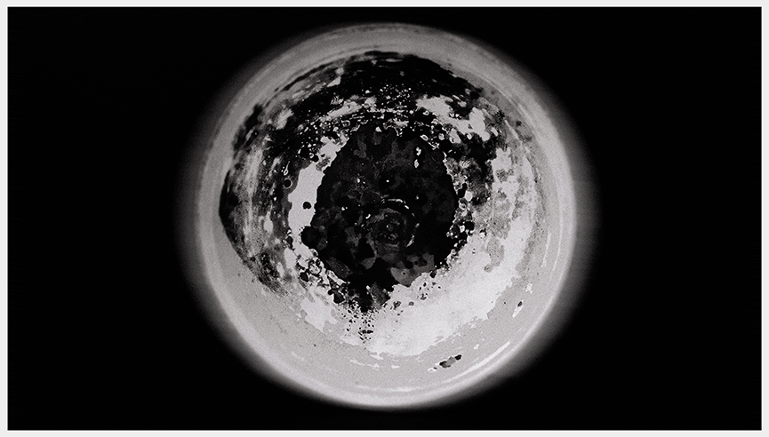
“Lots of ideas came and went with this prompt, including the darkness of present day Ukraine but, finally, I settled on something that had, hopefully, a sense of vertigo, as well as a tinge of Hitchcock. I remembered a trip to New Zealand, during which there was a minor earthquake. I was standing outside having walked in a surprisingly calm manner out of the vibrating house (no damage) and watched frozen to the spot, the feeling of the earth beneath my feet no longer being solid, static and secure but moving in waves – a living thing – resulting in a true loss of balance.” Tracing paper, string, cracked mirror, graphite and watercolour on gesso.
Kerfe Roig
“When I looked at the work of Saul Bass (familiar, although I did not know his name) word collage seemed the obvious response. I didn’t overthink it.”
haunted by an inferno of blood
shattered by grief–
why this needless danse macabre?
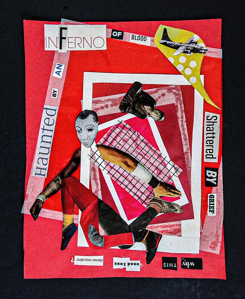
if you follow fate
far away to the return of time
understand
that the passage
into prophecy and myth
is final
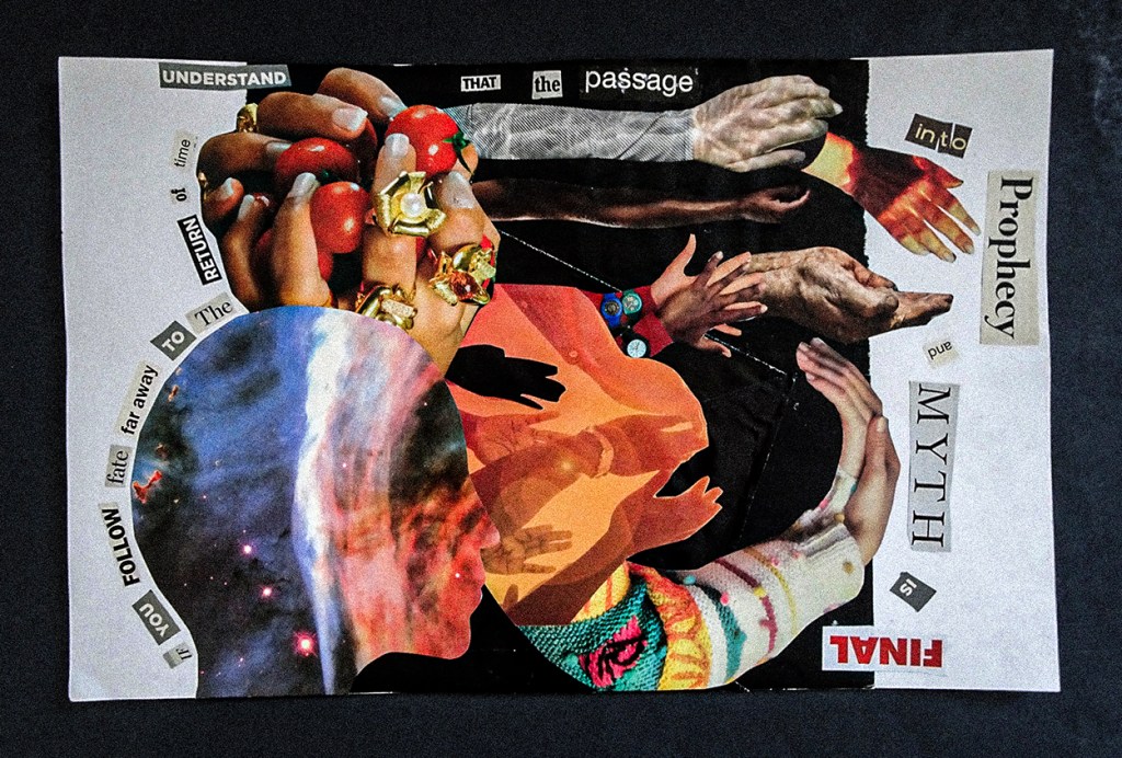
when the hidden clue
is fluctuating between
sinister truth
and the vestiges of myth
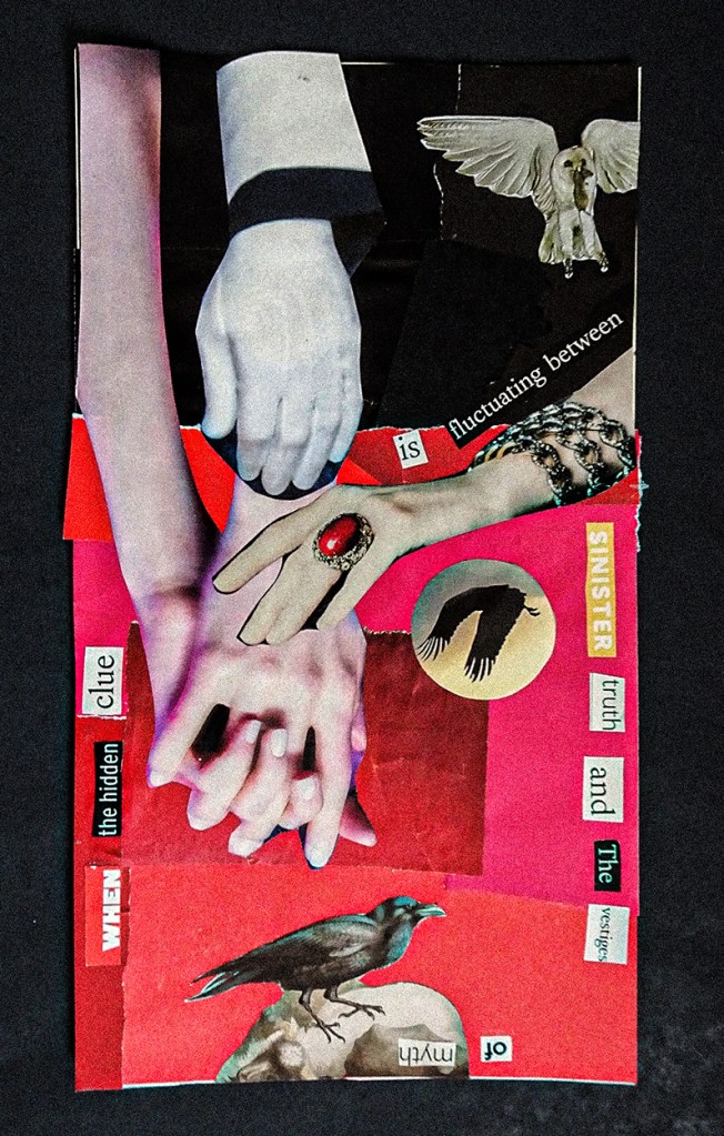
kblog.blog / methodtwomadness.wordpress.com
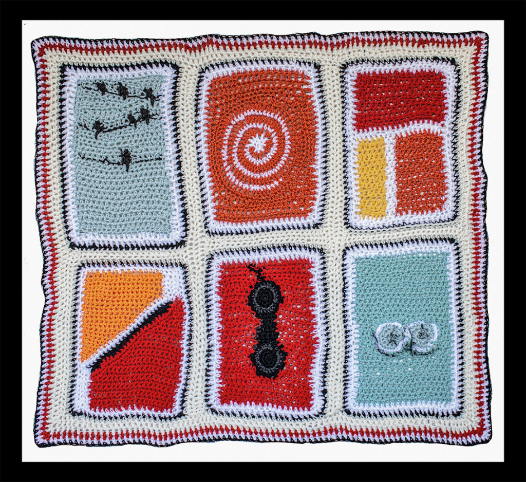
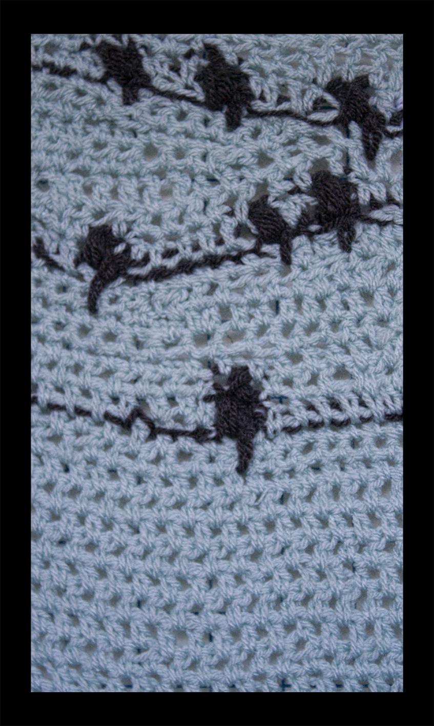
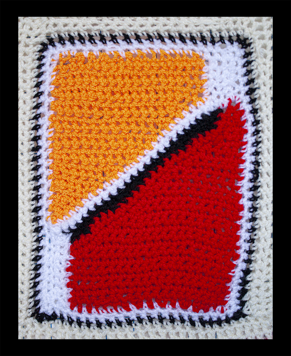
Charly Skilling
“Although I did not know the name of Saul Bass before this prompt, much of his work was instantly recognizable. Here are the film posters I grew up with, and I had a really fun time playing with the colours, the geometrics, and the directness of Bass’s images. I had to find some new techniques and some worked better than others, but overall, I am pleased with the finished object. So next time I want to curl up on the sofa to watch a classic movie, my “Movie Night” throw will be right there with me!”
Graeme Daly
“Some Saul Bass inspired illustrations from the gorgeous and brutal The Handmaid’s Tale. Its stunning red and teal colour palette was truly calling for it!”

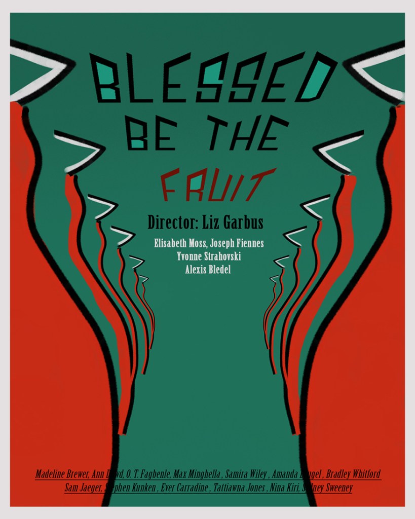
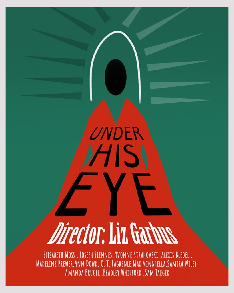
@graemedalyart / vimeo.com/graemedaly / linkedin.com/in/graeme-daly / twitter.com/Graeme_Daly / gentlegiant.blog
Tom Beg
“The work of early motion designers like Saul Bass and John Whitney is something of an enigma, which I think comes from a certain looseness hard to replicate using modern digital animation techniques. Recently, I have begun to pick up a bit of coding to supplement my usual creative outlets and try to understand an entirely new way to generate art and animation that just a few months ago had basically been totally unknown to me. Despite what may sound like quite a rigid and unforgiving system of creativity, I have found there is a kind of looseness in programming graphics that is a lot of fun to play with. Add a few lines or numbers and expressions and just see what happens. Sometimes you can produce some unexpected and interesting results that harken back to the days of the early computer artists and graphics designers.
As for me, it’s very early days, as far as my skills go, but I have been able to produce a few little interesting bits. One of the exciting things about using code is that nearly everything can be randomised or given a level of user interactivity. No two images or animations will appear the completely same. Feel free to generate your own unique versions of these images using the links below.”
Saul Bass Inspired Spirals: https://openprocessing.org/sketch/1508265
Lissajous Curves: https://openprocessing.org/sketch/1510216
Painterly Swirls: https://openprocessing.org/sketch/1508666
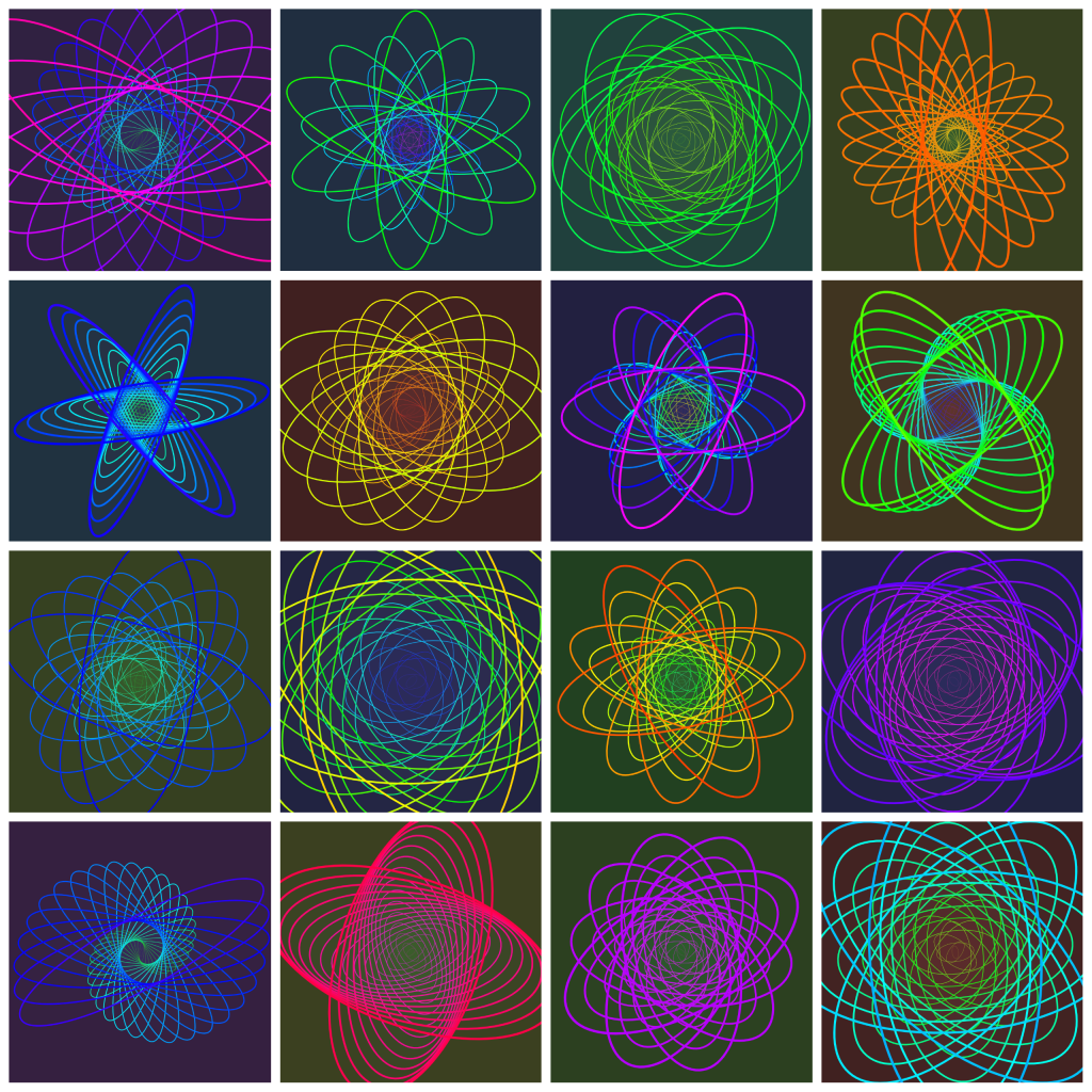
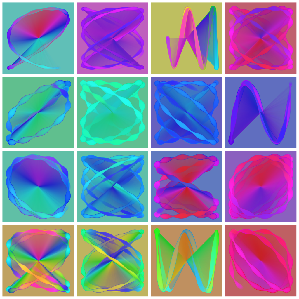

twitter.com/earthlystranger / vimeo.com/tombeg / tombeg.com
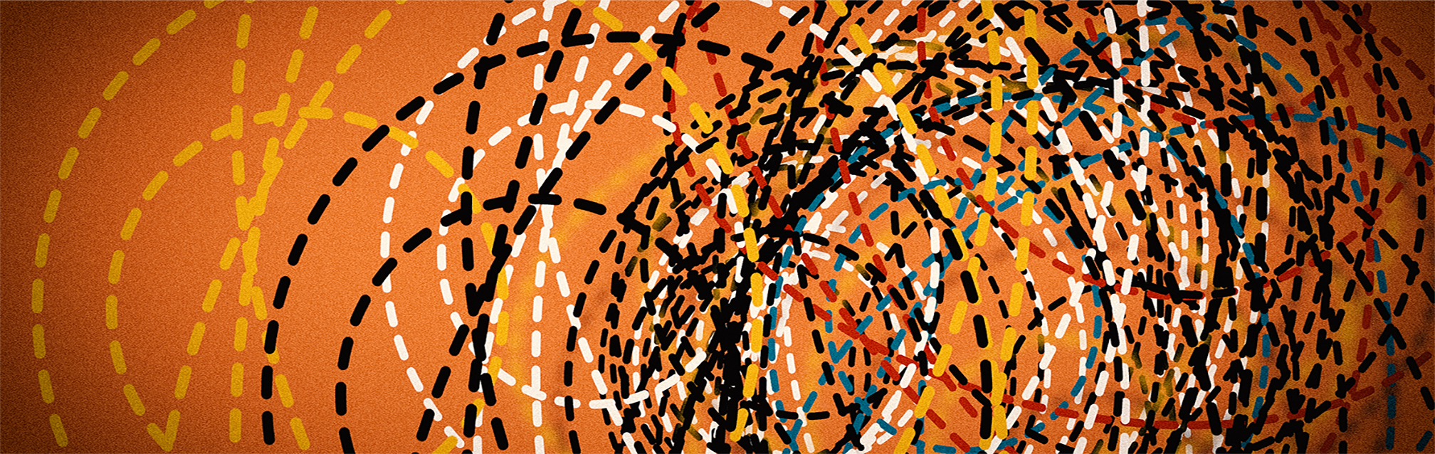
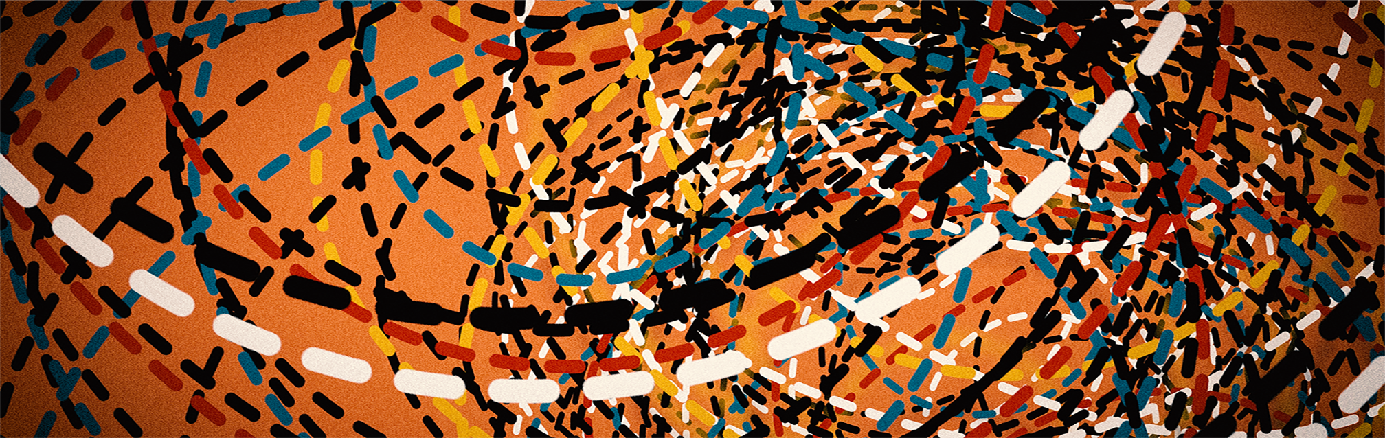
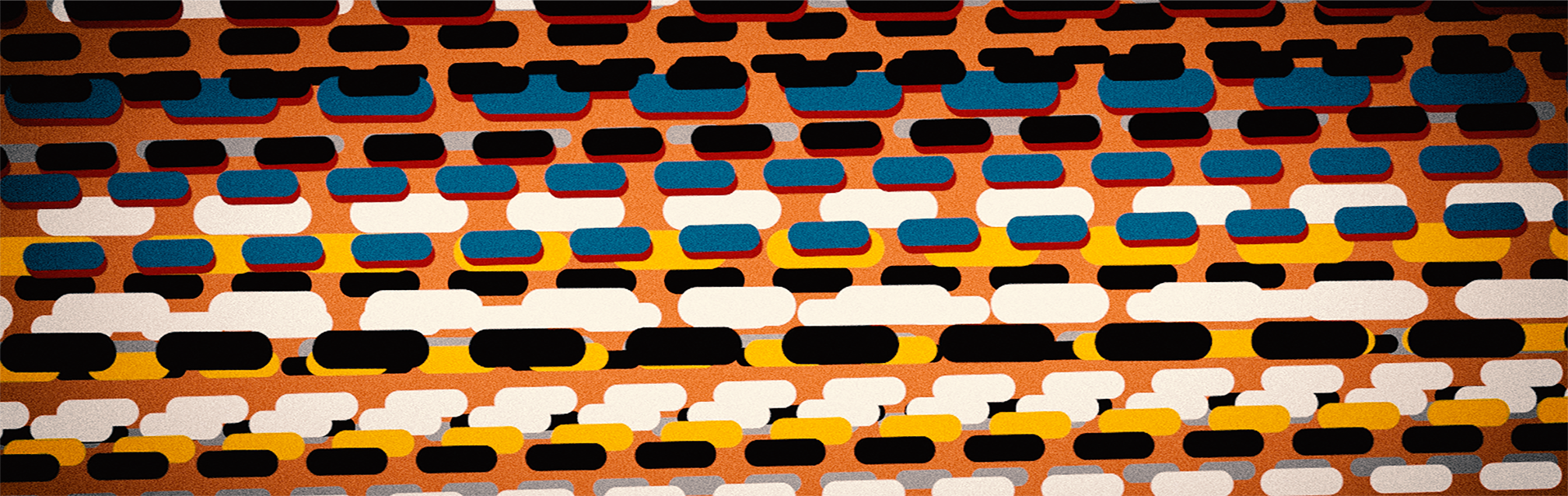
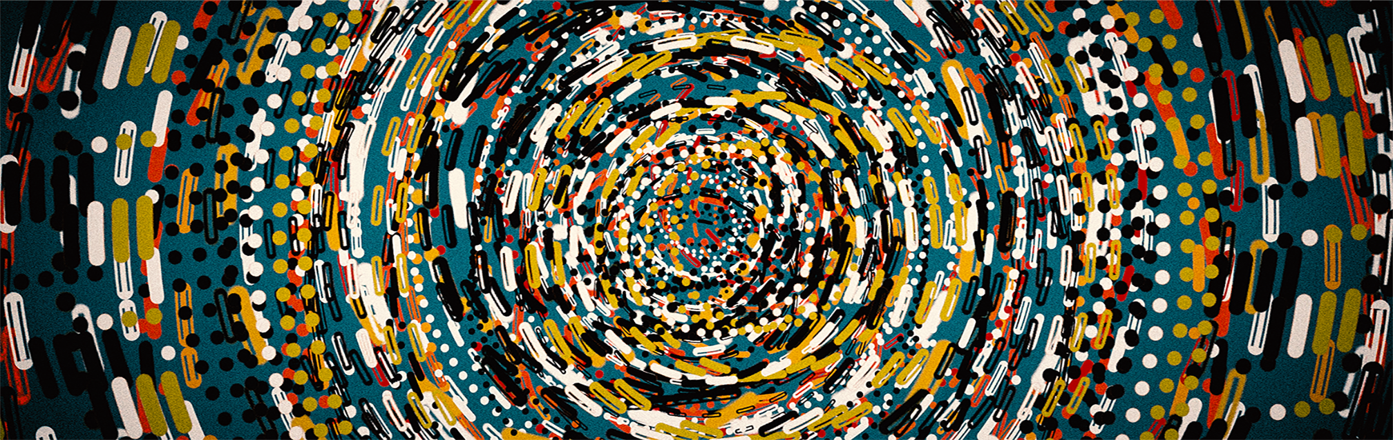
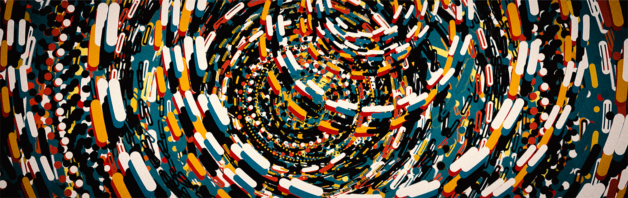
Phil Gomm
“Back when I was teaching an undergraduate course, one of my yearly highlights was a screening for students of Alfred Hitchcock’s Psycho on the big screen. There are many showier reasons for enjoying this film, but I always loved the Saul Bass-designed opening titles – those simple horizontal lines sliding in across the frame with such urgency, while Bernard Herrmann’s score propelled them along. Working with a few simple elements – dots and dashes, lines and ellipses – I set about producing an affectionate fantasia on some Bass-inspired themes.”


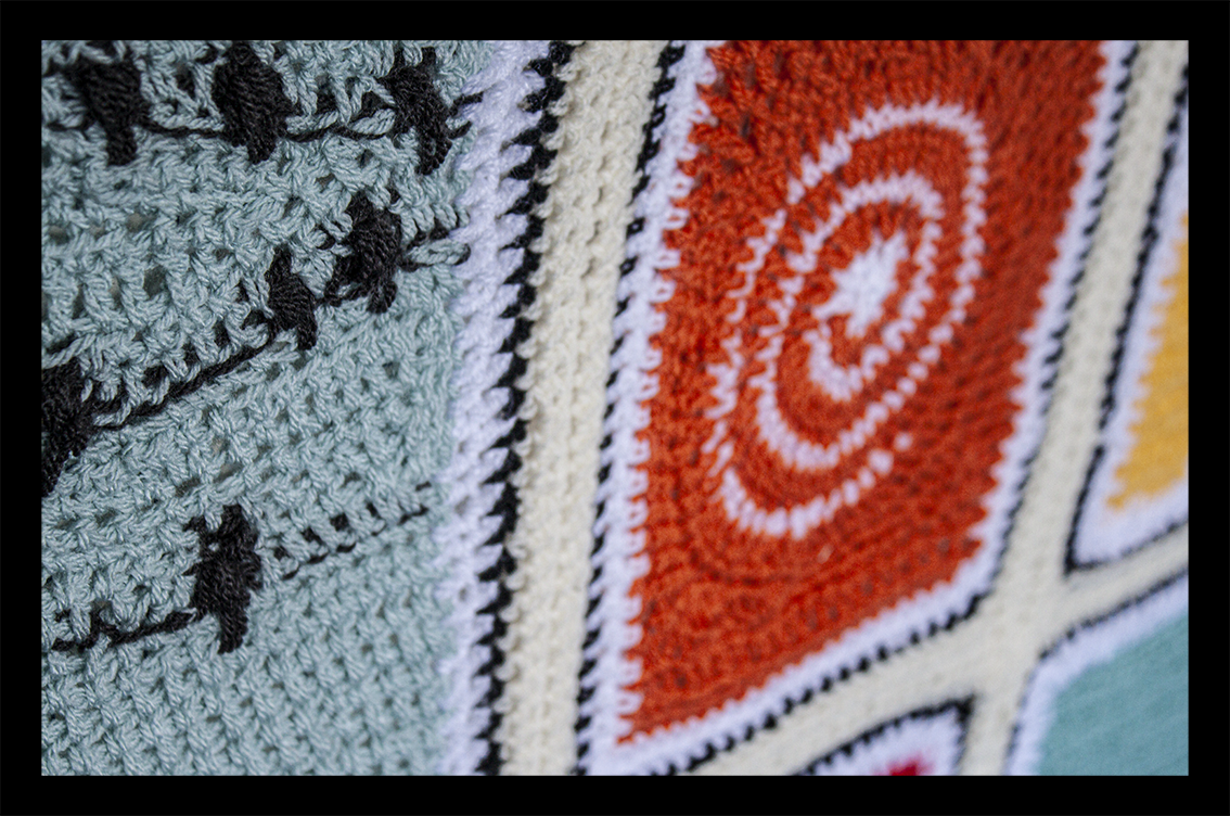
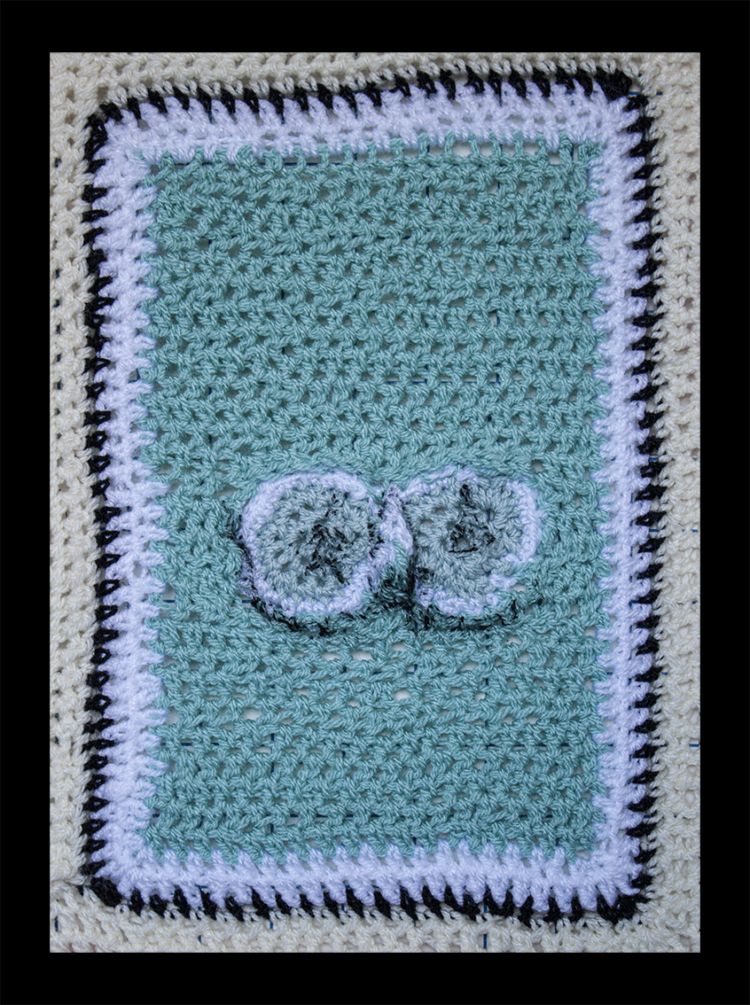
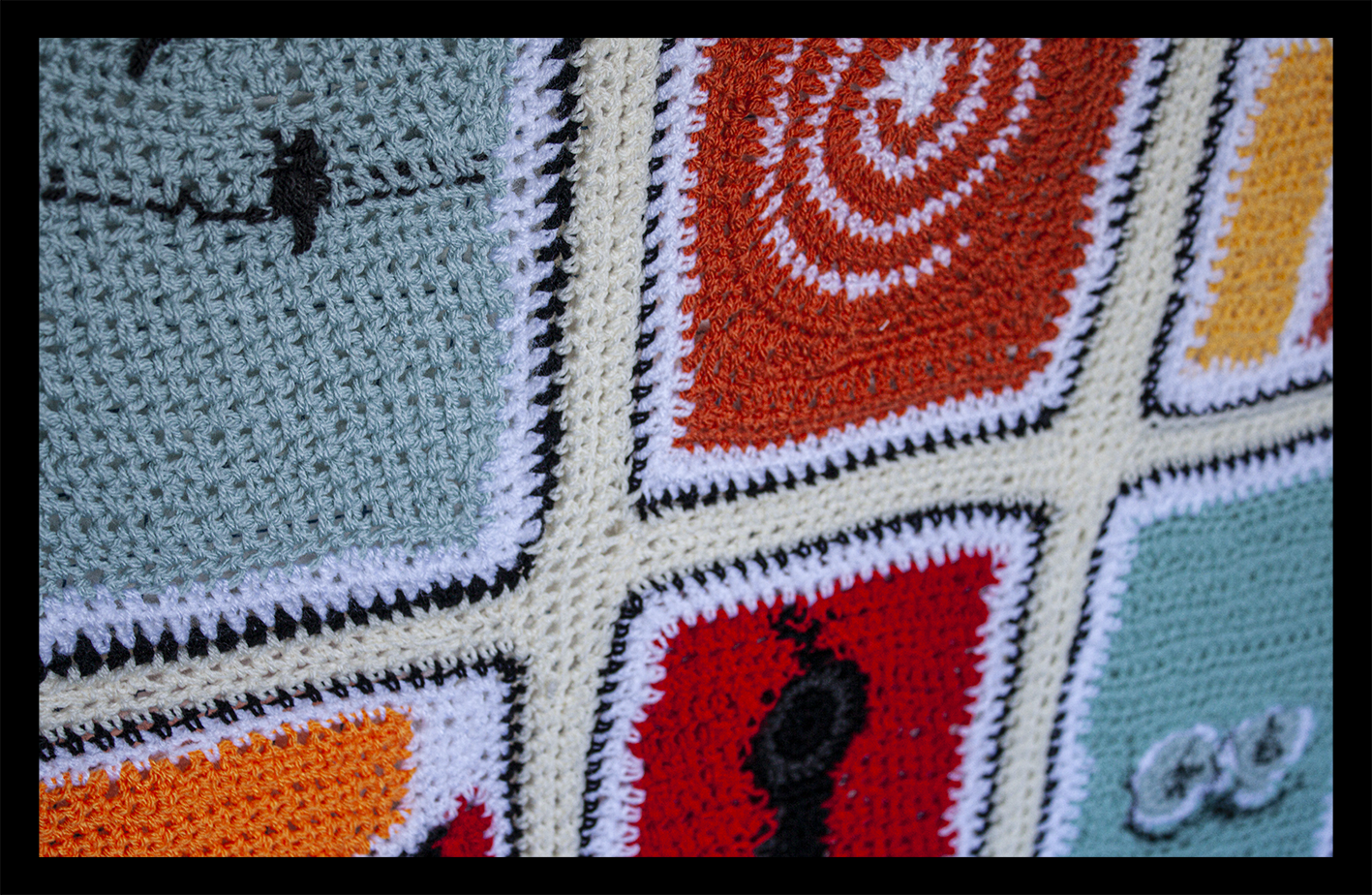
Marion Raper
“We have a ‘clattering’ of jackdaws which visit us at least twice a day to gather up the food that has been spilled from our bird feeders by the other smaller birds. One day we noticed one jackdaw was moving around rather strangely and being shooed away by the others. As it hopped about we could then see it had a badly damaged wing, and when the others flew off it quickly ran/jumped away and scuttled into our hedge. Over the last 5 or 6 weeks ‘Hoppy’ has managed to survive by scrounging food from us and various other neighbours in turn. Now he is not intimidated by the other birds and manages to hold his own even against some huge black crows and rooks which sometimes arrive. In fact, he is tolerated quite well by the other birds, and I have even seen a couple of his jackdaw mates fly up and knock food down from the feeders especially for him as he waits below. You can’t help but admire Hoppy, and for this reason I have made him the star of my Saul Bass-style poster.”
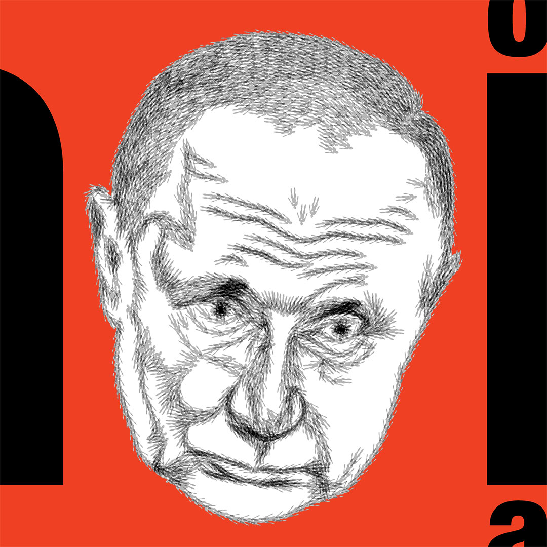
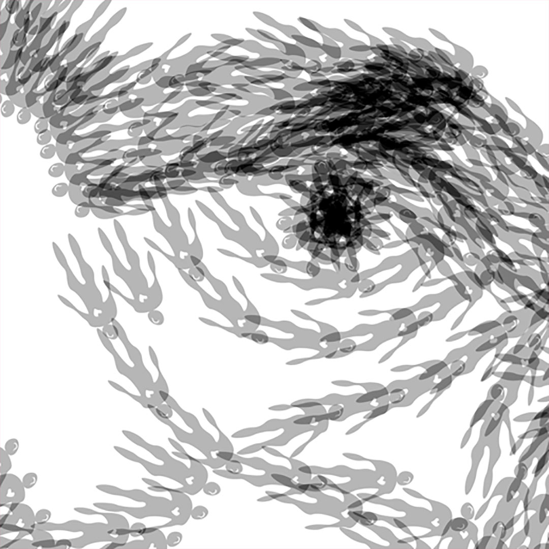
James Randall
“Sorry – bit of a rant but better out than in. The face is made of of little figures – meant to be asexual, they look more like men with extra big hips. I just can’t imagine how awful life must be for the Ukrainians because of that psychopath. Nukes, China? I think at a human level it is well past time to step in.”
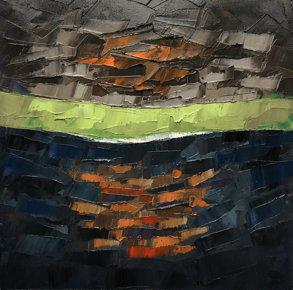
Gary Thorne
“I struggled to find a form of language/text to add to a painting that further portrayed the emotion within the situation I was visualising. I realised that in this most horrific of situations there was ‘voice’ yet their distress calls simply evaporated into the cloud formations above, leaving no hope for those adrift in the English Channel. A bleak painting for bleak times.”
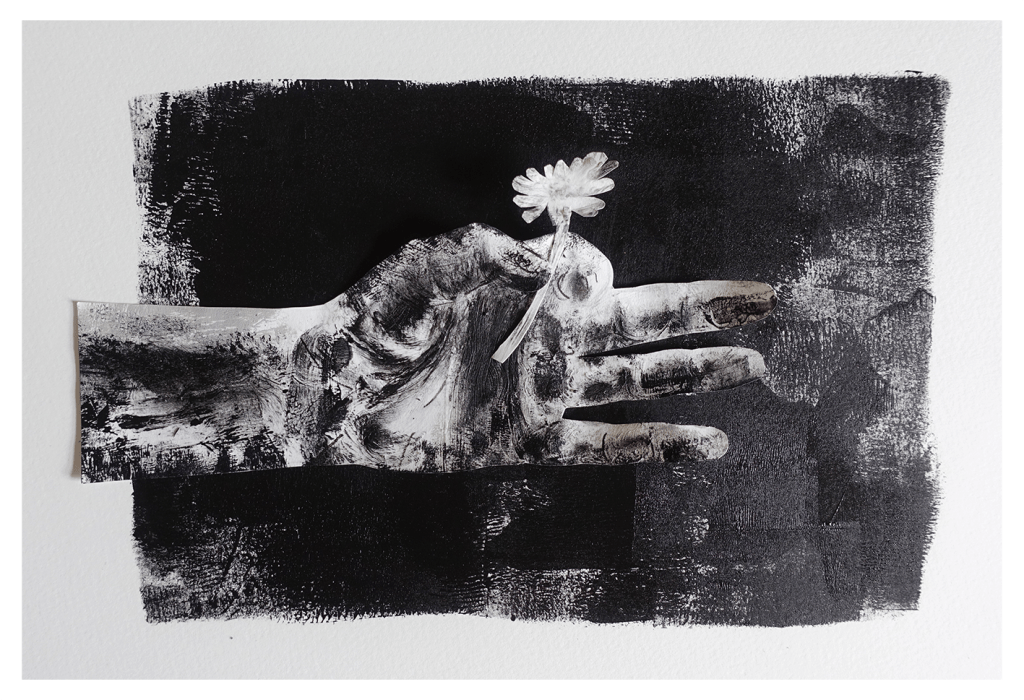
Phil Cooper
“I remember watching movies as a kid and loving the Saul Bass credit sequences more than the actual film; they seemed more exciting and mysterious by far. Whilst doing a bit of research for this prompt, I came across on old Sci-fi short film Saul and Elaine Bass directed called Quest. It looks dated and clunky now, but I liked it all the same, with some nice visuals and design. The ending resonated with the current times for me, and it led me to thinking about how precious every day of our lives are. This piece of work might be a poster for the movie. I’d been looking at Saul Bass when I made it. “
instagram.com/philcoops / hedgecrows.wordpress.com / phil-cooper.com
Inspired perhaps by the whirling spirograph of Saul Bass’s Vertigo poster, but prompted too by the importance of parsing distinctions between ideologies and individuals, Naum Gabo’s Linear Construction No.2 is our jumping-off point for the next two weeks.


Leave a comment