
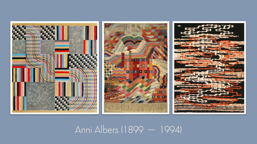

In our last Kick-About, Regina Giménez gave us maps, circles, and carefully arranged geometries. This week, we turn to Anni Albers, whose work helped establish weaving as a modern art form through the ideas and discipline of the Bauhaus. Her textiles show how thread, pattern, colour, and structure can become precise, expressive, and radical. As always, the works that follow were made in a short time — and for all previous editions of The Kick-About, go here.
Kerfe Roig
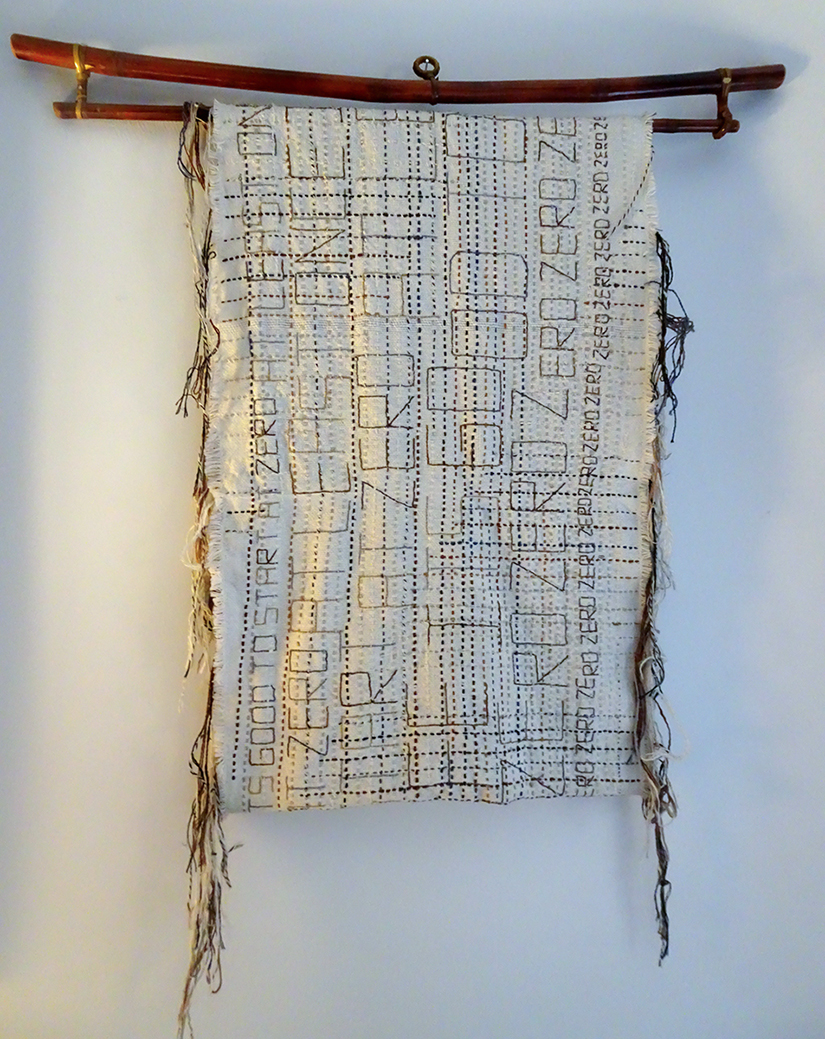
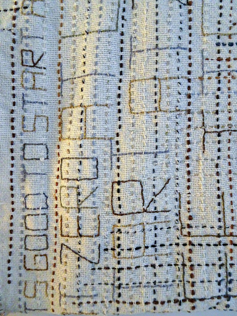
“At least once in life, it’s good to start at zero.” — Anni Albers
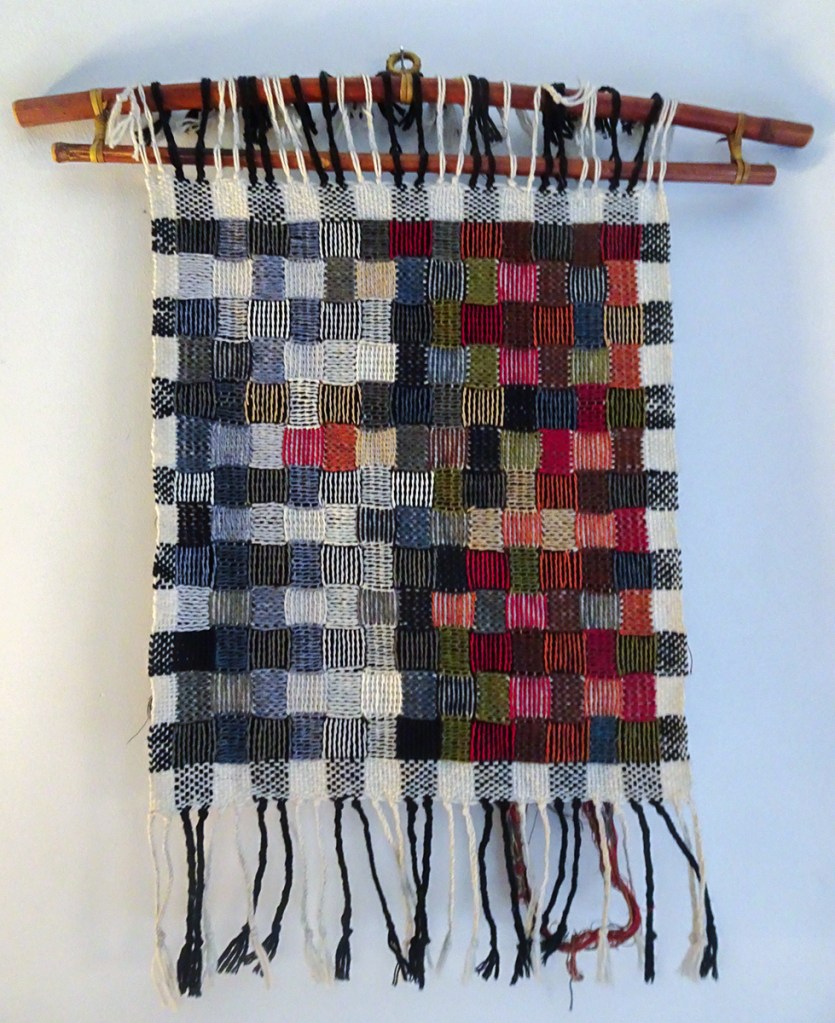
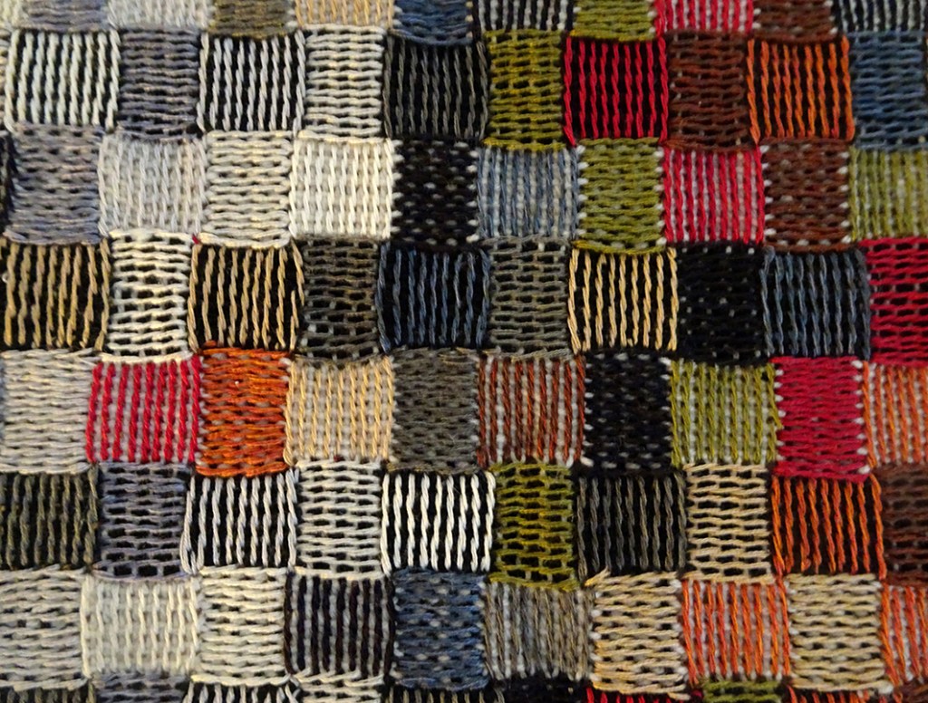
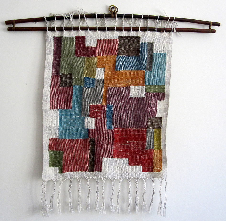
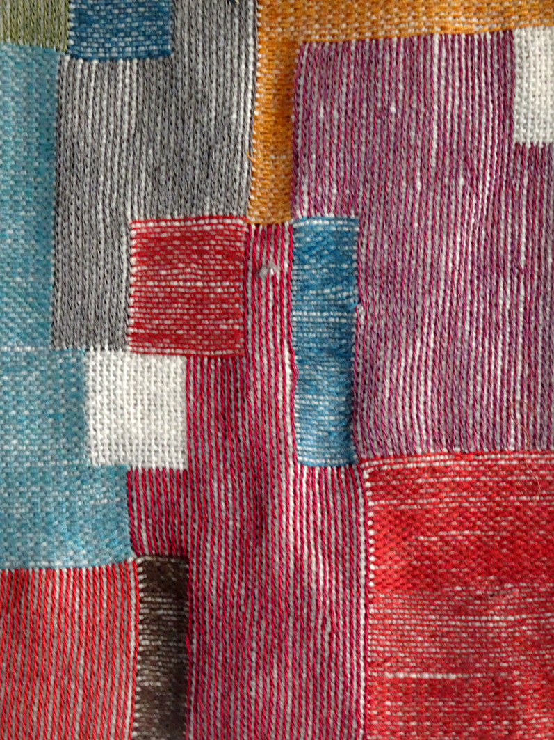
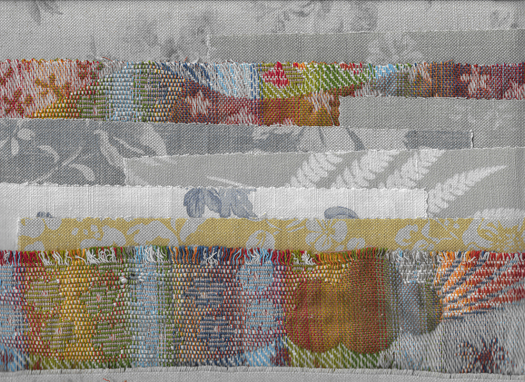
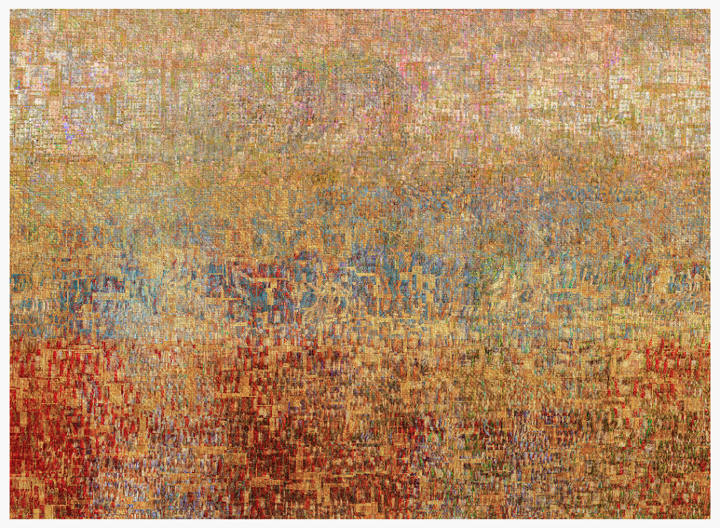
“In 2014, I did a few textile pieces inspired by Anni Albers. Needless to say, these took me months. When I saw the prompt, I figured I could produce nothing better in a short amount of time to honour her wonderful work.
Many of Albers’ weavings created in the 1950s and 1960s have titles with language references, but the text they contain is abstract, often with thread laid over the background weave. I used the quote above, which I have always liked, to make an embroidery on a loosely woven piece of fabric I bought on Etsy from Kira Silver.
The other two pieces use an Andean embroidery technique of wrapped-warp embroidery, which makes the embroidery look like weaving. I discovered this method through Albers’ interest in Andean art and textiles. Once again, I bought handwoven fabric to use as grounds on Etsy — these came from Matthew Yanchuk.
I haven’t done anything like this in a very long time, but I think I have some more grounds from both Etsy vendors packed away somewhere.“
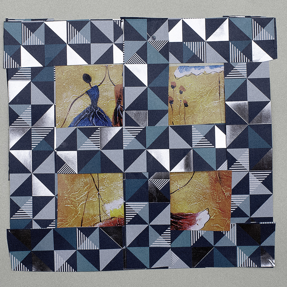
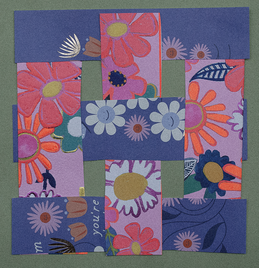
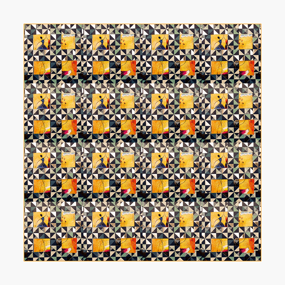
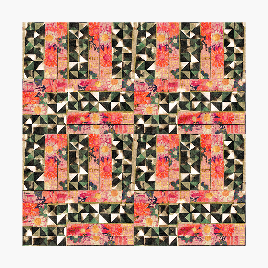
Charly Skilling
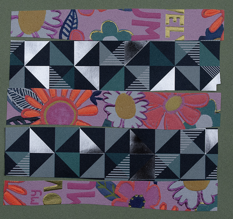
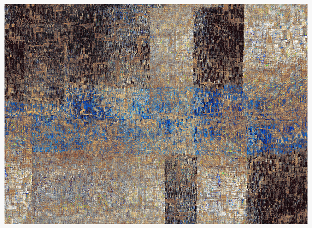
“Anni Albers’ patterns are very crochet-friendly, so my first thought was to crochet something. But I was a bit short on time, so I decided to try weaving something with strips of paper or card instead. When I started looking for suitable materials, I came across some old gift bags and greetings cards and, on a whim, cut them into strips and started playing around with shapes and patterns.
The structures are geometric, the colours varied and strong, and the shapes on the cards completely random — a sort of “Bauhaus meets psychedelia”. I had a lot of fun with these, and they have given me some ideas for a repeatable crochet pattern.”
Gary Thorne
“Liking Anni Albers’ fine drawings, I set about another freeform doodle, then painted it in with oils, as with the previous KA. I ended up in the same place, wondering how to move it on, so I snapped an iPhone photo and then, with ease, mucked about within the phone app, editing out and adding layers — rather basic-level stuff with a fat finger. Yet I liked this freedom, and it just might lead me back to resolving the original oil painting.”
James Randall
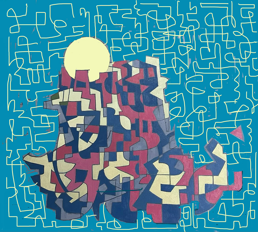
“Albers’ works are fine, restrained, and esoteric, so it was up to me to bring them down to earth as best I could — not through any great effort, but because the only way was down, and I had to be happy to let the work head in that direction.
I began with a picture of the Grand Canyon from way back, because on the drive away from it there were little Native American shops selling weavings, and when I took the photo there were storm clouds rolling in. Across this image I added a grid of softly curved lines and then shapes — this is really the Albers connection, I guess. Taking the grid, I copied it, then expanded the line thickness and smoothed the resulting shapes, using this as a template to ‘spray paint’ around the edges and produce ghostly pink wisps.
It needed a point of focus, so I added a figure with three legs. It begged for features, so I added doughnuts on the twelve-column grid I always work to, creating a head and hands, but also placing more doughnuts around the grid in strategic spots. I added a cloak of lines, then joined up the doughnuts to create two strands of weaving (one had to break!).
The depth of the image was suggesting the cosmos to me. I played with colours and fiddled with the figure layers to confuse the order. Finally, I added a screen, like a big old tree trunk with open shapes. I added some linework to the tree in its larger solid areas and drew in some highlights and shadows. There was a bit more fiddling with colour after that.
This KA had no particular map of intention — I just went along for the ride, trying to massage the different parts into working together as it made its merry way.”
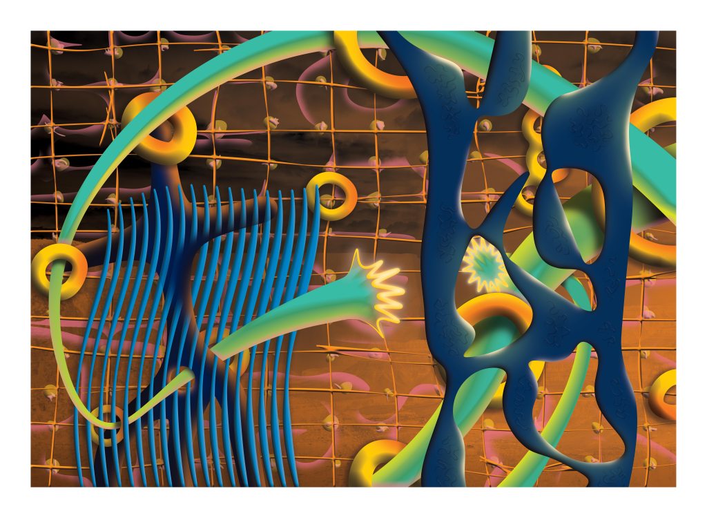
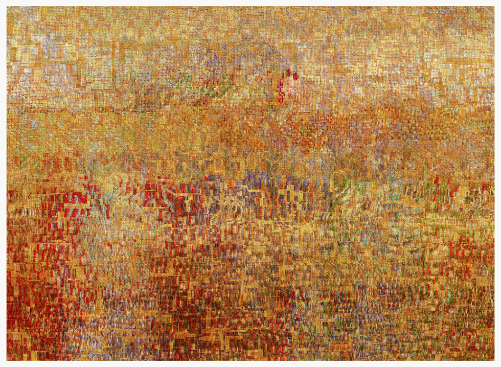
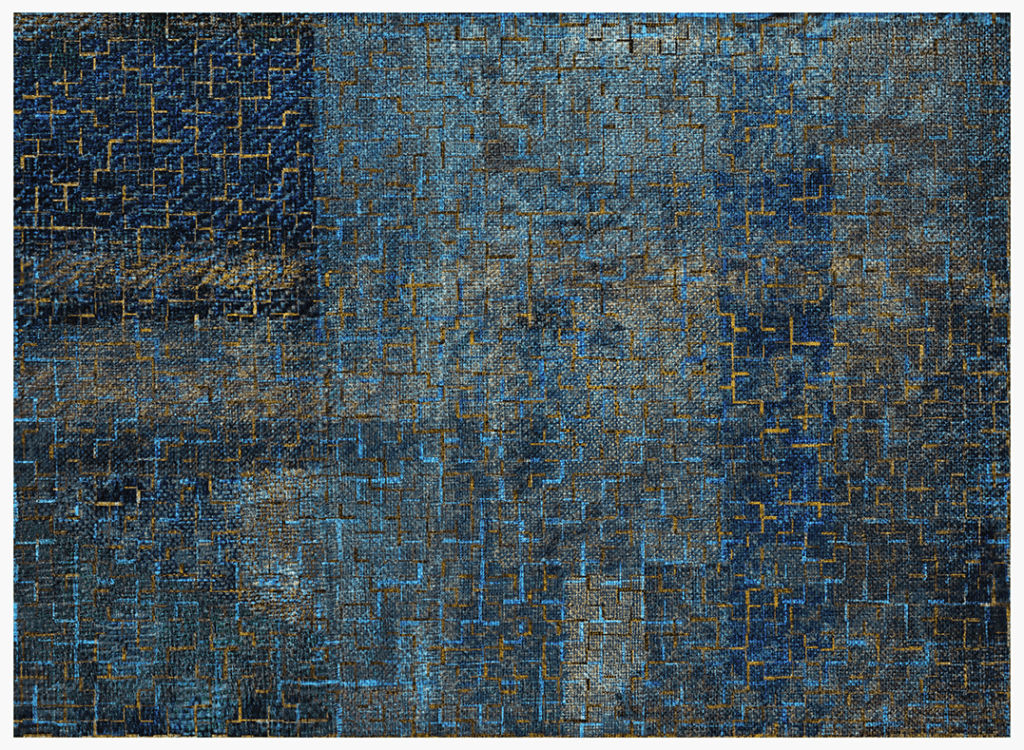
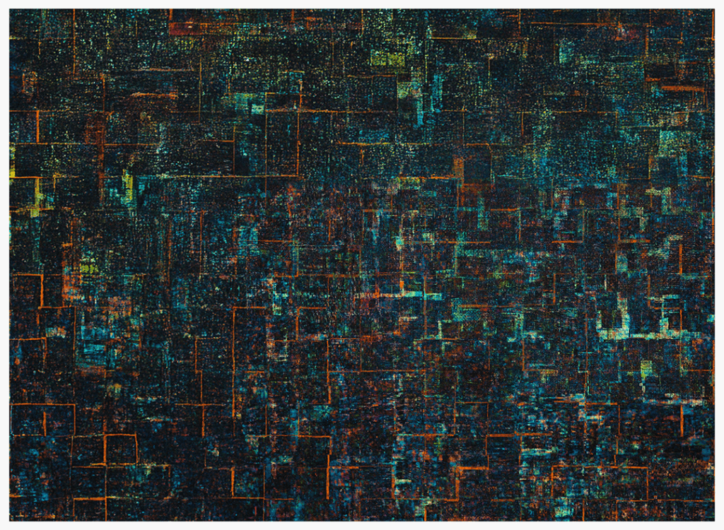
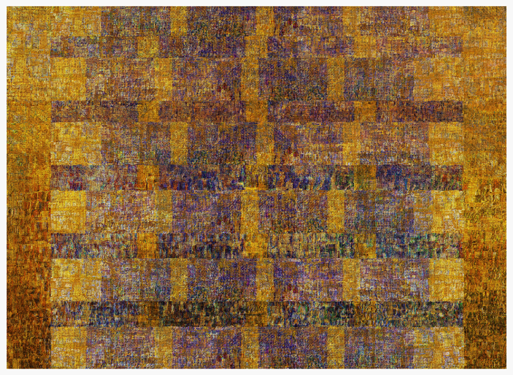
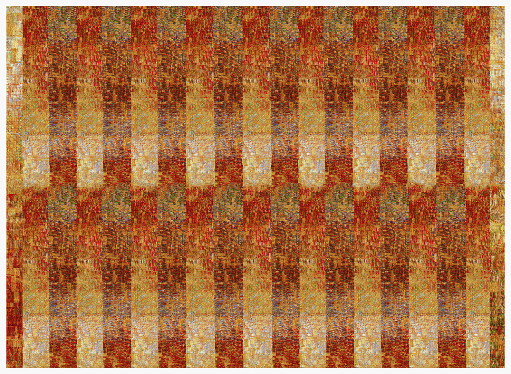
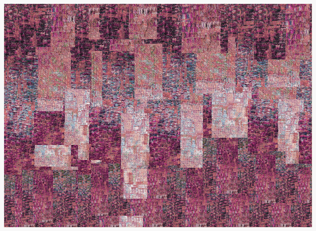
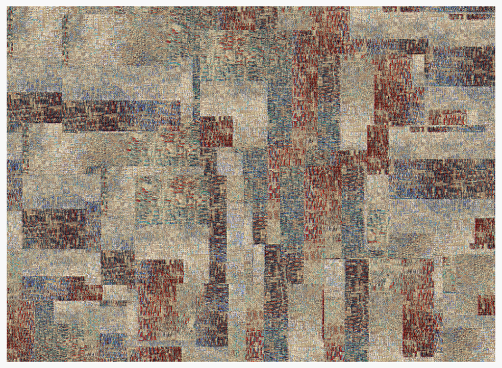
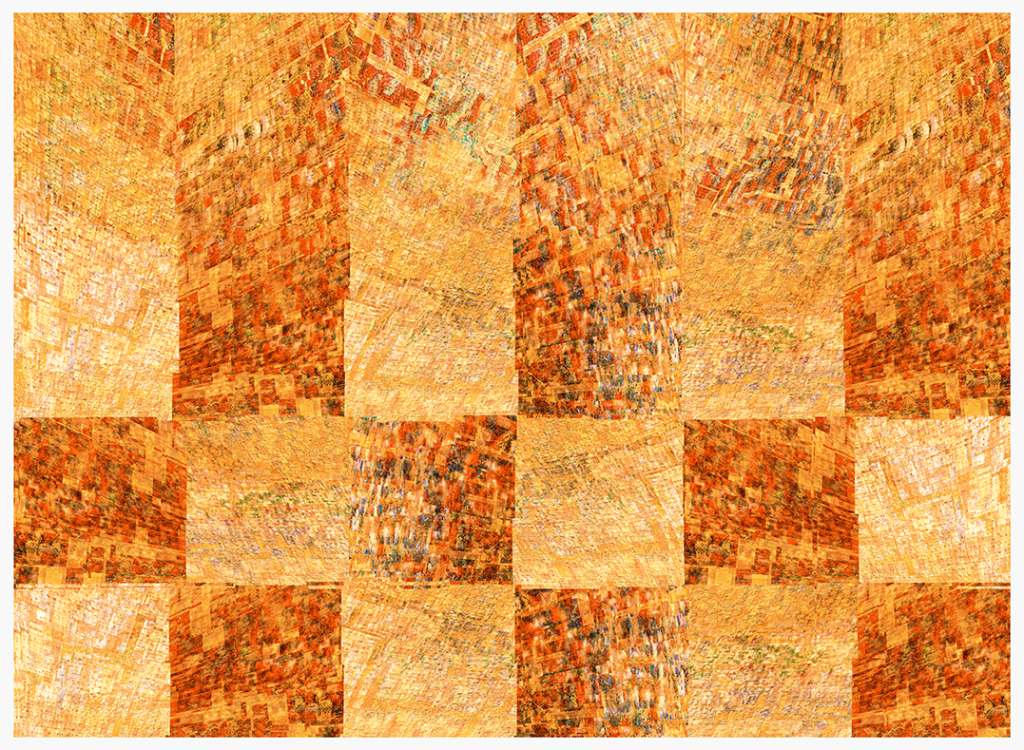
Phil Gomm
“My response began by rooting out various off-cuts of fabric I have hanging about, and scanning them. That done, I did a simple thing and began to duplicate and layer this one scan (below) to try and produce some Alber-inspired images. The detail in the scans meant I was able to work with the actual textures of the fabric, which meant that the surfaces of the images, though digital, remained pleasingly woven and tactile. I introduced some loose repeat patterns; one of the aspects of Alber’s designs I love is the sense of disorder breaking out, of a messing-up of an otherwise more standardised pattern, almost like a glitch.”
philgomm.com / behance.net/Phil_Gomm
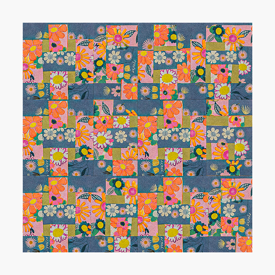
Graeme Daly
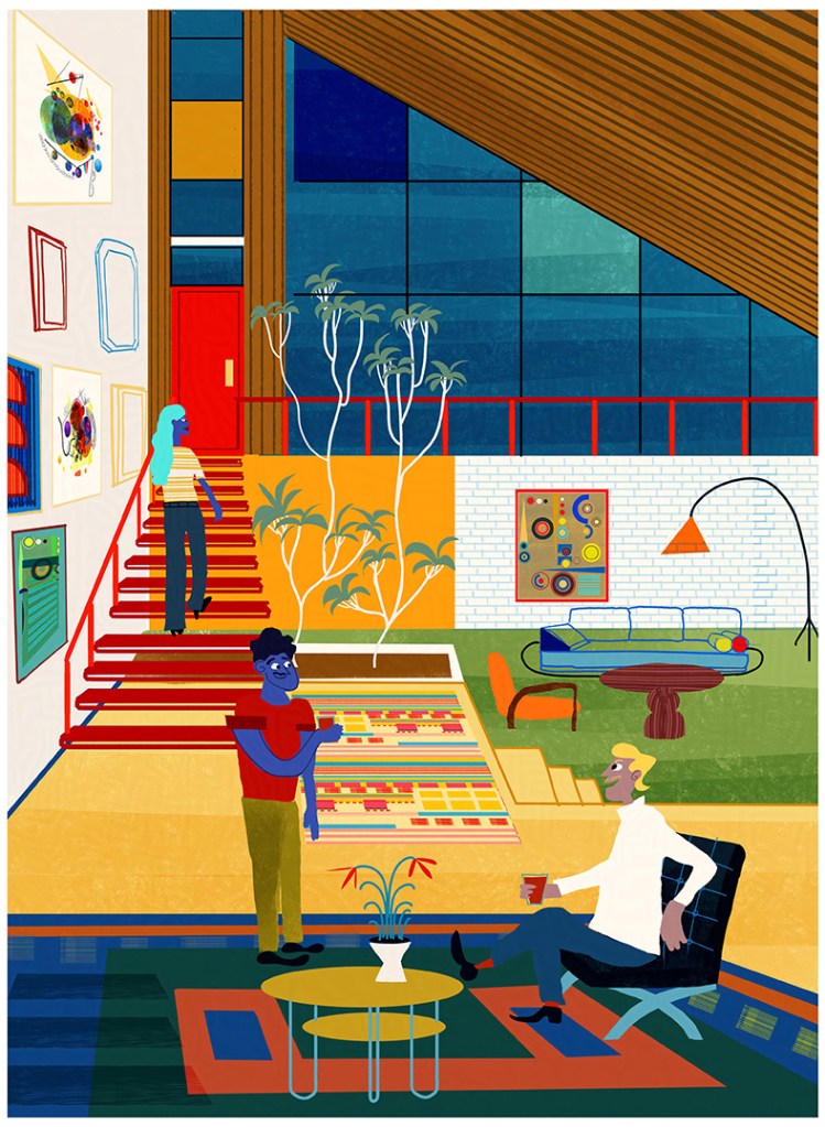
“I really wanted to illustrate with this Kick-About, so I envisioned Anni Albers’ beautiful textiles as rugs within a suitable adobe setting. The illustration features designs resembling those of the Bauhaus, where Albers studied textiles, coupled with mid-century design and a sprinkling of UPA-style animation design — all areas I love to draw.
I also thought it would be fun to include some previous Kick-About designs as wall art within the illustration. One of these days I’ll have my own space and design it exactly how I want. I can only imagine actually owning one of Albers’ pieces and how completely it would transform a room with that colour!”
@graemedalyart / vimeo.com/graemedaly / linkedin.com/in/graeme-daly / twitter.com/Graeme_Daly / gentlegiant.ie
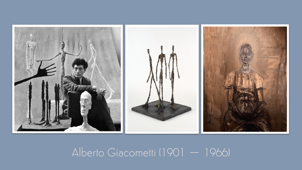
Next time, our prompt turns to Alberto Giacometti and his unmistakable, elongated figures.


Leave a comment